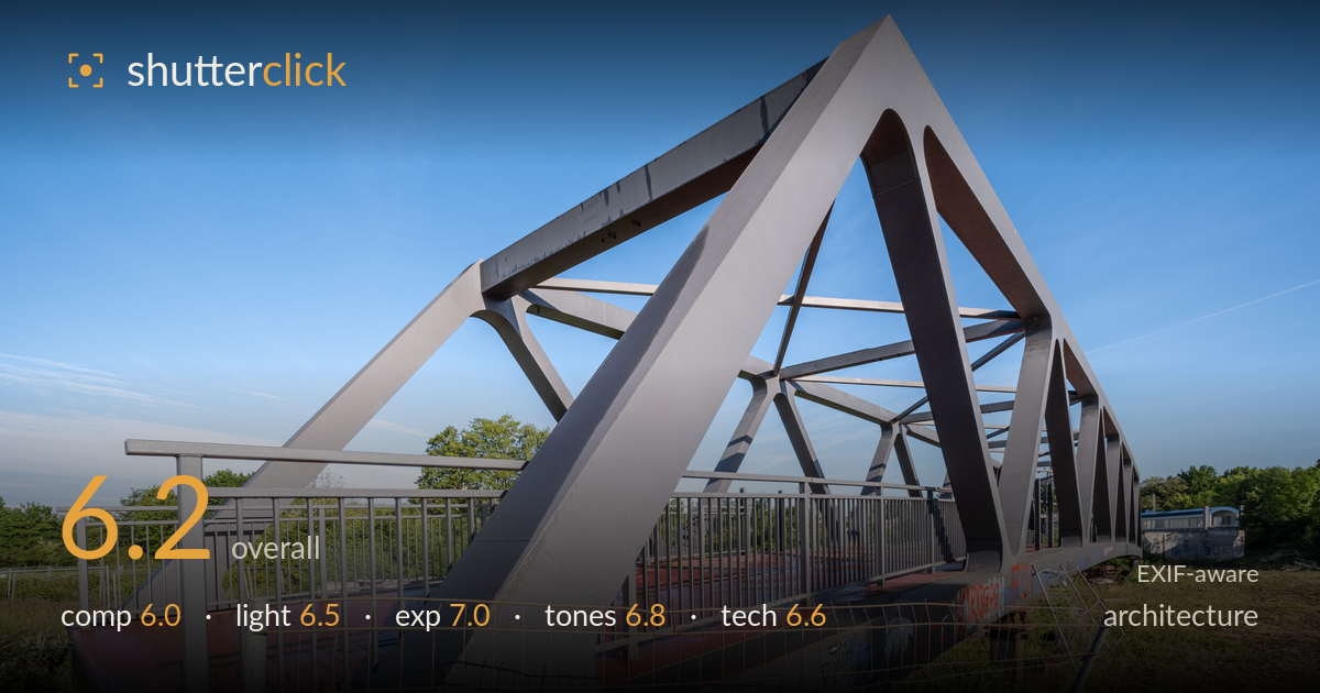
Steel truss bridge against blue sky
Photo by Dietmar Rabich

| Focal length | 9 mm |
| Aperture | f / 10.0 |
| Shutter | 1/150 s |
| ISO | ISO 250 |
| Exp. comp. | 0.0 EV |
| Shot at | 06:15 · May 19, 2026 |
The triangular truss geometry is the real draw here, and the low three-quarter angle lets the diagonals converge into a strong sense of depth and structure against a clean sky. What holds the frame back most is the foreground clutter: a sagging construction fence, hubcaps, and scrubby grass crowd the lower third and pull attention from the bridge's clean engineering. The 9mm perspective stretches the near end aggressively, which is expressive but leaves converging verticals unaddressed. A cleaner vantage, more attention to the bottom edge, and perspective correction would let the structure read as the deliberate subject it deserves to be.
The three-quarter angle exploits the truss diagonals well, drawing the eye along converging lines into the frame and creating genuine depth. The apex sits high and gives the structure presence against open sky. The weakness is the foreground: the wire fence, hubcaps, and weeds occupy the lower third and add visual noise without narrative purpose. The bridge's near end is cropped tight at the left edge while the sky dominates the top. A cleaner base and more considered edges would let the geometry carry the frame.
Low, warm morning light rakes across the steel from the left, modelling the flat truss faces and separating planes that would otherwise merge into grey. Shadows fall long across the red deck, adding form. The clear sky delivers even, predictable illumination. The trade-off is that the shaded faces of the trusses go rather flat and dark, and the hard sun leaves little softness on the structure's texture. Still, the timing gives the metal dimension it would lack under flat midday light.
Exposure is well judged for a high-contrast scene. The sky retains gradation from deep blue at top to lighter near the horizon without clipping, and the red deck holds saturation and detail. Shadow areas on the shaded truss faces stay readable rather than crushing to black. Highlights on the sunlit steel are controlled. The overall brightness feels deliberate, balancing the bright sky against the darker structure. Nothing appears accidentally under- or over-exposed; the dynamic range is handled cleanly across a demanding tonal spread.
The blue-sky-versus-warm-steel palette gives the image a clean, contemporary feel, and the red deck adds a welcome accent. White balance reads neutral and believable. Contrast is punchy without becoming harsh, and the grey truss holds subtle tonal separation between lit and shaded faces. The sky gradient is smooth. Where tones fall slightly short is the muddy green foreground, which sits dull against the crisper structure and sky. A touch more separation in those shadowed greens would lift the lower frame's overall coherence.
The 9mm lens on the X-E5 delivers the wide sweep this angle needs, and f/10 keeps the whole structure from near fence to far end acceptably sharp — a sensible depth-of-field choice for architecture. Focus lands well on the truss members, and 1/150s at ISO 250 is more than adequate for a static subject, keeping noise negligible. The main technical concern is uncorrected perspective: the ultra-wide focal length exaggerates the near end and the vertical posts lean noticeably, a keystoning effect that architecture is judged strictly on. Some barrel distortion is also visible in the fence and horizon line. The extreme angle is a legitimate creative decision, but the converging verticals would benefit from correction in post, and shooting slightly further back with a fraction more level would reduce the stretch. Sharpness across the frame is good, aperture is well within the lens's sweet spot, and the exposure settings are appropriate throughout.
What would elevate it
Tags
Shot something like this?
Expert photo critique, on demand — scored across six categories, EXIF-aware. Start with 3 free critiques, no credit card.
critique my photo — free