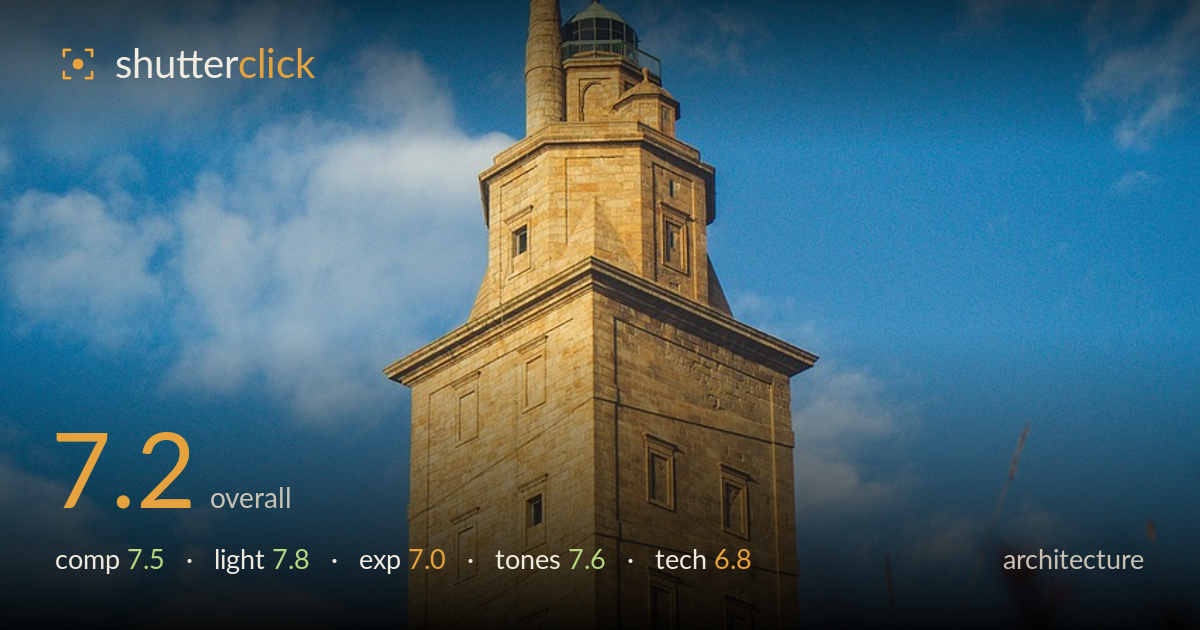
Stone tower against a summer sky
Photo by the_p_adventure

No EXIF metadata in this file
Technical analysis based on visual assessment only.
A confident low-angle treatment of a stone tower that uses foreground foliage to ground the structure and add depth, a smart move for a lone vertical subject against sky. The warm evening light on the masonry is the strongest asset, giving the stone texture and dimensionality against the clean blue backdrop. What holds it back most is the slight backward lean of the tower — the low angle introduces convergence that reads as an accidental tilt rather than a deliberate perspective, and the soft foreground occupies a large slice of frame without quite resolving into intentional foreground interest. Verticals corrected and a touch more compositional discipline would lift this notably.
The tower sits slightly left of centre with the spire near the upper third — a workable placement that lets the structure rise through the frame. The foreground grasses build depth and scale, and the portrait orientation suits the vertical subject. The tower leans back and slightly, though, so the base feels heavier than the top wants to be. The foreground occupies nearly the bottom third yet stays entirely out of focus, so it functions more as a soft frame than a resolved element. Centring the tower horizontally would settle the balance.
Warm, low-angle sunlight rakes across the stone from the left, revealing the block courses and window recesses with genuine three-dimensionality — exactly what architectural masonry wants. The side lighting gives the flat faces modelling rather than washing them out, and the golden cast separates the warm stone cleanly from the cool sky. Shadows on the right-facing planes are deep but not blocked. The green dome catches just enough light to register. This is the image's real strength; the timing near golden hour was well chosen.
Overall exposure is balanced — the sunlit stone holds detail without clipping and the sky retains cloud structure and gradation. The shadowed faces of the tower sit a touch dark, losing some of the masonry texture that the lit side shows so well. Highlights in the brightest clouds edge toward white but stay controlled. The foreground foliage is exposed reasonably given its shade. A gentle shadow lift would recover detail on the tower's darker planes without flattening the strong directional light.
The warm-stone-against-blue-sky palette is the classic golden-hour architecture combination and it works here — the honeyed masonry plays well against the saturated cerulean sky and white clouds. The reddish-brown foreground foliage harmonises with the stone tones, keeping the palette coherent. Contrast is healthy and the blues are rich without turning cyan or overcooked. White balance leans warm, which suits the hour. The saturation is pushed slightly, most visible in the sky, but stays this side of heavy-handed.
Focus is placed correctly on the tower, which is acceptably sharp across its faces, and the shallow depth of field renders the foreground grasses into a soft foreground wash — a reasonable creative choice, though the transition zone means nothing in the foreground is crisp enough to serve as a genuine anchor. Depth of field looks moderately wide open; a smaller aperture would have brought at least the nearest foliage into usable focus while keeping the tower sharp. The most correctable technical issue is the perspective: the tower converges backward, a keystoning effect from tilting the camera up at close range, and for architecture this reads as a lean rather than deliberate distortion. Shooting from further back with a longer focal length, or correcting verticals in post, would fix it. No obvious noise or motion issues are visible, and the overall capture is clean. Sharpness on the tower itself is solid enough to hold up.
What would elevate it
Tags
Shot something like this?
Expert photo critique, on demand — scored across six categories, EXIF-aware. Start with 3 free critiques, no credit card.
critique my photo — free