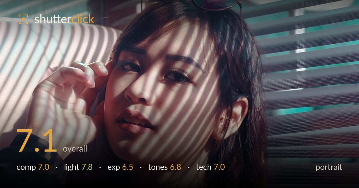
Striped light through the blinds
Photo by Didit-Art

No EXIF metadata in this file
Technical analysis based on visual assessment only.
The blind-shadow light is the star here — those diagonal stripes wrapping across the face and shoulders give the portrait a strong editorial mood, and the subject's steady, contemplative gaze holds attention. What most holds it back is the way the striping falls on the eyes: the key expressive feature is partly cut by shadow bands, softening the connection. The blown highlights in the upper-left window and the slightly cool, flattening white balance also pull energy from the frame. The dessert in the foreground competes rather than complements. A cleaner light placement across the eyes and a tighter crop would elevate this notably.
The subject sits slightly right of centre with the hand-to-face gesture adding a natural triangle that anchors the frame. The blinds provide a strong graphic backdrop, and the sunglasses on the head add a stylish note. However, the dessert glass intruding into the bottom edge is a distraction — it competes with the face rather than supporting the story. The generous headroom pushes the eyes low in the frame. A tighter crop favouring the upper two-thirds would strengthen the subject's presence and reduce the foreground clutter.
The hard directional light through the venetian blinds is the defining choice, and it works as a mood device — the striped shadows across face and body create rhythm and an editorial edge. Direction is flattering enough to model the cheekbones and jaw. The trouble is placement: the shadow bands fall across the eyes, which in portraiture is where the light most needs to be clean. A slight shift so the stripes cross the forehead or below the eyeline instead would preserve the effect while keeping the gaze fully lit.
The face is exposed reasonably, holding skin detail in the mid-tones, but the window in the upper-left is fully blown with no recoverable detail, pulling the eye out of frame. The dark clothing and lower shadows sink toward black, losing texture in the lace. The contrast between the bright striping and deep shadow is extreme, and the histogram would show clipping at both ends. Exposing slightly for the highlights and lifting shadows in post would recover a fuller tonal range across the frame.
The palette leans cool and slightly magenta, with the teal wall behind offering a nice complementary counterpoint to the warm skin. But the white balance feels a touch off — skin reads slightly muddy and the whites of the blinds carry a cool cast. Contrast is high, which suits the mood but crushes shadow detail. Warming the balance a little and easing the saturation in the shadows would render the skin more naturally while keeping the graphic teal-versus-warm interplay intact.
Focus appears to land on the face, with the eyes reasonably sharp given the challenging striped light falling across them — though the shadow bands make it harder to read critical sharpness on the near eye. Depth of field is shallow enough to soften the blinds behind without fully dissolving them, which keeps the graphic backdrop legible; that's a defensible choice here. The foreground dessert glass is well out of focus but still large enough to distract. Noise is controlled and detail in the hair and lace holds up. The main technical vulnerability is the dynamic range: the scene's contrast exceeds what a single frame handles cleanly, leaving blown windows and blocked shadows. Shooting from a marginally different angle to avoid the brightest window, or exposing to protect highlights and lifting the face in post, would balance the frame. Overall execution is competent, with the hard mixed light being the harder variable to tame than any gear limitation.
What would elevate it
Tags
Shot something like this?
Expert photo critique, on demand — scored across six categories, EXIF-aware. Start with 3 free critiques, no credit card.
critique my photo — free