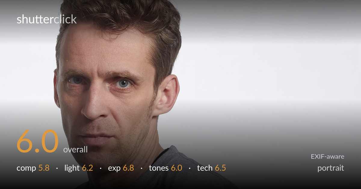
Studio portrait with a direct gaze
Photo by Dmitry Makeev

| Focal length | 50 mm |
| Aperture | f / 13.0 |
| Shutter | 1/160 s |
| ISO | ISO 100 |
| Exp. comp. | 0.0 EV |
| Shot at | 20:59 · Mar 30, 2015 |
A solid, workmanlike studio portrait with a direct, slightly confrontational expression that carries the frame, but it is held back by loose composition and a flat lighting setup. The gesture — hand on hip, body angled, head turned to camera — reads as deliberate and gives the figure some attitude. The grey shirt occupies a huge portion of the frame with little to do, and the soft, frontal light leaves the face without much modelling. Sharp eyes and a clean white background keep it usable, but tighter framing and more directional light would lift this from a competent record to a portrait with presence.
The three-quarter body angle and turned head create a workable diagonal, and the hand on hip adds intent. But the framing is loose — the torso dominates while the face, the real subject, sits cramped near the top-left edge with the crown almost clipped. The lower half is a large expanse of plain grey shirt that adds little. A tighter crop emphasising the head and upper body, with the eyes nearer an upper-third line, would give the figure far more authority and remove dead space.
The light is soft and broadly frontal, which keeps skin tones clean and avoids harsh shadows, but it leaves the face flat with minimal modelling across the cheeks and jaw. There is a catchlight in the eyes, which helps, but the lighting does little to sculpt form or separate the subject from the background. A key placed more to the side, with a touch of shadow on the far cheek, would build dimension and give the strong expression more weight.
Exposure is well controlled. The white background sits bright without blowing out destructively, and skin tones retain detail in both the lit planes and the shadowed side of the face. Highlights on the forehead and nose are held in check, and the shirt keeps its mid-grey texture. The histogram is balanced for a high-key studio setup. If anything, the overall rendering is a touch flat, but nothing clips problematically and the brightness reads as deliberate.
White balance is neutral and accurate — the grey shirt and white backdrop read clean without a colour cast. Skin tones are natural, if a little pale and lacking warmth. The image is low in contrast overall, which suits the high-key look but contributes to the flat feel. The grey-on-grey-on-white palette is muted and monochromatic by nature; a slight contrast boost and a touch of warmth in the skin would add life without breaking the clean studio aesthetic.
At f/13 on a 50mm lens, the depth of field is very deep — far more than a portrait needs against a plain backdrop. Focus is accurately placed on the near eye, which is sharp with a clear catchlight, and 1/160s at ISO 100 freezes the pose cleanly with no noise. The trade-off is that f/13 flattens the rendering and forced more light onto the scene than necessary; the background is already plain, so there is nothing to gain from this much depth. Opening up to around f/4 to f/5.6 would have kept both eyes and the face sharp while softening the shirt folds and any background texture, giving the subject more separation and a more flattering, three-dimensional look. The 50mm focal length on the APS-C 60D works out to a roughly 80mm equivalent, which is a sensible portrait length with little distortion. Settings are competent and the capture is clean — the main missed opportunity is the overly small aperture.
what would elevate it
tags
Shot something like this?
Expert photo critique, on demand — scored across six categories, EXIF-aware. Start with 3 free critiques, no credit card.
critique my photo — free