Styled portrait on the stairs
Photo by Sunriseforever

No EXIF metadata in this file
Technical analysis based on visual assessment only.
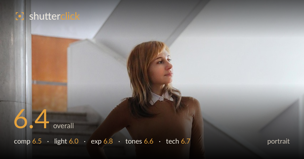
A competent full-length fashion portrait let down mainly by flat, directionless light. The pose reads as styled and intentional, the outfit is the clear subject, and the staircase and column provide architectural context that supports rather than competes. The averted gaze suits the editorial mood. What holds it back is soft, even illumination that gives the figure little form or separation from the pale wall, and a background that, while relevant, is busy across the middle. Cleaner subject-background separation and a stronger directional key would lift this from a solid look-book frame to something with genuine dimensionality and polish.
The full-length framing gives the outfit room and the diagonal staircase adds movement behind the figure. Subject placement slightly right of centre works, and the column on the left anchors the frame. However, the pillar crops awkwardly against the edge and the head sits close to the busy stair line, reducing separation. A little more headroom management and a cleaner backdrop behind the upper body would isolate the subject better. The low, straight-on angle is honest for fashion but flattens the sense of the space.
The light is soft and even, which is forgiving on skin but leaves the figure with little modelling — the brown top and the pale wall behind read at similar brightness through the torso, so the subject nearly merges with the background. There are no strong catchlights and no clear key direction, so the face lacks the sculpting that makes a portrait feel three-dimensional. A window or reflector placed to one side would carve out cheekbone and jaw and lift the subject off the wall.
Exposure is well controlled overall. The bright white wall and staircase hold detail without blowing out, and shadow areas under the stairs and in the wood floor retain information. Skin tones sit at a natural midtone level, and the tights keep their pattern without clipping to pure white. Nothing looks accidentally dark or crushed. The tradeoff is that the even exposure across figure and background reinforces the flatness — technically clean, but doing little to command attention toward the subject.
White balance is neutral and believable across the grey stairs, warm wood and brown knit. The palette is muted and cohesive — earthy top, cool plaid, warm floor — which suits an editorial look. Contrast is on the gentle side, matching the soft light, and saturation is restrained rather than punchy. The warm wood foreground provides a pleasant counterpoint to the cool greys. A touch more contrast or a subtle tonal separation between the top and wall would help the subject read more emphatically against the neutral surroundings.
Focus appears accurate on the figure, with the face and outfit rendered with adequate sharpness for a full-length frame. Depth of field is moderate — the background stairs remain clearly legible rather than softened, which keeps context but does little to isolate the subject. For a fashion portrait, either a wider aperture to gently blur the busy staircase or a longer focal length to compress and simplify would strengthen separation. Noise is not a concern; the image looks clean at this viewing size. The perspective is fairly natural without obvious distortion, and the vertical lines of the column and wall stay reasonably true. The main technical opportunity is not sharpness or exposure but the depth-of-field and lens choice: a tighter working distance with more compression would flatter proportions and lift the figure from the cluttered mid-ground. Overall execution is solid and dependable, just conservative in the choices that would give the frame more polish.
What would elevate it
Tags
Shot something like this?
Expert photo critique, on demand — scored across six categories, EXIF-aware. Start with 3 free critiques, no credit card.
critique my photo — free