Summer afternoon on the canal
Photo by Zachtleven

No EXIF metadata in this file
Technical analysis based on visual assessment only.
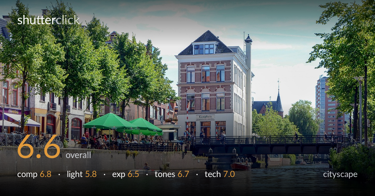
A pleasant, well-organized canal scene with strong layering — water foreground, café terrace, the gabled centerpiece building, and the bridge tying both banks together. The biggest limit is the light: harsh midday sun flattens the brickwork and pushes the sky toward a pale, low-contrast wash, draining the drama a more raking hour would give. The kayaker is a nice anchor but sits small and slightly lost. The composition works but the central building competes with a busy left bank for attention. With softer light and a clearer hierarchy of subject, this scene has real postcard potential.
The layered structure is the strength here — calm water leads the eye up through the café terrace to the gabled brick building, with the bridge spanning to balance the tree-lined right bank. The Kamphuis building makes a natural anchor near center, supported by the rule-of-thirds placement of the green umbrellas. Where it loosens is competition: the busy left bank, the bridge crowd, and the boats all pull attention without a single dominant subject. The kayaker, a lovely human-scale element, sits small and easy to miss in the lower-left.
This is the weakest link. Hard, high midday sun flattens the brick façade and trees, producing little of the modeling that gives architecture depth. The sky reads pale and hazy, with low contrast that robs the scene of separation against the buildings. Shadows fall short and harsh rather than shaping form. Early morning or the warmer, lower angle of late afternoon would rake across the gable, deepen the brick color, and give the water more luminous reflection — transforming a flat record into an atmospheric scene.
Exposure is balanced and safe for tricky midday range. Highlights in the bright sky stay just shy of clipping, and shadow detail holds in the trees and under the bridge. Midtones on the brick are placed sensibly. The water retains gentle reflection detail without going muddy. The image leans slightly toward the bright side overall, which contributes to the washed sky feel, but nothing is badly blown. A touch more highlight recovery on the clouds would restore some of the texture the sky currently lacks.
Colors are clean and natural — the green foliage and umbrellas read accurately, the brick holds a warm earthy tone, and white balance sits neutral with no obvious cast. Saturation is restrained and pleasant. The limit is contrast: the pale sky and flat light leave the overall tonal range compressed, so the image feels a little soft and low-energy. A modest contrast lift and a slightly deeper sky would add the punch the midtones currently want, separating the building from its hazy backdrop.
Sharpness and depth of field are well handled — the central building, café, and bridge all render crisply, and front-to-back focus holds across the frame, which suits a cityscape. There's no obvious motion blur in the water or the kayaker, suggesting a shutter speed fast enough for the handheld daylight scene. Noise is a non-issue at this light level. The horizon and verticals are largely level, with the building's lines reading true rather than keystoned — a good result for a frame this wide. The focal length flattens and gathers the scene effectively, holding both banks without obvious distortion at the edges. Overall execution is solid and competent. The main improvement is creative rather than technical: a slightly lower, longer perspective or a step that placed the kayaker more deliberately within the frame would convert clean technique into a stronger image. As shot, the craft is dependable and the file would respond well to careful tonal work in post.
what would elevate it
tags
Shot something like this?
Expert photo critique, on demand — scored across six categories, EXIF-aware. Start with 3 free critiques, no credit card.
critique my photo — free