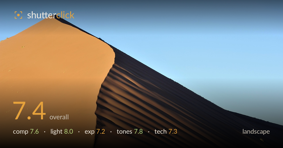
Sunlit dune ridge against blue sky
Photo by AndreaPivari

No EXIF metadata in this file
Technical analysis based on visual assessment only.
The diagonal crest of the dune slicing across the frame is the strongest asset here, and the low, raking light that splits the sunlit face from the shadowed flank gives the mountain of sand real form. The tiny figures at the base provide crucial scale that elevates the whole image. What holds it back is a slightly cluttered, flat foreground strip of gravel that adds little, and highlights on the orange face that sit close to blown in places. A cleaner base and a touch more shadow recovery would let the geometry and scale sing more fully.
The dune's ridge forms a powerful descending diagonal that carries the eye from top-left to lower-right, and the peak placed high-left leaves the sky as effective negative space. The clustered figures near the base are the key that unlocks scale, well spotted. The foreground gravel strip, however, is a flat and featureless band that eats roughly a fifth of the frame without contributing. The scattered acacia trees along the base help anchor the scene, but the horizon sits a little low and the base feels slightly cramped against the bottom edge.
Low-angle side light is doing the heavy lifting, cleanly dividing the glowing sunlit face from the deep shadowed flank and revealing the rippled texture along the transition. This directional quality is exactly what gives the dune its sculptural mass and sense of scale. The warm colour of the light suits the subject. The contrast between lit and shadow sides is strong but risks tipping into harshness, and a fraction earlier or later in the golden window would have softened the shadow edge and added more graduated modelling across the shaded face.
Overall exposure is balanced, holding the bright orange face and the dark shadow flank in the same frame without either collapsing entirely. The sunlit slope is pushed hard, though, and the brightest orange areas near the crest are close to clipping, losing some fine texture. Shadow detail on the flank survives but is dense and could carry more information. The sky is clean and well controlled with no distracting blow-out. A slightly more conservative exposure protecting those highlights, then lifting shadows in post, would have preserved more of the surface detail on both sides.
The warm orange of the sand against the clear blue sky is a naturally strong complementary pairing, and it reads convincingly here without looking over-saturated. The tonal separation between the lit and shadow faces is the picture's engine, and it holds up well. White balance is neutral and believable. The shadow flank leans a touch muddy in its darkest reaches, and a small amount of contrast and clarity lift in the mid-shadows would recover the rippled structure there. The sky gradient is smooth and clean, a good backdrop for the warm mass.
Judging from the visual evidence alone, focus appears sound across the dune, with the crest and rippled slope holding good detail and the distant figures rendered sharply enough to register as people rather than smudges. Depth of field looks more than adequate for a scene of this depth, suggesting a sensible working aperture. There is no visible motion blur and noise is not an issue in the bright conditions. The focal length flattens the scene slightly, which actually helps stack the dune into a monolithic wall, though it also compresses the foreground into that dead gravel band. The main technical opportunity is in capture discipline around the highlights on the sunlit face, which sit near the clipping point; bracketing or a marginally darker exposure would have banked more surface texture for the shadows to be lifted against. The clean, aberration-free edges and lack of visible flare into the sky point to competent handling of a contrasty, high-light situation.
What would elevate it
Tags
Shot something like this?
Expert photo critique, on demand — scored across six categories, EXIF-aware. Start with 3 free critiques, no credit card.
critique my photo — free