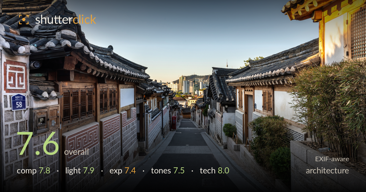
Sunlit hanok alley toward the city
Photo by Basile Morin

| Focal length | 24 mm |
| Aperture | f / 14.0 |
| Shutter | 1/10 s |
| ISO | ISO 100 |
| Exp. comp. | 0.0 EV |
| Shot at | 04:15 · Jun 4, 2024 |
A well-executed Hanok street scene that uses the converging alley as a natural leading line toward the distant cityscape, creating strong depth and a satisfying old-versus-new juxtaposition. The warm rim light on the right-hand roof gives the frame a focal anchor. What most holds it back is the empty upper-left sky, which occupies nearly a third of the frame without doing enough work, and slight shadow flatness in the traditional walls. The verticals hold well and the tile detail reads crisply. A tighter framing and a touch more shadow separation would lift a competent travel image toward something more deliberate.
The alley funnels the eye cleanly from foreground stonework to the distant towers, a textbook use of converging lines with the two rooflines framing the vanishing point. The house number '58' plaque and geometric wall pattern give the left edge a strong entry point. The warm-lit roof on the right balances the darker mass opposite. The weakness is the large expanse of plain sky in the upper left, which leaves the top third under-used. Lowering the horizon or including more roofline would tighten the balance.
Low, warm sunlight rakes across the right-hand roof and window, giving that corner a genuine glow and separating it from the cooler shaded structures. The directional quality suits the traditional tile and timber, revealing texture on the illuminated eaves. The left side and street sit in open shade, softer and cooler, which reads as an intentional temperature contrast. The main limitation is that most of the scene falls in flat ambient light while only one corner catches the drama, leaving the composition slightly lopsided in energy.
Exposure is well controlled overall. The sunlit roof on the right holds highlight detail rather than blowing out, and the shadowed street retains information without muddiness. The gradient sky is smooth and clean at ISO 100. The shaded traditional walls sit a touch dark and flat, and could carry a little more midtone lift to reveal their stone and pattern detail. The distant cityscape near the vanishing point is slightly hazy and low in contrast, softening what should be a compelling focal point.
The warm-to-cool split works in the image's favour: golden window and roof against a graduated blue sky and neutral grey street. White balance is believable and the tile greys are clean. Saturation stays restrained, appropriate for the muted traditional palette. The reddish wall motifs read accurately. The distant buildings suffer from atmospheric haze that mutes contrast at the focal point, and the shaded areas could use a fraction more tonal separation to keep the darker timber from merging. Overall a coherent, natural grade.
The settings are well matched to the subject. At 24mm on the 5D Mark IV, f/14 delivers front-to-back sharpness across the deep alley, and edge tile detail holds up. ISO 100 keeps the file clean with smooth sky gradation and no visible noise. The 1/10s shutter is slow, which on an empty street is fine — nothing moved — but it implies a tripod or very steady handling; any pedestrian would have blurred, so timing the empty frame was a smart call. Verticals are near-plumb with minimal keystoning, which matters for architecture; the wide lens' distortion has been kept in check well. Focus placement across the mid-plane is accurate. The only refinements worth noting: f/14 pushes toward diffraction on this sensor, and f/11 would have preserved marginally more critical sharpness with the same depth of field. A polariser could have cut the atmospheric haze veiling the distant skyline.
What would elevate it
Tags
Shot something like this?
Expert photo critique, on demand — scored across six categories, EXIF-aware. Start with 3 free critiques, no credit card.
critique my photo — free