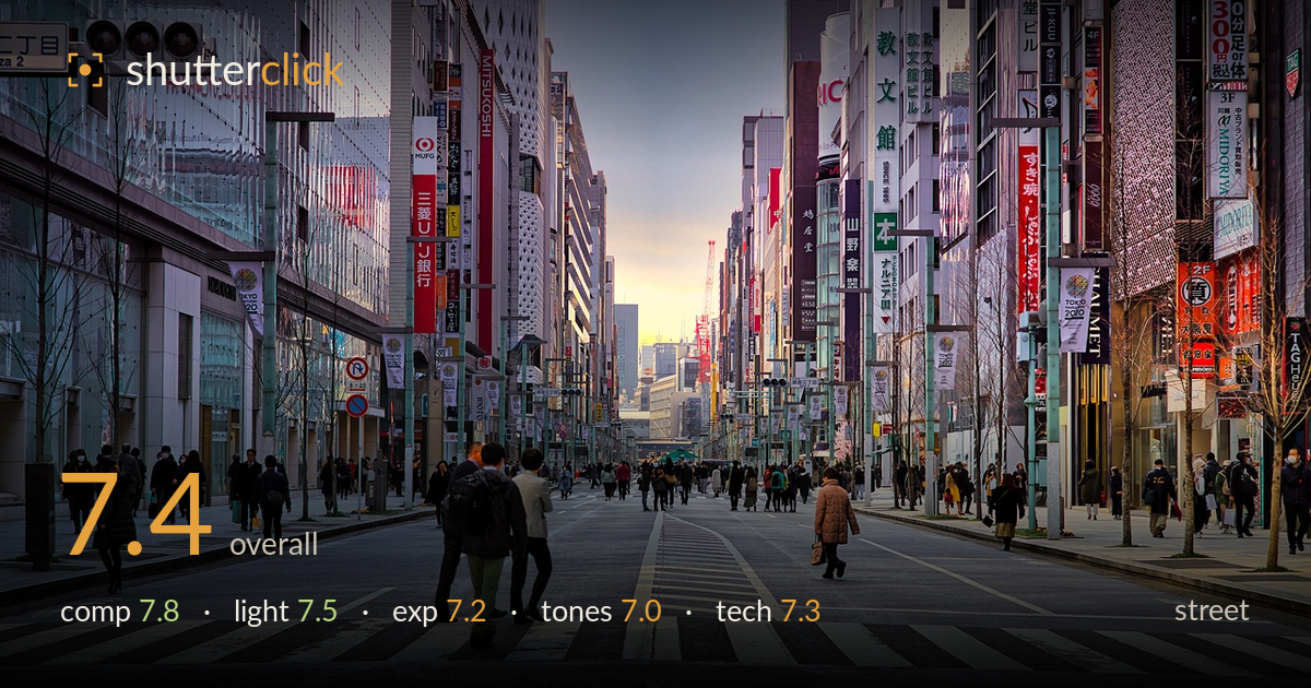
Sunset down the ginza avenue
Photo by djedj

No EXIF metadata in this file
Technical analysis based on visual assessment only.
A confident one-point perspective down Ginza's pedestrianized avenue, where converging building lines and the crosswalk stripes pull the eye straight to a glowing sunset gap between the towers. The symmetry is the image's real strength, and the scattered pedestrians give scale and life. What holds it back is a lack of a single decisive moment — the crowd reads as pleasant activity rather than a resolved gesture or juxtaposition. The foreground pair walking away are anchoring but faceless, so the frame stays a handsome establishing shot rather than a story. A cleaner, more intentional focal moment would elevate it.
The one-point perspective is the backbone here: building facades converge cleanly on the bright horizon gap, and the crosswalk lines reinforce the pull. Symmetry between the left and right storefronts is well balanced, and the walking pair anchors the lower third. The horizon sits high, which suits the vertical canyon of signage. The weakness is that no single subject wins the eye — the crowd disperses attention, and the foreground figures face away, so the strong geometry lacks a human focal point to reward it.
The soft sunset glow funneling through the distant gap gives the frame warmth and depth, contrasting nicely with the cool grey overcast up top. Light is flat and diffuse across the buildings, which keeps the signage readable but flattens the facades — little modeling or shadow shape. The timing is the smart choice: catching the warm slot of low sun between the towers gives the composition its destination. A touch more direction would have sculpted the architecture rather than leaving it evenly lit.
Exposure is well judged for a high-dynamic-range scene. The bright sunset core holds most of its detail without blowing out, and the shadowed storefronts and figures retain information. Midtones on the road sit a little flat and grey, which is faithful to the overcast but drains punch. The sky's cooler upper band is clean and noise-free. Overall a balanced capture that resists clipping at both ends — deliberate rather than accidental, though the mid-scene could carry slightly more contrast for presence.
The warm-to-cool gradient from the sunset gap up to the grey sky is the tonal centerpiece and works well. Signage reds and oranges add welcome accents against the muted concrete. White balance leans slightly cool overall, which suits the overcast but leaves the road and facades a touch lifeless. Saturation is restrained and believable. The mid-tones lack separation, so the greys of pavement and buildings blend; a modest contrast lift or split-tone warmth in the mids would give the frame more dimensionality.
Without EXIF, judging from visual evidence: depth of field is deep, keeping foreground crosswalk and distant towers acceptably sharp, consistent with a smaller aperture suited to this all-in-focus cityscape approach. Focus appears set around the mid-distance, and the frame reads crisp across the signage, which is where detail matters most. The pedestrians are frozen cleanly with no motion blur, indicating a fast-enough shutter. Noise is well controlled, likely a low ISO given the daylight. Verticals on the buildings converge naturally with the perspective rather than showing distracting keystone lean, and the frame is level — the crosswalk and horizon line both hold true. Lens choice reads as a moderate telephoto or normal focal length, which compresses the canyon effectively. The one technical limitation is that the deep focus, while appropriate, means nothing is isolated — a shallower plane on the foreground pair could have given the human element more weight without sacrificing the perspective read.
What would elevate it
Tags
Shot something like this?
Expert photo critique, on demand — scored across six categories, EXIF-aware. Start with 3 free critiques, no credit card.
critique my photo — free