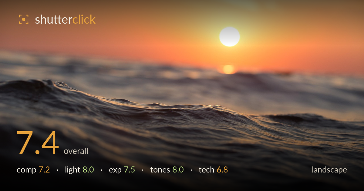
Sunset over an ocean wave
Photo by Pexels

No EXIF metadata in this file
Technical analysis based on visual assessment only.
A water-level sunset that trades sweeping vista for intimacy, and the low vantage is the strongest decision in the frame — the wave crest carries texture and the sun sits in a natural upper-right position. The shallow depth of field is the sticking point: with the crest itself the intended subject, the plane of focus lands ambiguously and no part of the wave reads truly crisp. The warm gradient and clean sun rendering give the image real mood. A slightly deeper aperture to anchor the wave and a touch more foreground sharpness would elevate an already atmospheric frame.
The water-level perspective is the smart move here, placing the wave crest as a foreground anchor while the sun sits well off-centre in the upper right — a natural, unforced placement. The horizon rides high, which suits the emphasis on water over sky. The wave line sweeps diagonally, adding motion. What's less resolved is the subject: the crest breaks across the lower-middle without a single point for the eye to settle, so the composition feels more atmospheric than deliberately structured. A defined focal ripple would sharpen intent.
The low sun delivers exactly what golden-hour water photography wants — a warm graded sky, soft directional light skimming across the wave, and specular glints picking out the ripples. The backlighting rims the crest and separates it from the darker trough below. Shadow rendering in the water stays gentle rather than crushed. The sun's glow is bloomed but not blown into a harsh disc. It's genuinely well-timed light, and the intimate vantage makes the most of the low angle raking across the surface.
Exposure is well balanced for a into-the-sun frame. The sun core is clipped, as expected, but the surrounding sky retains its orange-to-peach gradient without spreading into a white void. The wave's shadow side holds detail and avoids a muddy black. The midtones on the lit water sit comfortably, preserving the sheen. There's a slight loss of texture in the darkest troughs at bottom-left, but nothing catastrophic. The overall placement reads deliberate, protecting highlights while keeping the water legible.
The warm palette carries the image — a smooth peach-to-amber sky gradient sets a serene mood, and the cooler steel tones in the wave shadows provide welcome contrast against all that warmth. White balance leans warm intentionally and suits the hour. Saturation is restrained rather than pushed, keeping the sunset believable. The tonal transition from bright sun to darker foreground water is handled gracefully. The complementary interplay of warm sky and cool-grey water is the tonal high point.
The choice to shoot from water level with a shallow depth of field is the defining technical decision, and it's the one holding the image back. The plane of focus appears to fall somewhere in the mid-foreground, but the wave crest — the element the composition points to — never resolves to genuine sharpness, and the sun and horizon dissolve into soft bokeh. In a landscape, that ambiguity costs the frame; there's no anchor of crisp detail for the eye to reward. A narrower aperture would have extended sharpness across more of the wave while keeping the distant sun softly diffuse. Shutter speed appears sufficient to arrest the water's motion without smearing, and noise is well controlled throughout the shadows. Focus accuracy is the core issue: with the subject this close and the aperture this open, precise placement on the crest was critical and it drifted. The intimacy of the vantage is worth pursuing — it just needs a firmer point of focus to pay off.
What would elevate it
Tags
Shot something like this?
Expert photo critique, on demand — scored across six categories, EXIF-aware. Start with 3 free critiques, no credit card.
critique my photo — free