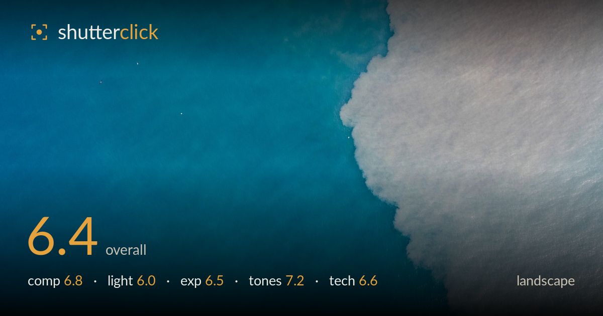
Surf meeting deep blue water
Photo by michasager

No EXIF metadata in this file
Technical analysis based on visual assessment only.
A clean, near-abstract aerial reading of the sea as two fields — deep blue water and pale foam — divided by an organic diagonal. The colour separation carries the frame and the graphic simplicity is its strength. What holds it back is that the composition rides a static diagonal that nearly bisects the frame corner-to-corner, and the foam side is soft and lacks a clear anchor or accent. There is no true focal point beyond the boundary itself, so the eye slides without settling. Treated as abstract water study it works; as landscape it wants either more texture detail in the foam or a small counterpoint element.
The frame divides cleanly into two masses — blue water and white foam — along an irregular diagonal, which gives graphic tension and a natural boundary that reads as a leading edge. The organic wave line is the strongest element. The division sits close to a corner-to-corner split, though, which can feel evenly weighted rather than dynamic. There is no secondary accent to anchor the eye, so it drifts along the boundary and out. Shifting the split off the diagonal, or including a small feature in the foam, would give the composition somewhere to land.
Flat overhead light typical of a top-down aerial — even, largely shadowless, and diffuse. This keeps the colour clean and avoids blown highlights on the foam, but it also flattens the texture of both water and surf, so the foam reads as a soft haze rather than crisp detail. Low, raking light would carve relief into the wave and give the foam dimension, but that is rarely available from directly overhead at midday. As it stands the light is serviceable and preserves the palette, without shaping the scene.
Exposure is well controlled for a scene with a bright white mass against deep blue. The foam retains detail and does not clip to pure paper white, which is the main risk here, and the blue holds midtone weight without blocking up. The overall rendering leans slightly soft and low in local contrast on the foam side, which reads more as flat light than as exposure error. A touch more separation in the highlights would give the surf more presence without pushing it past the clipping point.
The colour is the standout: a rich, saturated cyan-to-teal in the water grading against the cool pale foam, with a faint warm blush at the top edge that adds subtle interest. White balance sits cool, which suits the marine subject and keeps the blues believable rather than oversaturated. The tonal transition across the water — deeper at the edges, brighter through the centre — gives a gentle sense of depth. The foam's near-neutral whites read slightly muddy in places; cleaner highlight tone there would strengthen the two-colour contrast that drives the image.
Judged on visual evidence, this is a competently executed aerial. The water side holds fine surface texture and the ripples are resolved, indicating a shutter fast enough to counter drone movement and adequate sharpness through the blue field. The foam side is markedly softer, but this appears to be the diffuse nature of surf and flat light rather than a focus miss — there is no plane of sharp foam elsewhere to suggest the focus fell short. Noise is well controlled and the frame is clean apart from a couple of faint specks in the upper-left water. Depth of field is a non-issue from this altitude, since everything sits on one plane. The main technical gain would come from capturing more micro-detail in the surf — a slightly higher-resolution crop or lower altitude — so the foam holds structure rather than dissolving into a wash. Execution is solid overall, with no motion smear or exposure fault visible.
What would elevate it
Tags
Shot something like this?
Expert photo critique, on demand — scored across six categories, EXIF-aware. Start with 3 free critiques, no credit card.
critique my photo — free