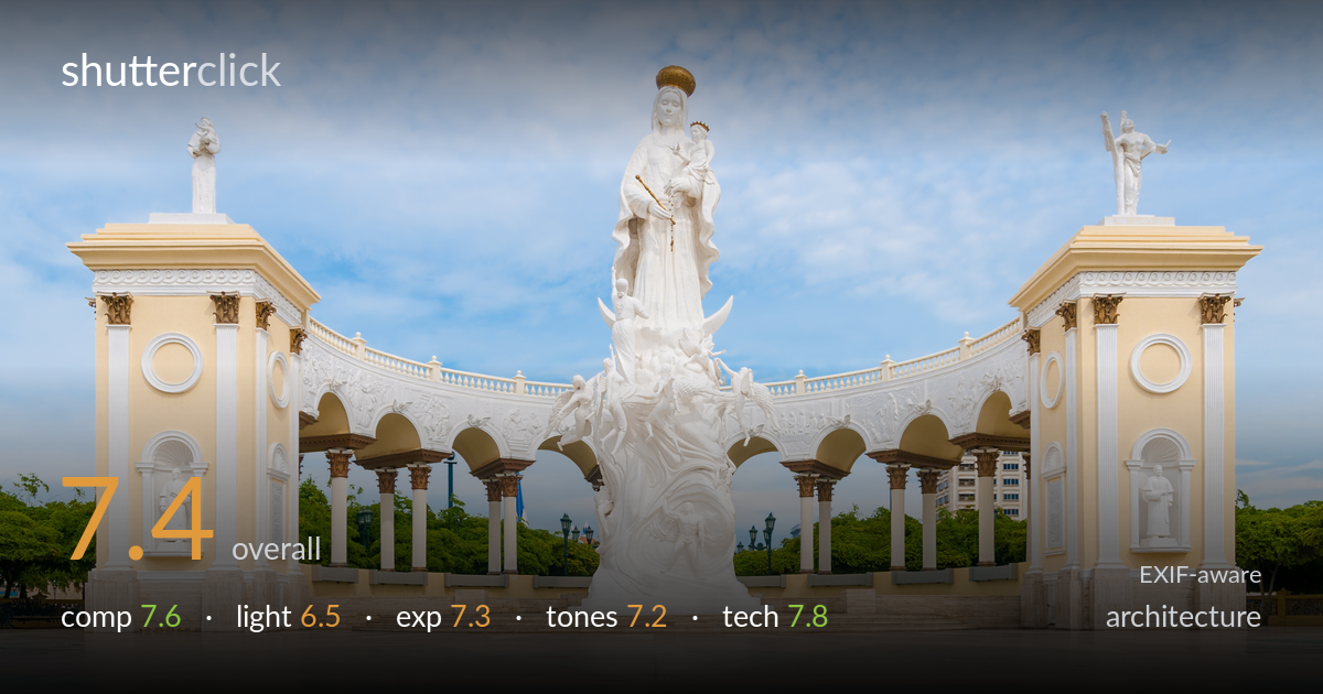
Symmetrical colonnade around a white statue
Photo by Béria Lima de Rodríguez

| Focal length | 18 mm |
| Aperture | f / 10.0 |
| Shutter | 1/400 s |
| ISO | ISO 100 |
| Exp. comp. | -0.33 EV |
| Shot at | 03:15 · Jul 31, 2013 |
A clean, symmetrical record of a monumental plaza, anchored by the central white statue and flanked by matching colonnades that sweep inward — the architectural logic of the scene is captured with real discipline. The strict frontal symmetry is the photo's greatest strength and its main limitation: it reads as documentation more than interpretation. Flat midday light keeps the white stone bright but drains the depth and modelling that raking light would give. Verticals are well controlled and the foreground sweep of paving adds welcome lead-in. Sharper attention to perfect centring and a more characterful hour would lift it further.
The mirror-symmetry of the two pavilions cradling the central statue is the organising idea, and it works — the curved colonnade pulls the eye inward to the white monument. The wide-open foreground of polished paving gives a clean lead-in and breathing room. The horizon and pillar verticals sit reasonably true. The build is a touch off-perfect: the central statue is fractionally left of dead centre and the two pavilions aren't quite balanced in size, which undercuts the rigour symmetry demands. A modern tower poking through the right arches is a small distraction.
Soft, high overcast-tinged daylight from a high sun keeps the white stone evenly lit and avoids blown highlights, but the trade-off is flatness. The statue's intricate carving — figures, drapery, the lunar base — loses much of its three-dimensional read without directional shadow to sculpt it. The yellow pavilions sit in even, shadowless light that flattens their relief and column depth. Early-morning or late-afternoon raking light from the side would carve out the architectural detail and give the whole scene the depth it currently lacks.
Exposure is handled competently. The -0.33 EV compensation protects the bright white statue and pale sky, and the highlights on the stone hold detail rather than clipping. Shadow areas under the arches and in the tree line retain information without muddiness. The overall brightness suits the airy, sunlit subject. The sky is slightly thin in tonal weight, edging toward washed-out in the upper area, where a touch more contrast or a graduated adjustment would give it more presence and stop it competing with the white stone for the eye.
The palette is pleasant and accurate — warm cream-yellow pavilions, cool blue sky, bright neutral white statue, and green foliage all read true with good white balance. Saturation is restrained and believable. The contrast is on the gentle side, in keeping with the flat light, which leaves the image feeling a little soft in tonal punch overall. The sky's pale blue could carry more depth, and a slightly stronger separation between the white statue and the bright background would help the central subject assert itself more firmly.
Settings are well chosen for the task. At 18mm on the D300's APS-C sensor, the wide field captures the full sweep of the colonnade, and f/10 delivers front-to-back sharpness appropriate for an architectural overview — the carving on the statue and the distant columns both hold detail. ISO 100 keeps the file clean with no visible noise, and 1/400s is far faster than needed for a static subject, leaving ample headroom. Focus is accurate across the plane. The main technical consideration is lens distortion: 18mm introduces mild barrel curvature and the wide angle slightly stretches the outer pavilions, exaggerating their scale relative to the centre. Verticals are largely corrected and clean, suggesting careful handling or post correction. A modest perspective or distortion correction in post would tidy the residual outward lean at the frame edges. Overall this is solid, deliberate execution — the gear choices serve the subject and the file quality is high.
what would elevate it
tags
Shot something like this?
Expert photo critique, on demand — scored across six categories, EXIF-aware. Start with 3 free critiques, no credit card.
critique my photo — free