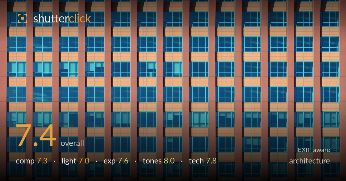
Teal and terracotta facade grid
Photo by Alvesgaspar

| Focal length | 100 mm |
| Aperture | f / 13.0 |
| Shutter | 1/125 s |
| ISO | ISO 100 |
| Exp. comp. | 0.0 EV |
| Shot at | 16:40 · May 11, 2013 |
A confident, graphic study of a glazed facade that leans on rhythm and colour contrast — the terracotta piers against teal glass carry the image. The repetition of vertical columns, punctuated by warm horizontal spandrel panels and the recurring diagonal shadow bands near the top, gives real visual rhythm. What holds it back is that the frame reads as a slice rather than a composed whole: the pattern is cut arbitrarily on all four edges, and without a top, base, or corner the eye has no anchor or resolution. A subtle asymmetry in column spacing on the right also unsettles the grid. Strong material for pattern work; a more deliberate edge decision would elevate it.
The vertical piers create strong, insistent rhythm, and the warm spandrel panels break the blue field at regular intervals to keep the grid from feeling monotonous. The recurring diagonal shadows across the upper windows add a welcome secondary pattern. But the crop is the weak point: the pattern is severed on every edge with no top, base, or corner to anchor it, so it reads as an arbitrary slice rather than a resolved frame. The column widths also drift slightly toward the right, subtly breaking the grid's regularity.
Low, raking light from the upper left creates the diagonal shadow bands cast into the recessed window bays — the most dynamic element in an otherwise flat facade. That directional light also warms the terracotta piers and pulls saturation from the glass. Beyond those shadow accents, however, the facade is evenly and frontally lit, so the surfaces read as uniform planes with little modelling. The lighting does its job for a pattern shot but offers limited three-dimensional shaping across the broader grid.
Exposure is well controlled across a tricky mix of bright warm panels and darker glass. The orange spandrels hold their texture without clipping, and the reflective glazing retains detail in both the deep teal and lighter reflected passages. Shadows in the recessed bays stay readable rather than blocking up. At ISO 100 the file is clean throughout. The histogram sits comfortably in the midtones with no obvious highlight loss — a deliberate, evenly judged exposure that suits the flat, evenly lit subject.
The colour is the standout. The complementary pairing of warm terracotta and cool teal glass is punchy and cohesive, and the palette holds consistently across the frame. White balance leans warm, which flatters the piers and gives the blues a rich saturation without tipping into garish. Contrast between the two hue families does the compositional work, separating structure from glazing cleanly. The lighter reflected sky patches in the glass add tonal variation that prevents the blue field from flattening. A confident, well-judged grade.
The settings are well matched to the subject. At 100mm the perspective is compressed enough to flatten the facade into a clean plane, minimising the converging verticals that plague architectural work — the piers run genuinely parallel here, which is exactly what a pattern study needs. f/13 delivers front-to-back sharpness across the entire grid, appropriate for a flat subject with no depth to isolate, and the D800E's 36MP sensor resolves the fine window mullions crisply. ISO 100 keeps the file clean, and 1/125s is more than adequate for a static building handheld or on a tripod. Focus appears accurate across the plane. The only technical caveat is that f/13 on this sensor is near the point where diffraction begins to soften fine detail — f/8 to f/9 would have preserved marginally more bite while still holding the flat plane sharp. Verticals read level; no keystoning correction appears necessary. Solid, deliberate execution throughout.
What would elevate it
Tags
Shot something like this?
Expert photo critique, on demand — scored across six categories, EXIF-aware. Start with 3 free critiques, no credit card.
critique my photo — free