Team fist bump
Photo by rawpixel

No EXIF metadata in this file
Technical analysis based on visual assessment only.
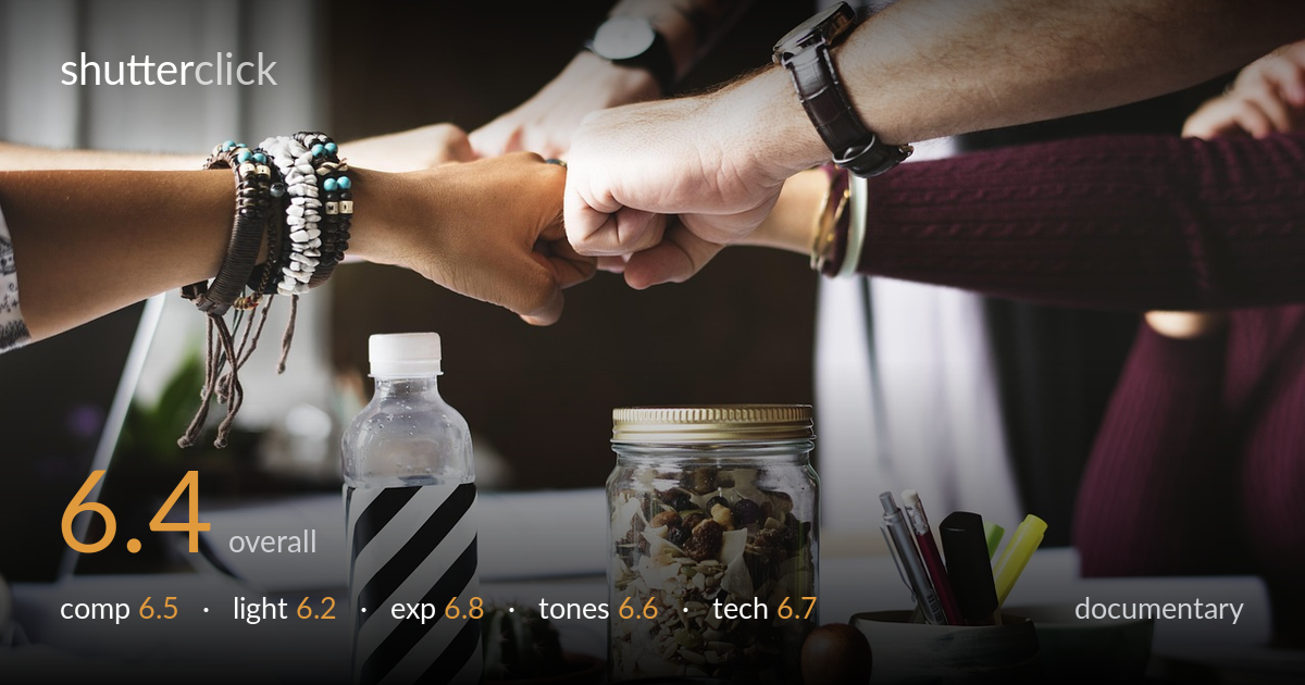
A clean, well-staged stock illustration of teamwork — the fist-bump convergence at the upper third reads instantly, and the layered desk objects below ground the workplace context. What holds it back is its conspicuously arranged feel: the bottle, jar, mug and pen pot sit in a tidy product-shot row that undercuts documentary authenticity, and the moment is generic rather than specific. The hands are the story but compete for attention with an equally sharp, busy foreground. As reportage it leans more commercial than candid. Tighter intent — either commit to the gesture or the workspace, not both with equal weight — would sharpen its narrative.
The four-way fist bump anchors the upper third and the radiating forearms create natural leading lines toward the center, which works. The foreground desk clutter adds context but is dense and competes for attention, splitting the frame into two equally weighted zones. The striped bottle and trail-mix jar are visually loud, pulling the eye away from the hands. A shallower stack or fewer props would let the gesture dominate. The convergence point of the fists sits slightly left of center, which is a reasonable placement, but the lower half feels like a separate photograph.
Soft, diffused window light from the right gives gentle modeling on the arms and skin, flattering and even without harsh shadows. The fall-off into the darker background separates the hands cleanly. However, the light is fairly flat overall — it documents rather than shapes, and the foreground objects sit in slightly muddy, low-contrast illumination that dulls their forms. A touch more directional light raking across the desk would give the jar and bottle dimension. The mood is pleasant but lacks the punch that would make either layer of the scene feel decisive.
Exposure is well controlled across a tricky range. Skin tones on the arms hold detail without blowing the brighter highlights on the rightmost forearm, and the dark background retains some shape rather than crushing to black. Shadow areas in the lower desk region sit slightly heavy but remain readable. The white bottle cap and label whites are near the ceiling but not clipped. Midtones on the skin are placed naturally. Overall a safe, balanced exposure that handles the high-contrast window light competently, with only the deepest desk shadows lacking recoverable detail.
The palette is warm and inviting — earthy browns, the maroon sleeve, and natural wood tones give a cohesive, lifestyle feel. White balance leans slightly warm, pleasant for the workspace mood though the skin tones edge toward orange. The black-and-white striped bottle provides a useful tonal anchor against the warmth. Contrast is moderate and the gradation through the skin is smooth. Saturation is restrained and tasteful. The background's desaturated darkness contrasts nicely with the foreground warmth, though the overall grade is conventional and could carry more tonal separation between the cluttered foreground elements.
Focus appears placed on the fists and forearms, which are acceptably sharp, while the depth of field keeps the background pleasantly soft and the foreground objects largely crisp — suggesting a moderately stopped-down aperture that tried to hold both planes. That compromise mostly succeeds but means nothing has dramatic isolation; the trail-mix jar and bottle are nearly as sharp as the hands, contributing to the divided attention. No visible motion blur, and noise is well controlled in the shadows, pointing to good light and a reasonable ISO. The lens looks like a standard focal length with no obvious distortion, appropriate for this scene. Sharpness is solid where it counts. The main technical limitation is the depth-of-field decision: a wider aperture would have separated the gesture from the busy desk and clarified the subject hierarchy. Focus accuracy on the central fists is the priority, and that has been met, but the overall rendering reads as a careful setup rather than a reactive capture.
What would elevate it
Tags
Shot something like this?
Expert photo critique, on demand — scored across six categories, EXIF-aware. Start with 3 free critiques, no credit card.
critique my photo — free