Team photo at centre court
Photo by AndresDeOsma

No EXIF metadata in this file
Technical analysis based on visual assessment only.
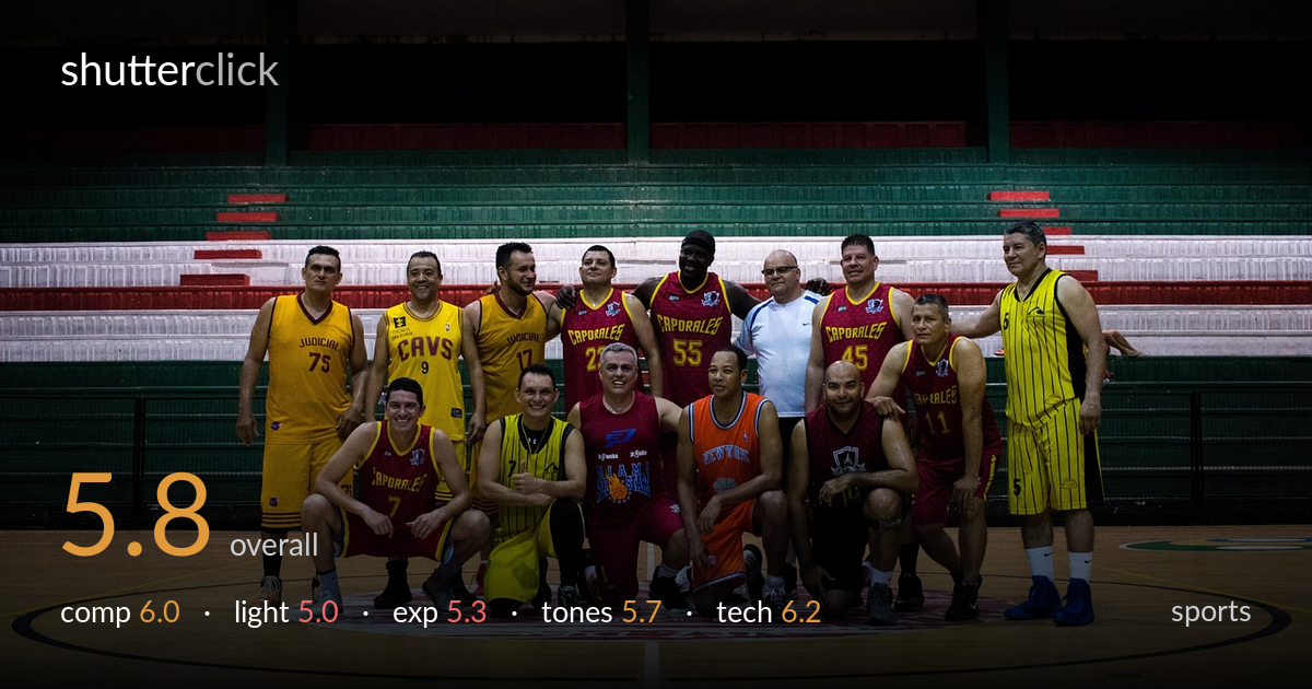
A serviceable team group photo with a clean two-row arrangement, but flat gymnasium lighting and a heavy expanse of dark, empty stands hold it back. The group reads as an organized unit and the court foreground gives a clear sense of place. Most limiting is the dull overhead light that leaves faces under-modelled and the upper half of the frame as dead negative space. Tightening the framing on the players, lifting shadow detail on the front row, and finding a moment with more uniform attention would raise this from a record-keeping snapshot toward a polished commemorative team portrait.
The two-tier grouping — standing back row, kneeling front row — is the right structure for a team shot and reads clearly. Placement on the centre court logo anchors the group well. However, the framing is loose: a large band of empty, dark seating fills the upper half and adds little, while the foreground court stretches further than needed. A tighter crop bringing the group larger in the frame, with the painted centre circle as a base, would concentrate attention and remove the dead space above.
Overhead gymnasium lighting is flat and even, which keeps everyone legible but offers no modelling — faces lack the directional shaping that gives a group dimension. The light falls off sharply into the stands behind, so the background goes nearly black while the floor stays bright, splitting the frame tonally. Shooting nearer a window or adding fill toward the front row would lift the shadowed faces and soften the harsh top-down direction that leaves eye sockets dim.
Exposure is balanced for the lit floor and uniforms, holding the bright court and yellow jerseys without clipping. The cost is the upper background, which sinks into murky near-black with no recoverable detail in the seating. Several front-row faces sit a touch under, losing detail in the kneeling players against dark legs and shadow. A modest lift to the shadows in post would recover those faces, and exposing slightly brighter overall would have served the people over the floor.
Colour is reasonably neutral with the gym's warm cast kept in check, and the red and yellow uniforms carry good saturation that helps the group pop against the muted surroundings. The wood floor reads with a natural warm tone. Contrast skews high because of the dark background, crushing the seating to a featureless block. Mid-tones in the faces are a little flat and muddy. A gentler tone curve and a slight shadow lift would restore gradation in skin and the deeper reds.
Focus appears accurate across the group, with both rows acceptably sharp — a sign the aperture was stopped down enough to hold the depth needed for a multi-row arrangement, which is the correct call here. The wide framing keeps everyone in plane without obvious distortion on the end figures. Noise is controlled in the lit areas, though the deep shadows in the stands show the muddiness typical of pushing a dim interior. Sharpness is adequate rather than crisp; the image reads slightly soft at full size, possibly from the modest light forcing a compromise on shutter or a low-contrast lens rendering. For a static posed group this execution is sound — the main technical gain would come from more light on the subjects rather than any change in focus or depth-of-field handling. A faster lens or added illumination would let the front-row faces resolve with more detail and cleaner shadows.
what would elevate it
tags
Shot something like this?
Expert photo critique, on demand — scored across six categories, EXIF-aware. Start with 3 free critiques, no credit card.
critique my photo — free