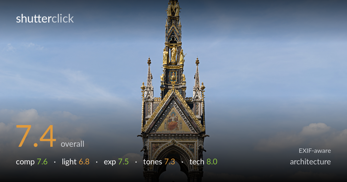
The albert memorial under blue sky
Photo by Diliff

| Focal length | 40 mm |
| Aperture | f / 7.1 |
| Shutter | 1/500 s |
| Shot at | 14:42 · May 12, 2008 |
A disciplined, near-perfectly symmetrical frontal record of the Albert Memorial that prioritises documentary clarity over drama. The central axis is held dead straight, verticals run true, and the spire's full reach is preserved without keystoning — genuinely well executed for a monument of this height. What most holds it back is the light: a high, flat midday sun leaves the architecture evenly lit but without the modelling that would give the gilded and carved detail dimension. The flanking marble groups feel slightly amputated at the edges, and the foreground steps consume frame space that adds little.
The symmetrical, centred treatment suits the monument's own axial design, and keeping the cross-tipped spire to its full height with breathing room of sky above is the right call. Verticals are impressively true. The weakness is the base: the broad apron of empty steps and the gilded railing eat the lower third without contributing interest, while the two flanking sculpture groups are clipped at the frame edges, reading as accidental rather than deliberate. Tightening the bottom or fully including the corner figures would resolve the balance.
Bright midday sun lights the structure frontally and evenly, which guarantees legibility of the mosaics and gilding but flattens the relief. The carved spire detail and the deep arch lack the directional shadow that would give them sculptural depth, and the gold reads more as bright patch than dimensional metal. A lower, raking light — mid-morning or late afternoon — would rake across the Gothic detailing and animate the gilt. The blue sky and scattered cloud do provide a pleasant, uncluttered backdrop.
Exposure is well judged across a demanding range. Highlights in the white marble groups and the bright sky hold without obvious clipping, and the gilded elements retain colour rather than blowing out. Shadow detail in the dark columns under the arch and within the recessed spire stages is preserved. The histogram appears to sit comfortably mid-frame with no crushed blacks. Slightly more headroom could have been protected in the brightest cloud highlights, but the balance here is clean and deliberate.
Colour rendering is natural and restrained — the gold reads warm without garish saturation, the marble stays neutral, and the sky's blue-to-cloud gradation is believable. Contrast is moderate, appropriate to the flat light, though the overall result is a touch low in punch as a consequence. The mosaic panels retain their colour. A modest contrast lift and selective clarity on the stonework would add separation between the many tonally similar grey-and-white elements without tipping into artificiality.
Technically this is the strongest aspect. At 40mm the perspective is well chosen — long enough to keep convergence minimal yet wide enough to contain the full monument, and the verticals are genuinely true, suggesting either careful camera levelling or perspective correction in post. f/7.1 is a sensible choice for an architectural subject at this distance, sitting near the lens's sharpness sweet spot and delivering front-to-back depth across a static, distant subject. 1/500s is far faster than needed for a tripod-steady building, but it cost nothing here and froze any breeze in the trees. Focus appears accurate across the structure, and detail holds in the spire's intricate carving and the relief frieze at the base. The image reads as cleanly resolved with no visible noise or diffraction softening. A slower shutter on a tripod with a lower ISO would be the textbook approach, but the result as captured is clean and well rendered.
what would elevate it
tags
Shot something like this?
Expert photo critique, on demand — scored across six categories, EXIF-aware. Start with 3 free critiques, no credit card.
critique my photo — free