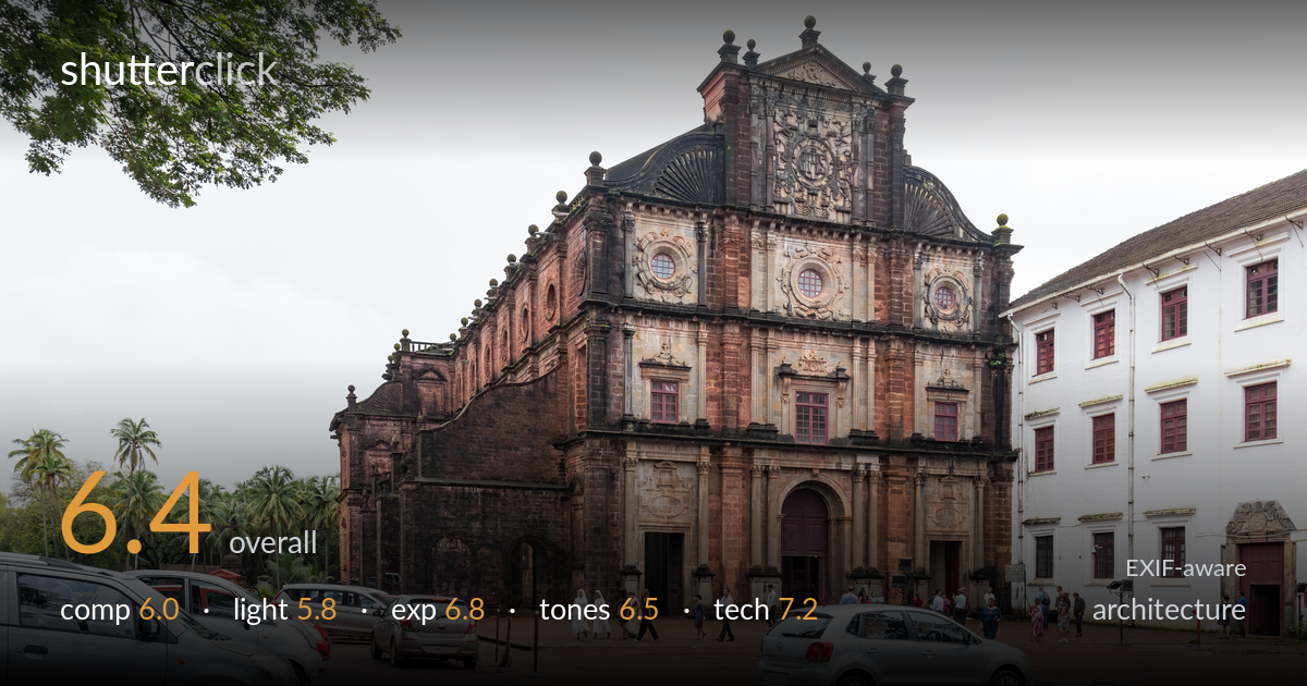
The basilica facade under cloud
Photo by iMahesh

| Focal length | 18 mm |
| Aperture | f / 8.0 |
| Shutter | 1/125 s |
| ISO | ISO 100 |
| Exp. comp. | 0.0 EV |
| Shot at | 10:33 · Aug 11, 2024 |
A clear, documentary record of the Basilica of Bom Jesus that captures the laterite facade's intricate detail and warm stone colour well. The biggest limitation is the foreground: a row of parked cars and a wet, cluttered plaza dominate the lower frame and undercut the dignity of the architecture. The overcast light is flat and renders the sky as a featureless white mass. A three-quarter angle gives some sense of mass, but converging verticals lean noticeably. The facade itself is well exposed and detailed — the building deserves a cleaner, more considered foreground and stronger light to match its grandeur.
The three-quarter angle reveals the building's depth and side wall, which is more dynamic than a flat-on view. But the foreground is the weakness: parked cars fill the lower-left and centre, pulling attention from the facade and lending a snapshot feel. The overhanging branch top-left adds a frame but reads as accidental. The white building on the right competes for attention without contributing. A position further back or higher, clear of the cars, would let the architecture command the frame as the subject deserves.
The heavy overcast delivers soft, even light that flatters the carved stone detail and avoids blown highlights on the facade — useful for revealing texture across the relief work. But it is also flat and directionless, so the building lacks the modelling and depth that raking side light would bring. The sky is a featureless white, offering nothing and forcing a high-contrast boundary against the roofline. Late-afternoon directional light would carve the ornamentation and lend the laterite a warmer glow.
Exposure on the facade is well judged — the warm laterite tones and the shadowed recesses both hold detail, and the rose windows and carved panels read clearly. The blown white sky is largely a consequence of the overcast conditions rather than an exposure error, though it occupies a fair share of the frame. Shadow detail in the darker side wall and entrance arches is retained without muddiness. Overall a competent, balanced exposure for difficult flat-light conditions.
The reddish-brown laterite stone is rendered with pleasant warmth and good separation between the weathered upper sections and lighter carved panels. White balance looks neutral and believable. The wet plaza and white adjacent building provide cool counterpoints. Contrast is necessarily gentle under the flat sky, which keeps the stone soft rather than punchy. The blank sky drains tonal interest from the upper frame. A modest contrast lift on the facade and a graduated treatment of the sky would add tonal depth.
The settings are well chosen for the situation. f/8 on the 18-55mm kit lens sits in its sharp aperture range and delivers front-to-back depth of field appropriate for architecture, keeping both foreground cars and the distant facade in focus. ISO 100 yields a clean, noise-free file with maximum detail in the stone carving. 1/125s is ample for a static subject and comfortably hand-holdable with the IS lens. Focus is accurate across the facade. The main technical shortfall is perspective: at 18mm the wide field captures everything but introduces converging verticals — the towers lean inward — and the laterite columns near the edges show mild distortion. Shooting from further back at a slightly longer focal length, or correcting perspective in post, would straighten the verticals that architecture demands. The execution is otherwise solid and the file holds plenty of detail to work with; the geometry is where it falls short of clean architectural standards.
what would elevate it
tags
Shot something like this?
Expert photo critique, on demand — scored across six categories, EXIF-aware. Start with 3 free critiques, no credit card.
critique my photo — free