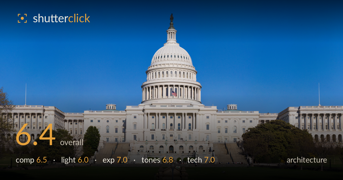
The capitol under clear skies
Photo by Noclip

No EXIF metadata in this file
Technical analysis based on visual assessment only.
A clean, symmetrical documentation of the Capitol that reads more as a competent record than an interpretation. The dead-centre placement suits the building's own axial symmetry, and the verticals are impressively controlled for such a wide panoramic stitch. What holds it back is the flat, near-frontal midday-ish light that leaves the white stone slightly featureless and the sky a large expanse of uniform blue with no gradation or interest. The framing devotes considerable real estate to empty lawn and sky without a strong foreground anchor. A different hour and a more purposeful foreground would elevate this from postcard to photograph.
The symmetrical, centred framing is the correct instinct for a building this axial, and the dome sits cleanly on the vertical centreline. Verticals stay upright across the whole stitch, which is no small feat. However, the foreground lawn is a large empty band with an awkward cropped monument nub intruding at the bottom edge, and the sky occupies nearly half the frame without earning it. Trimming the top and bottom, or introducing a deliberate foreground element, would tighten the balance and give the eye somewhere to rest before the facade.
The light is even and frontal, evenly illuminating the facade and dome with no distracting cast shadows, which keeps the architecture legible. That same quality is the limitation: it is flat, high-angle light that flattens the dome's colonnade and leaves the white stone reading as a broad tonal mass rather than sculpted form. Raking side light from a lower sun would model the columns, deepen the dome's ribbing, and give the marble dimension. As shot, the building is described but not shaped.
Exposure is well judged for a high-contrast white subject under bright sky. The marble holds highlight detail without clipping, and the shadowed portico and steps retain information rather than blocking to black. The lawn keeps its texture in the greens. The blue sky is clean and untelevised. There is little to fault technically here; the histogram appears well within range across the tonal span, with deliberate midtone placement on the stone. A touch more shadow lift under the portico would add depth but is not essential.
The white balance is neutral and the marble reads convincingly white without a colour cast, which is the hard part with a subject like this. The blue sky is saturated and clean, and the spring greens are natural. Contrast is moderate and appropriate. The main tonal weakness is the sky's uniformity — a single flat blue with no gradient — which makes the upper half feel inert. A polariser or a shoot with some cloud texture would add tonal variation and let the facade separate more crisply against it.
This appears to be a multi-frame panoramic stitch, and the execution is clean — no obvious seams, ghosting, or misalignment across the wide field, and the verticals remain true, which suggests careful capture and processing. Sharpness holds well across the frame, with the dome's colonnade and the facade's window detail crisply resolved, indicating a well-chosen aperture and accurate focus at this distance. Noise is not evident and the image looks to have been made at a low ISO in good light. Depth of field is effectively deep, as required, keeping foreground trees and the distant dome equally sharp. The one technical consideration for a reshoot is the perspective: shot from near lawn level, the facade is slightly foreshortened and the dome recedes; a marginally more elevated vantage or a longer focal length from further back would render the dome with more presence relative to the wings. Overall, the technical craft of the stitch and focus is the strongest aspect of the image.
What would elevate it
Tags
Shot something like this?
Expert photo critique, on demand — scored across six categories, EXIF-aware. Start with 3 free critiques, no credit card.
critique my photo — free