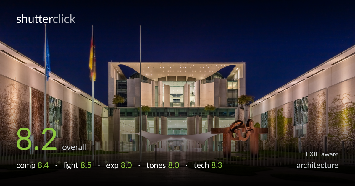
The chancellery at blue hour
Photo by Diego Delso

| Focal length | 24 mm |
| Aperture | f / 11.0 |
| Shutter | 1.0 s |
| ISO | ISO 100 |
| Exp. comp. | 0.0 EV |
| Shot at | 23:00 · Apr 21, 2016 |
A confident, symmetrical blue-hour study of the German Chancellery that gets the fundamentals right: the wings converge to frame the lit central facade, verticals run true, and the twilight sky balances the warm artificial lighting beautifully. The dead-centre composition suits the building's formal geometry. What holds it back is the foreground — the lower expanse of paving reads as empty and dark, eating frame real estate without adding interest. The flagpoles and corten sculpture inject welcome asymmetry, but a touch more shadow recovery in the courtyard would complete an already accomplished image.
The symmetrical framing matches the Chancellery's formal architecture, with both vine-clad wings drawing the eye toward the glowing central block. The flagpoles add vertical rhythm and the corten sculpture breaks the symmetry just enough to keep it from feeling sterile. Verticals are clean and the building sits well. The weakness is the foreground: the lower third is mostly dark, featureless paving that adds little. A slightly lower angle or stepping forward would have given the courtyard tiles a stronger leading function toward the entrance.
Timing is the strength here — true blue hour, with deep gradient sky still holding colour against the warm wash of the facade. The interplay between the cool twilight and the golden interior glow is well balanced, and the uplighting on the side wings reveals the climbing vines with pleasing texture. The lit ceiling lattice of the central canopy is the natural focal glow. Shadow areas in the courtyard fall a touch flat, but overall the light shapes the building's depth and materials convincingly.
A well-judged exposure for a tricky high-contrast scene. The bright interior and lit facade retain detail without blowing out, and the sky holds its tonal gradient down to the rooflines. The foreground paving is where it sags — the lower portion sinks into murky shadow with little recoverable texture. Bracketing or a gentle shadow lift in post would have opened that area while keeping the highlights intact. The histogram clearly leans dark by design for the blue-hour mood, which is the right instinct, just slightly overdone below.
The cool-versus-warm balance is the signature here: a saturated indigo sky against the cream and amber of the lit stone reads cleanly and avoids the muddy magenta that plagues blue-hour shots. White balance is well controlled across two very different light sources. Contrast is healthy and the corten sculpture's rust tones pop without screaming. The foreground shadows could carry a touch more separation, and the very darkest paving tips toward black with no detail, but the overall grade is restrained and tasteful.
Solid technical execution throughout. At 24mm the wide field captures both wings and keeps verticals largely upright, suggesting careful levelling or correction — keystoning is minimal for such a wide angle. f/11 is the right call for front-to-back sharpness across the courtyard and facade, sitting comfortably before diffraction softening on the 5DS R's high-resolution sensor. ISO 100 keeps the files clean with no visible noise even in the sky gradient, and the 1-second exposure on a tripod is well within reach for a static scene. Focus is accurate, with the central facade and side detail rendered crisply. The only refinement worth noting: a single exposure struggles to hold both the bright interior and the dark courtyard, so an exposure blend or a graduated approach would have rescued foreground detail without compromising the highlights. The lens choice suits the subject, though a dedicated tilt-shift would offer even tighter perspective control for this kind of formal architecture.
what would elevate it
tags
Shot something like this?
Expert photo critique, on demand — scored across six categories, EXIF-aware. Start with 3 free critiques, no credit card.
critique my photo — free