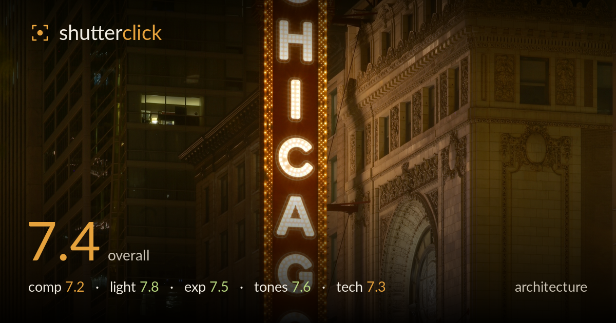
The chicago theatre at night
Photo by Daniel Schwen

No EXIF metadata in this file
Technical analysis based on visual assessment only.
The iconic vertical marquee anchors the frame with confidence, and the blue-hour timing catches the theatre's warm bulbs against the cooler surrounding glass towers for a rich, legible night scene. What most holds it back is verticality: the buildings lean slightly inward and the theatre's ornate facade tilts, undermining the geometric discipline architecture rewards. The sign is placed left of centre with the elaborate stone facade balancing right, a sound arrangement, but the base is cluttered where light trails, a lamppost and signage compete. A cleaner vertical correction and tighter foreground management would lift this from a strong record to a polished statement.
The vertical CHICAGO sign is a natural anchor and its placement left of centre lets the ornate stone facade fill the right, a balanced pairing of graphic type and architectural detail. The upward framing captures the marquee, sign and cornice cleanly. The base, however, is busy: the double lamppost overlaps the entrance, and the light trails run out of the lower edge without resolving. A slightly lower shooting position or a touch more street foreground would give the trails somewhere to lead the eye rather than clipping off.
The blue-hour timing is the strongest decision here, holding detail in the sky and stone while the marquee bulbs and neon read warm and vivid against the cool glass tower behind. The mix of tungsten sign light, the deep purple pedestrian bridge and the pale facade illumination gives real depth to the scene. The theatre's carved facade catches enough ambient and floodlight to reveal its relief without going flat. A moment earlier in twilight would have added a touch more sky separation at the top.
Exposure is well judged for a demanding night scene. The bright marquee bulbs hold their shape without blooming into featureless white, and shadow areas in the stone and lower street retain detail. The overall balance keeps the warm signage legible while the surrounding buildings sit at a natural evening brightness. Only the very brightest bulb clusters approach clipping, which is largely unavoidable and acceptable here. The dynamic range between the glowing sign and the dim street corners is handled with care rather than crushed.
The warm-to-cool interplay is the tonal highlight: golden marquee bulbs and amber stone against the blue-purple of the elevated bridge and glass tower. White balance leans warm, which flatters the theatre but pushes the facade slightly toward yellow in places. Contrast is well controlled, holding gradation in the stone relief and the sky. The red light trails add a punch of saturation that reads naturally rather than garish. A marginally cooler balance on the neutral stone would let the warm signage pop even more distinctly.
The long exposure is executed cleanly: car light trails streak red and white across the base, indicating a shutter long enough to convey motion while keeping the static architecture sharp. Noise is well controlled for a night frame, suggesting a low ISO on a stable support. Focus sits accurately on the theatre facade and the sign lettering is crisp. The most significant technical shortfall is perspective: vertical lines converge and the whole facade tilts slightly, betraying an uncorrected upward tilt of the lens. A tilt-shift lens, or a straight-on position with more distance, would preserve true verticals. Failing that, perspective correction in post would straighten the leaning towers and the theatre's edge, which is exactly the discipline architecture demands. Depth of field appears sufficient to keep both the near lamppost and the distant tower acceptably sharp. Overall the exposure length, stability and focus are handled well; verticality is the piece left unresolved.
What would elevate it
Tags
Shot something like this?
Expert photo critique, on demand — scored across six categories, EXIF-aware. Start with 3 free critiques, no credit card.
critique my photo — free