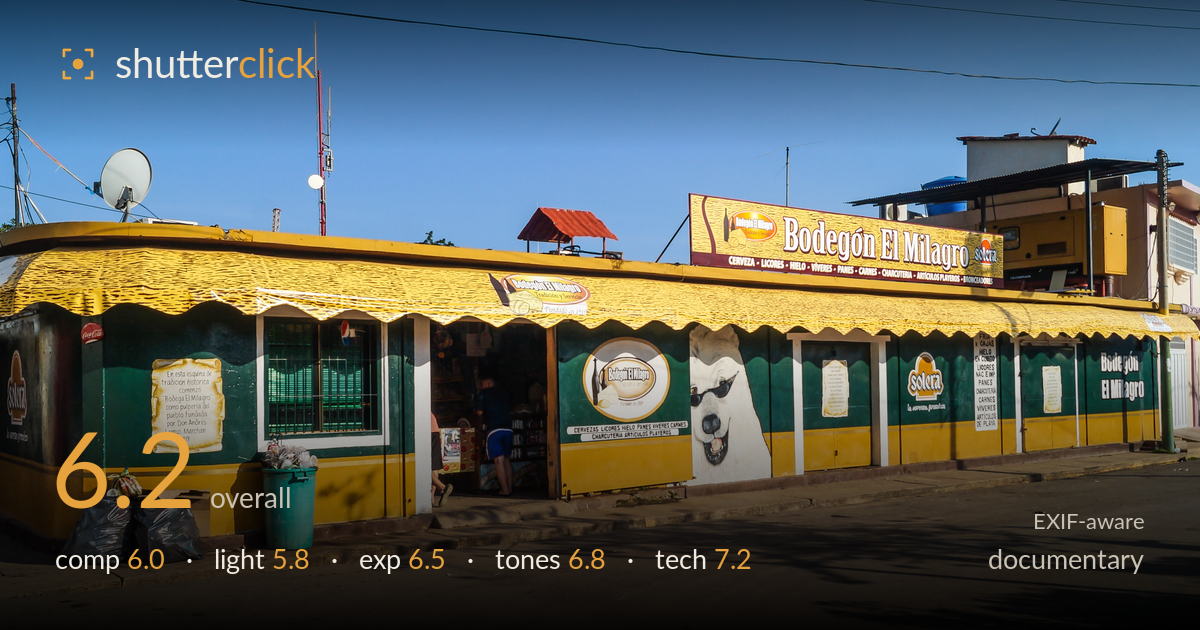
The corner bodegon in afternoon sun
Photo by Rjcastillo

| Focal length | 18 mm |
| Aperture | f / 9.0 |
| Shutter | 1/320 s |
| ISO | ISO 100 |
| Exp. comp. | 0.0 EV |
| Shot at | 07:16 · Aug 17, 2013 |
A clear, information-rich frontal record of a Venezuelan corner store that reads as honest documentary but stops short of a strong image. The full storefront is captured legibly, colours are vivid, and the painted dog with sunglasses gives the frame a spot of personality. What holds it back is the flat, near-frontal treatment and harsh late-afternoon light that flattens the volume of the building. The two figures inside the doorway are the only human presence and they're small and half-hidden. As reportage it documents the place competently; as a photograph it lacks a decisive moment or a stronger point of view.
The wide frontal framing catalogues the whole building and every sign, which serves the documentary intent, but it reads more like an inventory than a composition. The horizon and rooflines run reasonably level, and the diagonal of the awning gives some lead-in from the left. Foreground is dominated by empty road and the trash bags, which add texture and authenticity but also dead space. The painted dog and the two figures in the doorway compete as focal points without either being emphasised. A stronger anchor or a three-quarter angle would build depth.
Hard, high, late-afternoon sun falls almost frontally on the facade, producing flat modelling and few shape-defining shadows on the building itself. The awning casts a heavy dark band along the shopfront, sinking the doorway and figures into shade while the yellow trim glares. The sky is clean but empty. Low, raking side light near golden hour would carve out the building's form and warm the yellows without the harsh contrast. As shot, the light describes the subject adequately but adds little atmosphere or dimension to the scene.
Exposure is well controlled for a high-contrast daylight scene. Highlights on the white signage and yellow awning hold detail without significant clipping, and the sky retains a clean gradient. The deeper shade under the awning and inside the doorway goes fairly dark, swallowing the figures and interior goods, but that is a defensible trade-off given the range. ISO 100 keeps everything clean. A touch of shadow lift in post would recover the doorway detail that carries the human element without pushing the bright facade toward blown highlights.
Colour is the strongest asset here — the saturated green and yellow of the storefront against a deep, even blue sky gives the frame real punch and a strong sense of place. White balance sits slightly warm, which suits the afternoon light. Contrast is high, driven by the hard sun, and the shaded band under the awning reads quite dense. Saturation is pushed but stays believable rather than garish. Slightly opening the shadows and easing global contrast would keep the vivid palette while restoring gradation in the darker areas.
The settings are well matched to the task. At 18mm on the crop-sensor A37, f/9 delivers front-to-back sharpness appropriate for an architectural documentary frame, and the whole facade sits within the depth of field. 1/320s is more than sufficient to freeze this static scene and handle any camera shake handheld, and ISO 100 keeps noise negligible with clean shadows to work with in post. Focus appears accurate across the plane of the storefront. The main technical limitation is the lens's wide end: at 18mm there is mild barrel distortion and some stretching at the frame edges, and the near-frontal position keeps verticals reasonably upright but flattens depth. Stopping to f/9 was slightly more than needed given the flat subject plane — f/6.3 would have gained a touch of sharpness at the same distance — but the choice is sound. Overall execution is clean and dependable; the ceiling is set by the visual approach, not the technique.
What would elevate it
Tags
Shot something like this?
Expert photo critique, on demand — scored across six categories, EXIF-aware. Start with 3 free critiques, no credit card.
critique my photo — free