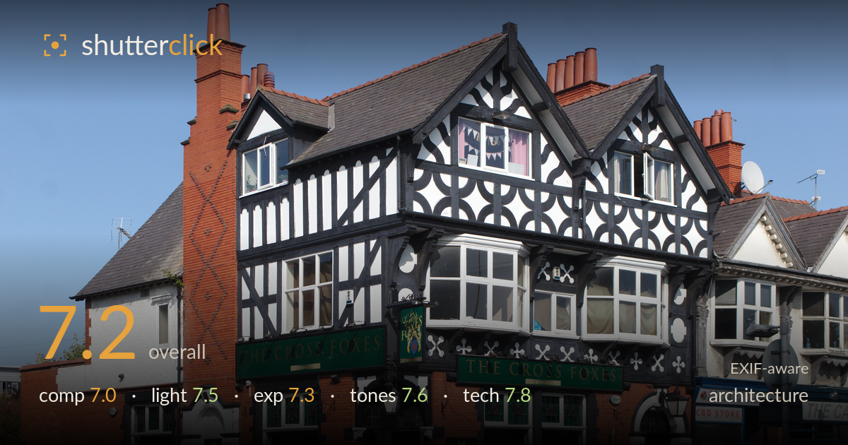
The cross foxes on the corner
Photo by Rodhullandemu

| Focal length | 31 mm |
| Aperture | f / 6.3 |
| Shutter | 1/640 s |
| ISO | ISO 100 |
| Exp. comp. | 0.0 EV |
| Shot at | 14:15 · Sep 20, 2020 |
A clean, well-documented record of a striking mock-Tudor corner pub, with the black-and-white timbering rendered crisply against a clear blue sky. The three-quarter corner view captures both facades and reads as a competent architectural document. What most holds it back is the loose framing on the right, where an intrusive traffic light, adjacent shopfronts, and a parked car clutter the edge and dilute the subject. Verticals are close to true but the leftmost chimney leans slightly, and there is room in post to tidy the frame and lift shadow detail in the brick base.
The three-quarter view is the right call for a corner building, showing both elevations and the full sweep of the gables and chimneys. The pub sits comfortably left of centre with useful breathing room above the roofline. The weakness is the right side: the traffic light on its post, the CBD store, and the parked car crowd the edge and compete with the subject. The road foreground is generous but largely empty. A tighter crop from the right or a step left would concentrate attention on the pub itself.
Strong, clear sunlight from the left rakes across the timbered facades and gives the white render and black beams good separation and dimension. The relief of the diamond brickwork on the chimney and the carved detailing reads well because the light skims it. Shadow sides of the projecting bays stay open enough to hold detail. The near-cloudless sky is convenient for clean geometry, though the high, hard light flattens the front-facing green fascia signs slightly. Overall the timing gives honest, legible modelling of the architecture.
Exposure is well judged for a high-contrast subject under bright sun. The white render holds texture without blowing, and the deep black timbering and slate roof retain form rather than crushing to void. The red brick base is a touch dark on its shadowed left return, where some detail is buried. The blue sky is rich and unclipped. The histogram appears well spread with no accidental highlight loss on the pale window frames, which is the easiest thing to lose here. A small shadow lift would balance it.
Colour handling is clean and natural. The terracotta brick and chimney pots sit warmly against a saturated but believable blue sky, and the green fascia signage stays true. White balance looks accurate with no colour cast in the render. Contrast suits the black-and-white timbering, which is the visual heart of the frame, giving crisp graphic separation. Saturation is pushed just enough to make the scene pop without turning garish. The tonal range from bright render to dark slate is handled with good gradation throughout.
The settings are well matched to the task. At f/6.3 the whole facade sits within depth of field, appropriate for a static building where front-to-back sharpness matters more than isolation. ISO 100 keeps the file clean, and 1/640s is far faster than needed for a tripod-free static subject, though it costs nothing here in good light. The 18-55mm kit lens at 31mm avoids the worst wide-angle distortion, and the focal length keeps perspective natural without excessive keystoning. Focus is accurate across the timbering, with the carved detailing and signage rendering sharp. Verticals are close to corrected, though the leftmost chimney and the left brick edge show a slight lean that suggests minor uncorrected convergence or a small tilt. The kit lens shows a little softness and reduced micro-contrast in the far right shopfronts, expected at this price point. Overall a technically sound capture that gets the fundamentals right for architectural documentation.
What would elevate it
Tags
Shot something like this?
Expert photo critique, on demand — scored across six categories, EXIF-aware. Start with 3 free critiques, no credit card.
critique my photo — free