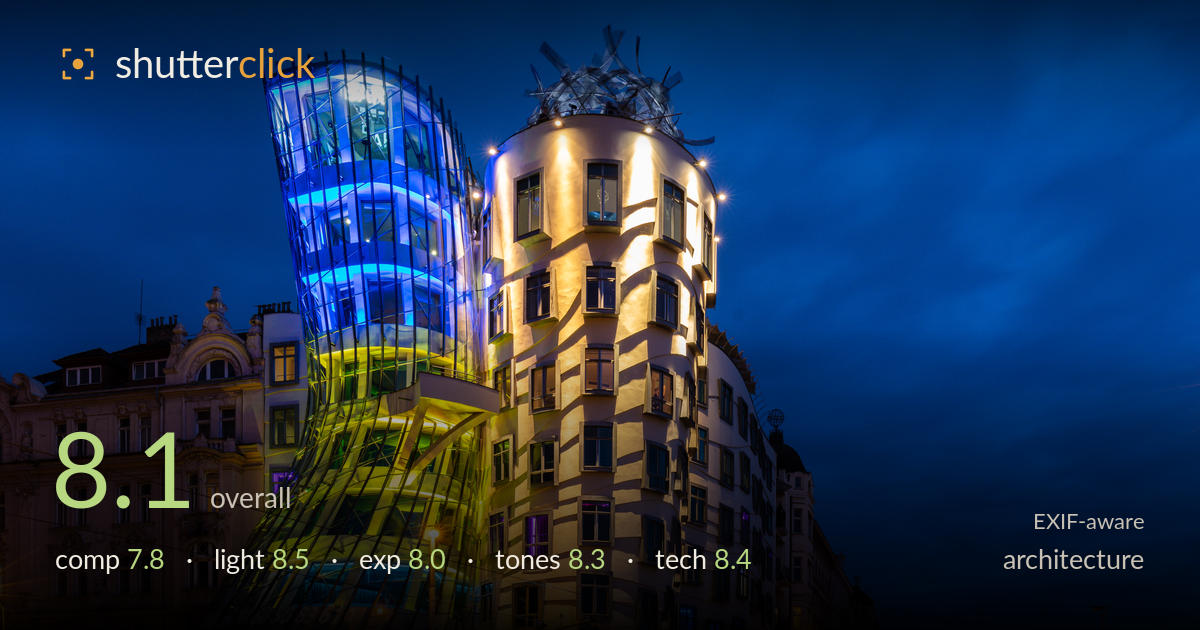
The dancing house at blue hour
Photo by Diego Delso

| Focal length | 23 mm |
| Aperture | f / 11.0 |
| Shutter | 8.0 s |
| ISO | ISO 100 |
| Exp. comp. | 0.0 EV |
| Shot at | 20:01 · Jul 1, 2022 |
A confident blue-hour rendering of the Dancing House that lets the building's curved forms and the blue-to-gold interior lighting carry the frame. The timing is the strongest asset: deep cobalt sky balanced against warm facade illumination, with light trails feeding the eye through the corner. What holds it back is a slightly restless right side — the road, street lamps and receding buildings compete for attention without fully resolving into a clean secondary story, and the historic building at left is dark and unclear. A touch more attention to convergence and edge tidiness would lift a very solid image toward excellent.
The corner placement of the building at the junction is well chosen, letting both facades read while the curved glass tower anchors the upper left. The road sweeping in from the right adds depth and a natural leading line. The historic building on the left provides useful context but sits in shadow and adds little beyond bulk. The right-hand street recedes pleasingly but the frame feels weighted heavily left, leaving the right two-thirds thinner. A slightly tighter crop or lower angle would strengthen the geometric interplay between the two structures.
The blue-hour timing is judged almost perfectly — the sky retains rich cobalt gradation rather than going black, and it plays against the warm sodium facade wash beautifully. The building's own architectural lighting, blue at top grading to green and gold below, is captured while still balanced against ambient sky. Street lamps introduce warm points that carry the eye down the road. The only softness is the left historic building, which receives almost no light and reads as a flat dark mass rather than a lit companion.
The long exposure holds a wide dynamic range cleanly: the bright interior glass and lit facade retain detail without blowing out, while the sky keeps tonal information. Shadow areas in the left building block up somewhat, losing architectural detail there. The light trails are exposed to a pleasing brightness without smearing into overexposure. Highlights on the illuminated windows and street lamps stay just controlled. A marginally longer or bracketed exposure would recover the darker left facade without endangering the highlights.
The colour grade is the image's signature — the deep blue sky reads richly saturated but believable, and the warm gold facade provides strong complementary contrast. The building's blue-green-gold interior lighting is rendered vividly and holds separation across those hues. White balance is well handled given mixed artificial and ambient sources. Saturation sits just at the edge of punchy without tipping garish. The warm-cool split does most of the emotional work here, and the mid-tones on the curved white facade carry gentle gradation rather than flattening.
The settings are well matched to the task. f/11 on the 16-35mm f/4L delivers deep front-to-back sharpness across the building and street, and at 23mm keeps distortion manageable for architecture. ISO 100 keeps the files clean, and the 8-second shutter both smooths the sky faintly and renders the vehicle light trails as elegant streaks through the junction — a deliberate, well-executed choice. Focus appears accurate across the facade with fine detail in the window frames and glass structure holding up. The vertical lines of the corner tower stay largely upright, suggesting careful levelling or corrected perspective, though a slight lean is visible on the far-right buildings. A tripod is clearly in use given the exposure length and the crisp static detail. Overall this is technically assured work; the only refinement would be tighter perspective control on the frame edges and perhaps a second exposure to lift the shadowed left building.
What would elevate it
Tags
Shot something like this?
Expert photo critique, on demand — scored across six categories, EXIF-aware. Start with 3 free critiques, no credit card.
critique my photo — free