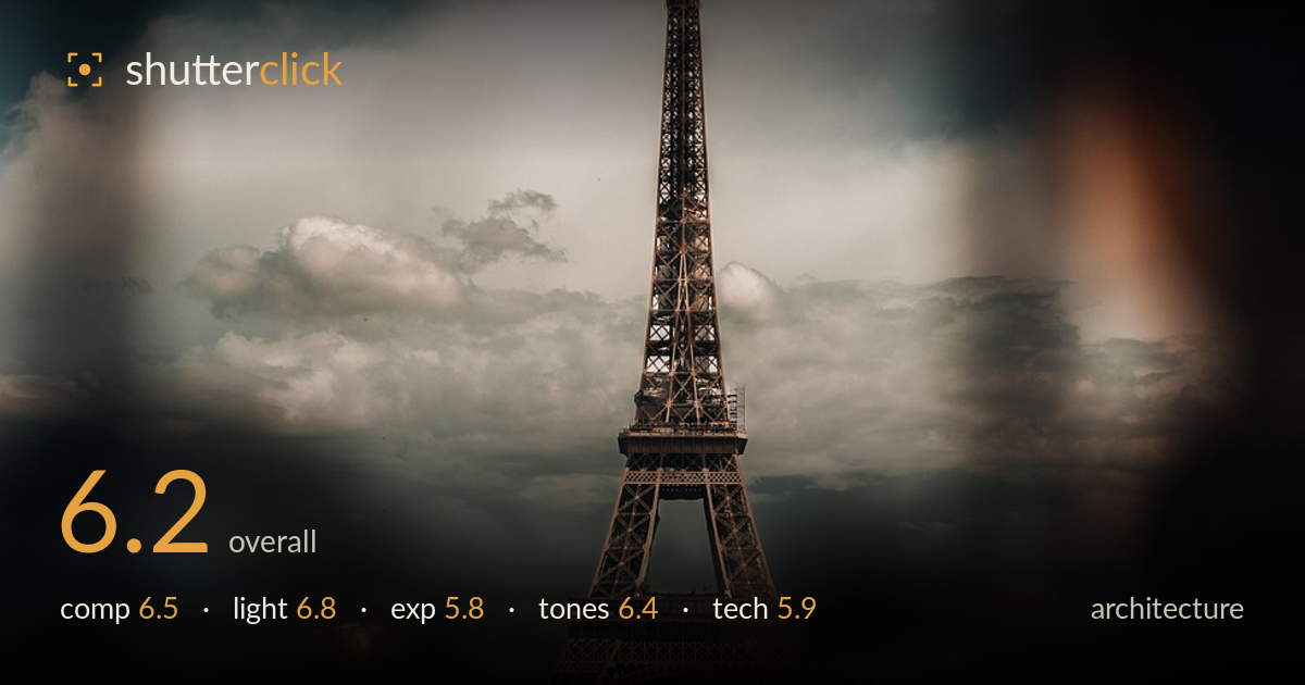
The eiffel tower through the frame
Photo by urtimudd89

No EXIF metadata in this file
Technical analysis based on visual assessment only.
The Eiffel Tower is placed cleanly and vertically, framed through an out-of-focus foreground element that lends atmosphere and a sense of stolen observation. The dramatic cloud bank behind the tower adds depth and mood. What most holds the image back is the heavy foreground blur that swallows the lower third and left edge — it reads as accidental obstruction more than deliberate framing in several places. The shadows are also crushed, losing the base of the tower and the cityscape into murk. The concept is strong; the execution needs a cleaner foreground and more controlled shadow recovery.
The tower sits centred and vertical, a defensible choice for such a symmetrical subject, and the height of the frame gives it room to rise. The dramatic clouds provide a strong backdrop and separation. The through-the-frame blur creates intrigue, but the large dark blurred mass on the right and the amber blob top-centre compete with the subject rather than support it. The foreground foliage and wall anchor the base loosely but add little. A framing that used the blur more intentionally, leaving cleaner space around the tower, would sharpen the intent.
The light is soft and directional, catching the tower's ironwork warmly against the cooler, moodier sky — a pleasing tonal split that gives the structure form and dimension. The cloud cover diffuses the light and prevents harsh shadows on the lattice, and the low warm glow suggests late-day timing that flatters the metal. The trade-off is that the same soft, waning light leaves the base and foreground badly underlit and detail-starved. Bracketing or shooting slightly earlier would keep the tower's glow while retaining the shadow structure below.
Exposure favours the tower and sky, which hold reasonable midtone detail, but the shadows are pushed too far. The base of the tower, the trees, and the cityscape collapse into near-black with little recoverable detail, and the overall image reads darker than the subject warrants. The bright amber blur at the top edge is the closest to clipping. The histogram is heavily weighted to the left. A more balanced exposure, or shadow lifting in post, would open the lower half without sacrificing the moody sky.
The teal-and-amber grade is atmospheric and suits the subject, with the warm ironwork playing against cool clouds. It leans toward the fashionable and slightly heavy-handed side — the shadows carry a muddy warmth that flattens separation in the darker areas. White balance drifts warm overall. The contrast is punchy in the sky but loses gradation in the crushed lower tones. Pulling back the amber in the shadows and restoring some neutral depth would let the tones feel intentional rather than filtered, and would clean up the muddiness at the base.
The image appears shot through glass or past an obstruction, producing the heavy foreground blur and the smeared amber highlight at the top — an interesting device, but one that isn't fully controlled here. The tower itself is acceptably sharp where the eye lands, with the lattice detail holding up at viewing size, though critical sharpness is soft. Focus is placed correctly on the subject. The out-of-focus foreground elements — the dark mass on the right and the blurred wall along the bottom — suggest a wide aperture that renders them as distraction rather than deliberate framing. Noise is controlled in the sky but rises in the crushed shadows. For architecture, tighter control over what enters the frame and a slightly stopped-down aperture to keep the whole tower crisp would serve the subject better. The verticals read reasonably straight, which is important for this genre; a touch of keystone correction on the base would fully square it.
What would elevate it
Tags
Shot something like this?
Expert photo critique, on demand — scored across six categories, EXIF-aware. Start with 3 free critiques, no credit card.
critique my photo — free