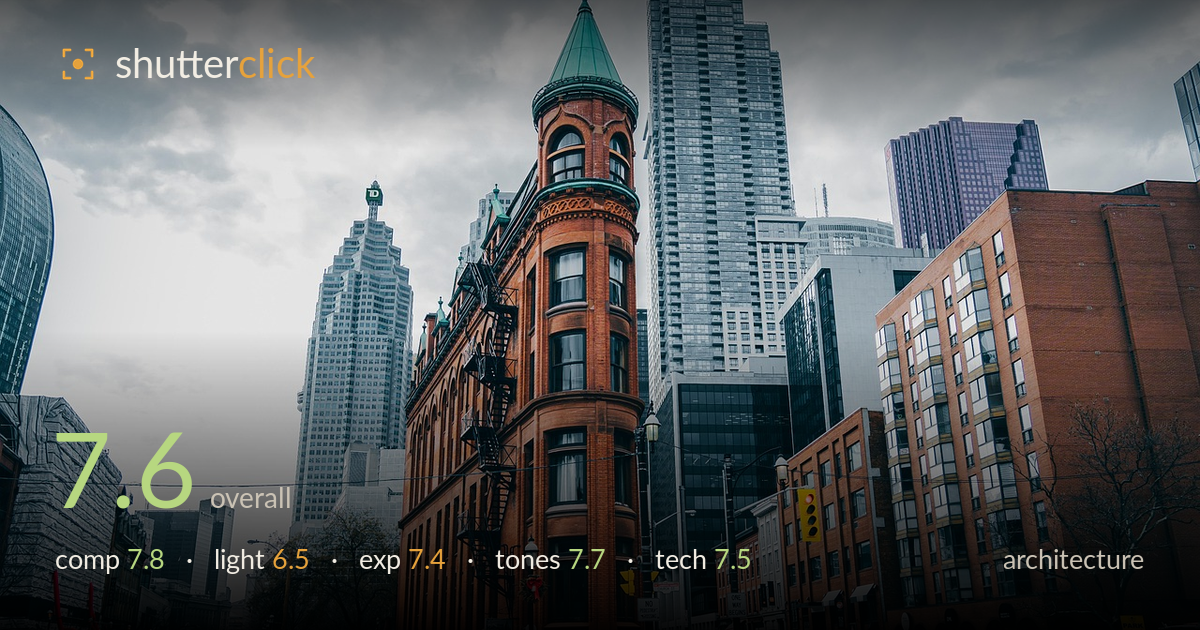
The flatiron on an overcast day
Photo by miguelbarrera3

No EXIF metadata in this file
Technical analysis based on visual assessment only.
A classic flatiron subject handled with a strong sense of place, the wedge building anchoring the frame while modern towers pile up behind it for a satisfying old-versus-new contrast. The prow points almost dead-centre, giving the eye a firm hook and letting both streets recede convincingly. What holds it back most is the flat overcast light, which mutes the brickwork's texture and drains modelling from every surface. Verticals lean slightly outward from the wide-angle perspective, and the sky is a large expanse of dull grey doing little work. Still, the layering and street-level life give it genuine documentary weight.
The triangular building forms a strong central wedge, its point drawing the eye immediately and its two faces leading into diverging streets — an effective foreground-to-background build. The pedestrians crossing at lower right add scale and life, and the tower stack behind creates depth. The sky occupies roughly the top third with little content, so a slightly lower framing or tighter crop from the top would concentrate attention on the architecture. The left street empties out somewhat, leaving that side quieter than the busier right.
Flat, diffuse overcast light dominates, which softens shadows and keeps the exposure manageable across the scene but strips the red brick of the directional modelling that would reveal its ornate texture and depth. The turret's green copper and the fire-escape ironwork read as detail rather than form. There is no highlight or shadow interplay to sculpt the wedge. Softer light suits even coverage, but a break in the cloud or low-angle raking sun would give the facade far more dimension.
Exposure is well controlled given the bright cloud cover. The sky holds together without heavy clipping, and shadow areas in the recessed windows and street retain usable detail. Midtones sit a touch low, contributing to the muted overall feel, but nothing is crushed. The brick's darker reds keep detail rather than blocking up. A small highlight-recovery and midtone lift would give the frame more presence without risking the sky, which is the trickiest element to protect here.
The grade leans cool and desaturated, a teal-and-grey treatment that plays the warm terracotta brick against the steel and glass towers — an intentional, cohesive look. White balance is on the cool side, which suits the overcast mood but leaves the image feeling slightly flat. The brick's warmth is the sole colour anchor and carries the frame. A touch more separation between the greys, or a modest warmth lift, would keep the mood while adding tonal richness across the concrete and glass.
Sharpness is solid across the facade, with the brick detail, window frames and fire escape all resolving cleanly, suggesting a well-chosen aperture and steady capture. Depth of field is deep, appropriate for architecture where front-to-back clarity matters, and both near street and distant towers hold detail. The wide-angle lens captures the full sweep of the intersection but introduces mild outward lean on the vertical edges — the turret and side buildings splay slightly, a keystoning effect that a perspective correction in post would tidy. Noise is well controlled in the shadow zones, consistent with shooting at a low sensitivity in good daylight. Focus is accurate on the primary subject. The framing catches the pedestrian activity at a reasonable moment, though the wide field means the people are small. For architecture the main technical priority going forward is verticality: correcting the converging and diverging parallels would lend the geometry the crispness the rest of the execution already earns.
What would elevate it
Tags
Shot something like this?
Expert photo critique, on demand — scored across six categories, EXIF-aware. Start with 3 free critiques, no credit card.
critique my photo — free