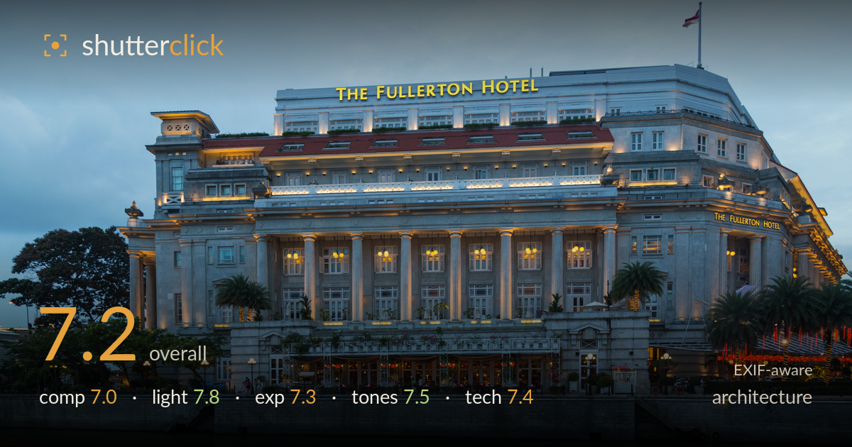
The fullerton hotel at dusk
Photo by Marcin Konsek

| Focal length | 24 mm |
| Aperture | f / 4.0 |
| Shutter | 1/15 s |
| ISO | ISO 400 |
| Exp. comp. | 0.0 EV |
| Shot at | 12:15 · Feb 10, 2016 |
A well-timed blue-hour capture of a classical facade where the warm interior glow of the arcade plays cleanly against the cool dusk sky. The verticals are respectably controlled and the water foreground grounds the frame. What most holds it back is a slightly loose composition: the building sits low, leaving a broad expanse of flat grey sky that adds little, while the base is crowded by riverside detail. Tightening the framing and lifting the shadows in the lower stonework would sharpen the impact. The light timing is the standout — that balance of ambient and artificial is exactly where this subject sings.
The facade is centred and shot near-symmetrically, which suits the formal classical architecture, and the river foreground provides a solid anchoring base. The two palm clusters frame the entrance nicely. However, the building sits low in the frame, ceding roughly the upper third to featureless grey sky that carries no cloud interest to justify it. A tighter vertical crop, or waiting for more dramatic sky, would concentrate attention on the ornate stonework. The flag at top-right feels cramped against the edge.
The timing is the strongest asset here — blue hour delivers a sky just dark enough for the arcade lights and the yellow signage to register warmly without the building going flat or the sky going black. The uplighting on the columns and cornice reveals the depth of the classical relief well. Interior lamps glow invitingly through the arcade. The overcast sky keeps the facade evenly lit and shadow-free, which is clean but also removes any directional modelling that raking light would bring to the stone texture.
Exposure is well judged for the mixed light. The warm interior highlights and the illuminated signage hold without clipping, and the sky retains tonal information rather than blowing out. The lower stonework and waterline drift a touch dark, losing some detail in the embankment and shadowed foliage. The water itself is rendered with reasonable midtone weight. A modest shadow lift in post would recover embankment texture without disturbing the balanced highlight rendering. Overall the histogram appears deliberate and controlled for the conditions.
The colour balance handles the blue-hour dichotomy skilfully: cool slate sky and green-grey water against the warm amber of interior lamps and the golden signage. That warm-cool contrast is the image's chief tonal appeal. The stone facade holds a natural neutral. The red lanterns at right add a welcome accent without overpowering. The overall saturation is restrained and believable. The grey sky is a little muddy and flat, and slightly more separation between sky and building would give the frame more punch.
At 24mm the wide end of the 24-105 is a sensible choice for encompassing the full facade from across the river, and keeping the camera reasonably level has held the verticals largely upright — impressive given the wide angle, though the outer columns show mild convergence. f/4 is adequate here since everything of interest sits at similar distance, and depth of field is not a concern for a flat facade shot from this range. The 1/15s shutter is slow for handheld work at 24mm; the IS lens and the static subject have carried it, and the frame reads acceptably sharp, but a tripod would have removed any risk and enabled a lower ISO. ISO 400 is modest and noise is well controlled in the shadows. Focus sits accurately on the facade. Overall a competent execution — a tripod and a base ISO exposure would have been the textbook approach for this static blue-hour architecture subject.
What would elevate it
Tags
Shot something like this?
Expert photo critique, on demand — scored across six categories, EXIF-aware. Start with 3 free critiques, no credit card.
critique my photo — free