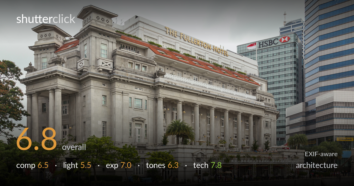
The fullerton hotel by the river
Photo by Marcin Konsek

| Focal length | 32 mm |
| Aperture | f / 7.1 |
| Shutter | 1/100 s |
| ISO | ISO 200 |
| Exp. comp. | 0.0 EV |
| Shot at | 10:26 · Feb 10, 2016 |
A clean, well-executed architectural record of the Fullerton Hotel, let down most by flat, overcast light that flattens the building's substantial stonework and detail. The verticals are well controlled and the corner-on framing reads the classical facade clearly, with the river foreground anchoring the base. The competing HSBC and glass towers behind add context but also pull the eye and crowd the right edge. The grey sky offers nothing. Strong as documentation; the work would lift considerably with directional light to model the columns and a tighter handle on the busy modern backdrop.
The three-quarter angle reads the corner of the building well, showing both the columned river facade and the side elevation with depth. The river and granite quay form a stable base, and the building sits comfortably with breathing room above. The verticals are kept largely upright, which matters for architecture. Less successful is the cluttered right third, where the HSBC tower and glass blocks compete for attention and the frame edge crops them awkwardly. The blank sky occupies a large, uneventful area that adds little weight to the composition.
Flat, even overcast light is the weakest element here. While it avoids harsh blown highlights on the pale stone, it also robs the classical facade of the modelling it needs — the columns, cornices and recessed windows read as a uniform grey mass rather than sculpted forms. There is no directional shaping, no shadow play to articulate depth on the colonnade. The red tile roofline and warm signage retain some life, but the overall lighting timing offers little drama or dimension for a building of this architectural richness.
Exposure is handled competently for difficult flat conditions. The pale limestone holds detail without clipping, and shadow areas under the colonnade and in the trees retain usable information. The bright overcast sky is rendered as near-white but not blown to distraction. Midtones sit a touch low, leaving the stone slightly muddy rather than luminous, which a small positive exposure compensation or a tone lift would have addressed. Overall the histogram appears well controlled with no significant loss at either end — a deliberate, safe exposure for the scene.
White balance leans neutral-to-cool, which suits the grey day but compounds the dull, low-contrast feel of the stonework. The limestone reads slightly flat and lacks the warm cream tone the material can carry. The red roof tiles and gold lettering provide welcome colour accents, and the murky green river is rendered honestly. Contrast is gentle throughout — appropriate to the diffuse light, but a modest contrast and clarity boost would separate the architectural planes and give the facade more presence. Tonal gradation in the sky is smooth and clean.
Settings are well matched to the subject. At f/7.1 the depth of field comfortably covers the building front to back, keeping the colonnade, signage and background towers acceptably sharp without diffraction softening. ISO 200 keeps noise negligible and preserves clean detail in the stone. The 1/100s shutter is more than adequate for a static, tripod-or-steady handheld architectural frame, and the 24-105 f/4L resolves fine detail in the masonry and ironwork crisply. At 32mm the perspective is natural with minimal distortion, and verticals are close to true — suggesting careful framing or modest correction. Focus is accurate across the facade. The main technical observation is that a polariser could have cut some of the dull haze and deepened the sky and water, and a slightly smaller aperture was unnecessary here. Solid, deliberate execution overall — the gear and settings serve the architectural intent well, leaving light rather than technique as the limiting factor.
what would elevate it
tags
Shot something like this?
Expert photo critique, on demand — scored across six categories, EXIF-aware. Start with 3 free critiques, no credit card.
critique my photo — free