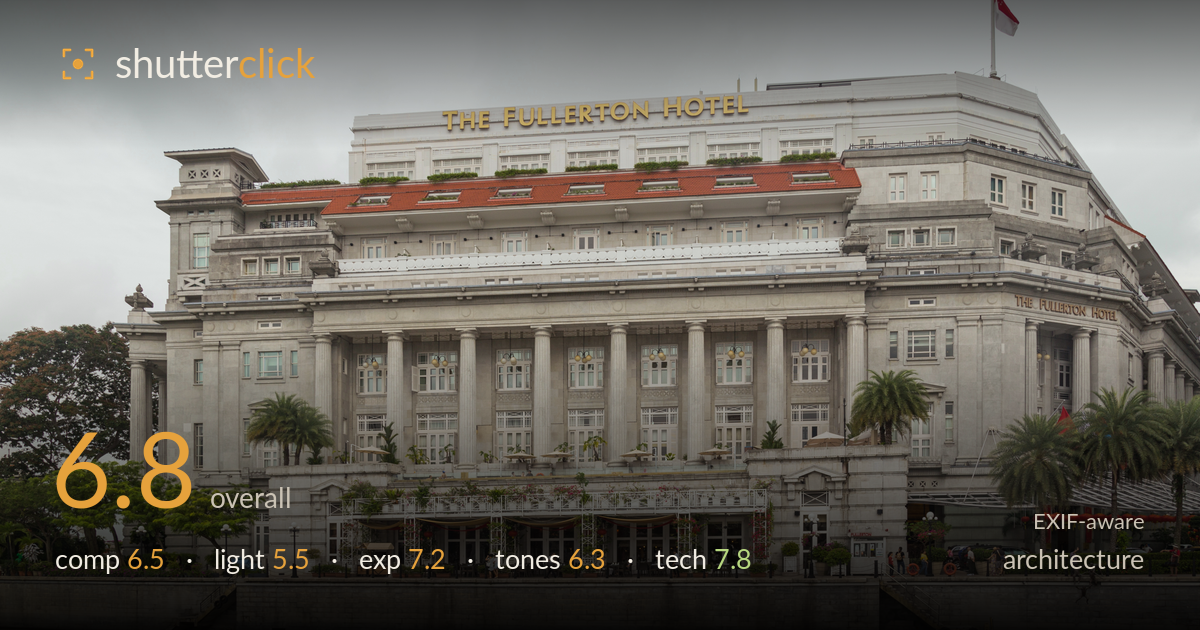
The fullerton hotel from the river
Photo by Marcin Konsek

| Focal length | 28 mm |
| Aperture | f / 7.1 |
| Shutter | 1/100 s |
| ISO | ISO 200 |
| Exp. comp. | 0.0 EV |
| Shot at | 10:31 · Feb 10, 2016 |
A clean, well-controlled documentary record of the Fullerton Hotel, with commendably corrected verticals and a full frontal view that respects the building's neoclassical symmetry. What most holds it back is the light: a flat, overcast sky flattens the stone's relief and drains modelling from the columns, leaving the facade grey and inert. The water foreground reads as dead space rather than a compositional asset. The technical execution is sound and the framing dignified, but the image documents rather than interprets. A stronger sky, better light, or a reflection worth including would lift it from a competent architectural inventory shot toward something with atmosphere.
The frontal, near-symmetrical framing suits the building's classical facade and the verticals are kept impressively upright. The full structure is contained with breathing room, and the riverside wall grounds it. Weaknesses: the horizon and stone wall bisect the lower third into a large band of featureless water that adds little, and the flag and sky occupy a heavy expanse of empty grey up top. Tightening on the facade, or using the water for a reflection, would sharpen the intent. Palm trees at the edges partly balance the frame.
The heavy overcast delivers even, shadowless illumination that keeps every window and cornice legible, which serves a documentary purpose. But it costs the image its dimensionality: the columns, pediments and deep loggia carry almost no shadow to define their depth, and the pale stone merges tonally with a white sky. There is no direction to the light and no time-of-day character. Raking side light from a lower sun, or the warmer wash of late afternoon, would model the relief and give the stone form and presence.
Exposure is handled well for a bright overcast scene. The stone facade holds detail across its midtones and the shadowed loggia interior retains readable information without blocking up. The sky is bright but not fully blown, preserving faint cloud structure. Nothing is meaningfully clipped and the histogram appears well placed for the conditions. The zero exposure compensation was a sound call against a large bright sky. If anything the whole frame sits slightly flat and low in contrast, which is a tonal matter more than an exposure fault.
White balance is neutral and accurate, rendering the grey stone honestly and letting the yellow signage and red roof tiles register with restraint. The tonal range, however, is compressed: the overcast pushes stone and sky into a narrow band of pale greys with little separation, and the whole image reads muted and low in contrast. The green foliage and terracotta accents provide the only real colour relief. A modest contrast lift and some highlight-shadow separation in post would give the facade more punch without falsifying the daylight.
The settings are well chosen for the task. At 28mm on full frame the wide zoom captures the whole facade at a workable distance, and f/7.1 sits in the lens's sharp range, delivering front-to-back depth of field appropriate for architecture with everything in the plane rendered crisply. ISO 200 keeps noise negligible and 1/100s is ample for a static handheld subject with the IS assisting. Focus is accurately placed on the facade and detail resolution across the stonework, windows and signage is strong. The verticals are close to true, suggesting either careful levelling or corrected perspective, which is exactly what this genre demands. The only technical caution is that a wide lens aimed slightly upward can introduce mild keystoning; here it is well managed but a tilt-shift lens or shooting from a higher vantage would eliminate the last trace of convergence. Overall the execution is clean and dependable, with no meaningful sharpness, motion or noise issues.
What would elevate it
Tags
Shot something like this?
Expert photo critique, on demand — scored across six categories, EXIF-aware. Start with 3 free critiques, no credit card.
critique my photo — free