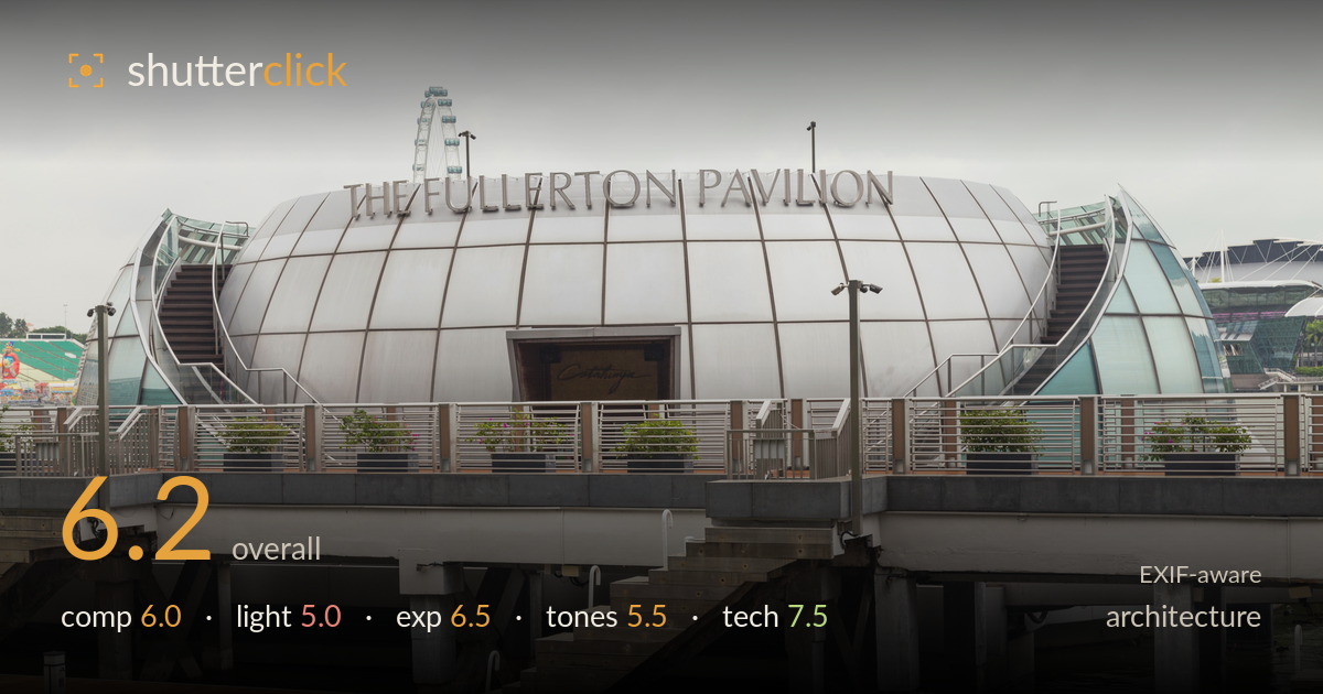
The fullerton pavilion by the water
Photo by Marcin Konsek

| Focal length | 58 mm |
| Aperture | f / 11.0 |
| Shutter | 1/30 s |
| ISO | ISO 200 |
| Exp. comp. | 0.0 EV |
| Shot at | 09:47 · Feb 10, 2016 |
The distinctive ovoid form of the pavilion is captured cleanly and legibly, with verticals held true and the whole structure sitting square to the frame. What most holds the image back is the flat, overcast light, which strips the metallic cladding of the sheen and modelling that would make it sing. The wide horizontal boat dock cutting across the lower third eats compositional space without adding much, and the grey sky dominates the top. A stronger sky, warmer light, or a tighter framing on the dome would lift this from competent documentation to something with more presence.
The pavilion is centred and rendered legibly, with the signage reading cleanly and the symmetry of the shell-like wings well balanced left to right. Verticals of the lamp posts stay upright, which suits the architecture. The lower third is dominated by the flat boat dock running horizontally, which flattens depth and adds a lot of dead foreground. The heavy band of grey sky above compounds the sense that the subject is compressed into a central strip. A tighter crop concentrating on the dome and its supporting piers would tighten the whole frame.
The overcast sky delivers soft, even, shadowless light that is the main limitation here. On a brushed-metal ovoid, this flat illumination kills the reflections, gradients and highlight roll that give curved metallic surfaces their form, leaving the cladding looking dull and uniform. There is no directional modelling to separate the dome from its glass wings or to reveal the vertical seams as sculptural lines. Directional side light near golden hour, or a break in the cloud, would carve the shape and add the metallic sheen the structure needs.
Exposure is handled sensibly for a bright overcast scene. The metal cladding retains detail across its curve without blowing out, and the shaded underside of the deck holds enough shadow information to read the piers and structure. The sky is bright but not clipped to pure white, preserving some tonal separation. Midtones sit a touch flat, which is a consequence of the light rather than the exposure decision. Overall the histogram appears well controlled with no accidental crushing or highlight loss across a wide dynamic range.
The palette is dominated by silver-grey metal, grey sky and grey concrete, giving the image a muted, monochromatic feel that suits the subject but reads as lifeless under this light. The warm timber of the dock is the only real colour accent and does some useful work in the lower frame. Contrast is low and mid-tones lack punch, leaving the metallic surface without the crisp separation it could have. A gentle contrast lift and selective white-balance warming would give the greys more structure and life.
Technically this is well executed. At f/11 on a 58mm focal length, depth of field comfortably covers the pavilion, the dock and the background elements, keeping the whole scene sharp front to back — the right choice for architecture. ISO 200 keeps noise negligible and preserves fine detail in the cladding seams and railings. Focus is accurate on the structure. The one thing worth watching is the 1/30s shutter: with the 6D and a 24-105L that is stabilised, so handholding is feasible, but 1/30 is marginal at 58mm and leaves little margin. On a tripod at this aperture, a slower, cleaner base shutter would be safer still and remove any risk of subtle shake. The lens choice is well suited — the 24-105 is a versatile, sharp performer at f/11, well into its optimal aperture range with diffraction not yet a concern. Verticals are kept largely true, suggesting careful camera levelling rather than heavy correction.
What would elevate it
Tags
Shot something like this?
Expert photo critique, on demand — scored across six categories, EXIF-aware. Start with 3 free critiques, no credit card.
critique my photo — free