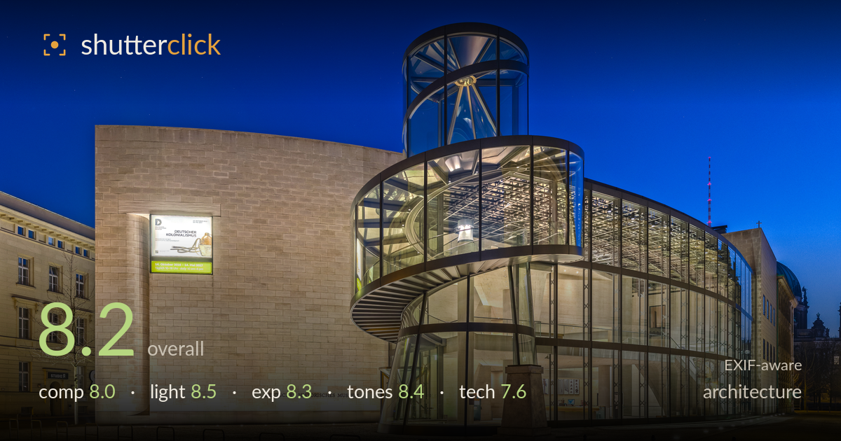
The glass wing at blue hour
Photo by Ansgar Koreng

| Focal length | 10 mm |
| Aperture | f / 7.1 |
| ISO | ISO 800 |
| Shot at | 07:55 · Jan 28, 2017 |
A polished blue-hour architectural study that plays the warm interior glow of the glass rotunda against a deep cobalt sky to genuine effect. The curved glazing and spiral ramp of the I.M. Pei wing are the clear draw, and the timing captures that brief window where sky luminance and artificial light balance. What holds it back is a slightly cramped right edge where the adjacent building and cathedral dome crowd in, and verticals that, while mostly controlled, still show subtle lean at the frame extremes from the ultra-wide lens. The stone facade reads a touch flat, but the light and colour work carry it.
The three-quarter angle reads the glass rotunda's curve well and lets the spiral ramp coil as the visual anchor. The blank travertine wall on the left provides useful breathing room against the dense glazing. The foreground bike racks and cobblestone add scale but eat a lot of lower frame without much reward. The right edge feels congested where the neighbouring building and cathedral dome intrude and compete. A cleaner separation there, or a step left, would let the rotunda stand more decisively as the subject.
The blue-hour timing is the photograph's strongest decision. Warm tungsten spilling from the glass interior against the saturated cobalt sky creates the classic architectural contrast, and the balance between ambient and artificial is judged well — neither the sky nor the interior blows out. The travertine facade is lit evenly if a little frontally, leaving its texture under-modelled. The rotunda glows convincingly from within, and the scattered ground lights add depth. A few minutes earlier might have retained more gradient in the upper sky.
Exposure is well controlled across a demanding dynamic range. The bright interior of the glass hall holds detail without clipping, and the deep sky retains clean tone without crushing into black. Shadow areas in the cobblestone and the darker right-side buildings keep enough information to read. The illuminated signage stays legible. Overall the histogram sits deliberately, with the mixed artificial and ambient sources balanced rather than fighting. Only the very brightest interior spotlights nudge toward the highlight limit, but nothing distracting escapes.
The warm-cool colour relationship is the tonal centrepiece and it works: golden interior against saturated blue sky, with the travertine reading a neutral warm that bridges the two. White balance is handled sensibly given the mixed lighting. Contrast is punchy without going harsh, and saturation on the sky is bold but stays just short of artificial. The stone mid-tones could use a touch more separation to avoid flatness. Overall a confident, coherent grade that suits blue-hour architecture.
At 10mm the ultra-wide framing captures the whole complex from close range, but it comes at a cost — subtle keystoning and perspective stretch appear at the frame edges, and the right-side buildings lean slightly inward despite mostly disciplined verticals. Some correction has clearly been applied, but a fraction more, or a tilt-shift approach, would fully resolve the converging parallels expected in architecture. f/7.1 is a sensible choice, delivering front-to-back sharpness across the facade and glazing, and focus is accurate throughout. ISO 800 is higher than ideal for a tripod-based blue-hour frame — this looks like a long exposure was avoided, since a lower ISO at a slower shutter would have cut noise in the deep sky and dark corners. Nothing is objectionably noisy, but 100–200 ISO with a longer exposure would have yielded cleaner shadows. The 10mm lens is sharp corner to corner here, which is respectable for such a wide focal length.
What would elevate it
Tags
Shot something like this?
Expert photo critique, on demand — scored across six categories, EXIF-aware. Start with 3 free critiques, no credit card.
critique my photo — free