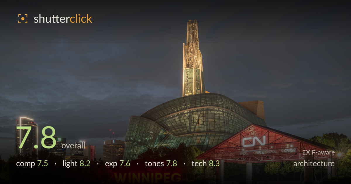
The human rights museum at blue hour
Photo by Ethan Sahagun

| Focal length | 35 mm |
| Aperture | f / 13.0 |
| Shutter | 20.0 s |
| ISO | ISO 100 |
| Exp. comp. | 0.0 EV |
| Shot at | 03:43 · Jul 19, 2026 |
A strong blue-hour treatment of the Canadian Museum for Human Rights, anchored by the glowing WINNIPEG sign and the illuminated glass tower against a moody, layered sky. The building's signature form reads clearly and the light balance between artificial and ambient is well judged. What holds it back most is verticality: the tall structures lean inward and the frame tips slightly, undermining the geometric precision architecture rewards. The left skyline sits a touch flat in the shadows, and the foreground grass is a large, empty band. Cleaner perspective correction and a more purposeful foreground would lift this from very good to excellent.
The building is placed off-centre right with the skyline balancing the left, and the WINNIPEG sign gives a clear entry point — a considered arrangement. The dramatic cloud layering fills the upper frame well and the tower breaks the horizon effectively. Two weaknesses stand out: the wide empty band of foreground grass adds little and pulls weight downward, and the framing feels slightly loose on the right where the structure crowds the edge. A lower angle or a touch more foreground interest would tie the base into the scene.
The blue-hour timing is the shot's greatest asset — enough ambient light remains to hold cloud detail while the artificial illumination reads strongly. The warm glow of the tower, the red-lit CN canopy, and the neon sign create a coherent hierarchy of light sources against the cool sky. Shadow rendering across the glass façade is soft and even. The one caution is the localized red spill on the trees around the sign, which reads slightly artificial, but overall the interplay of colour temperatures is handled with skill.
The 20-second exposure at ISO 100 holds a wide dynamic range with restraint. Highlights on the tower and canopy retain structure rather than blowing out, and the sky keeps its tonal gradation. The left skyline sinks a little deep into shadow, losing separation between the darker buildings, and the foreground grass is muddy in the lower left. A modest shadow lift in that region would recover detail without flattening the mood. Midtones on the glass are well placed and the neon sign is bright without smearing.
The colour palette works on a warm-cool axis: the amber tower and red signage against the slate-blue sky create pleasing tension. White balance sits convincingly for blue hour. The reds around the sign push toward oversaturation and bleed into the surrounding foliage, which cheapens that corner slightly. The sky's grey-blue gradation is smooth and the clouds carry good tonal separation. Pulling back red saturation and adding a hint of contrast in the shadow-heavy left third would tighten the overall balance.
Settings are well chosen for the scene. f/13 delivers front-to-back sharpness appropriate to an architectural night frame and keeps the various light sources crisp, and ISO 100 keeps noise negligible across the long exposure. The 20-second shutter smooths the sky's motion into the layered cloud effect while the still building stays sharp — the faint ghosting of people near the canopy is a natural and acceptable byproduct. The 35mm focal length on the 24-70 covers the scene without excessive distortion, though at this distance the tall structures still converge inward. Focus is accurate across the plane. The main technical shortcoming is perspective: the verticals lean and the horizon is marginally off level, both fixable in post. A tripod-mounted long exposure at ISO 100 is exactly the right foundation here; the execution is clean and deliberate, with only lens-correction refinement standing between this and a technically pristine result.
What would elevate it
Tags
Shot something like this?
Expert photo critique, on demand — scored across six categories, EXIF-aware. Start with 3 free critiques, no credit card.
critique my photo — free