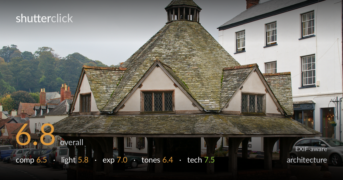
The old market cross
Photo by Herbythyme

| Focal length | 28 mm |
| Aperture | f / 7.1 |
| Shutter | 1/80 s |
| ISO | ISO 100 |
| Exp. comp. | 0.0 EV |
| Shot at | 11:30 · Oct 15, 2009 |
A characterful documentary record of a historic market cross, well centred and legibly described from base to finial. The flat overcast light is the biggest limiter — it renders the slate roof's lovely lichen texture and the timber framing without the modelling that low, raking light would bring, and the white sky reads as empty negative space. The surrounding parked cars and road markings clutter the lower frame and dilute the building's setting. The architecture itself is captured cleanly and sharply, but a more considered time of day and a tighter relationship to the subject would lift it from a competent record toward something with presence.
The octagonal market cross is placed centrally and given room to breathe, with the pyramidal roof and cupola well contained inside the top of the frame. The symmetry of the structure is respected and the stepped gables read clearly. However, the lower third is busy with parked cars, road markings and stray bollards that compete with the subject and root it in clutter rather than context. The large expanse of blank white sky adds little. A lower angle or a step closer would have strengthened the building's dominance.
Flat, diffuse overcast light dominates, and while it avoids harsh contrast and keeps the slate detail readable, it gives the structure little dimensional modelling. The timber posts, stone base and lichen-covered roof all have rich texture that a low, raking side light at golden hour would reveal far better. As it stands, the surfaces look uniformly lit and slightly lifeless. The white-rendered building to the right also flattens out under this light, losing separation from the equally pale sky.
Exposure is handled well for difficult bright-overcast conditions. The white sky is near the top of the range but not blown to total emptiness, and shadow detail under the open arcade and within the timber framing is retained. Midtones on the slate and render sit at a believable brightness. The choice not to dial in exposure compensation was sound here — pushing brighter would have clipped the sky entirely. Dynamic range is used sensibly across a scene with a tricky bright-to-shadow spread.
The muted, low-saturation palette suits the grey day and the weathered materials, with the green lichen on the slate and the russet stone base providing the few warm accents. Contrast is gentle, which keeps detail but leaves the image feeling slightly flat overall. White balance reads neutral, perhaps marginally cool, reinforcing the dull atmosphere. The white sky and white building blur together tonally. A touch more contrast and a slight warmth in the midtones would give the timber and slate more presence.
The settings are well matched to the subject. At 28mm on the APS-C body the wide field captures the full structure and surroundings, though that focal length introduces mild perspective stretch at the frame edges; verticals stay reasonably upright, suggesting careful camera levelling. f/7.1 is a sensible choice for a static building at this distance, delivering front-to-back sharpness across the timber posts, render and roof without straying into diffraction softening. ISO 100 keeps the file clean with no visible noise, appropriate for a tripod-friendly static subject. The 1/80s shutter is comfortably fast enough for a handheld 28mm shot and freezes the scene cleanly, the slate texture resolving crisply. Focus is accurate and the building is sharp throughout. The main technical caveat is the slight keystoning visible in the white building at right and minor edge distortion — a longer focal length from further back, or perspective correction in post, would render the verticals truer. Solid, deliberate execution overall.
what would elevate it
tags
Shot something like this?
Expert photo critique, on demand — scored across six categories, EXIF-aware. Start with 3 free critiques, no credit card.
critique my photo — free