The strip lit up at night
Photo by 31445

No EXIF metadata in this file
Technical analysis based on visual assessment only.
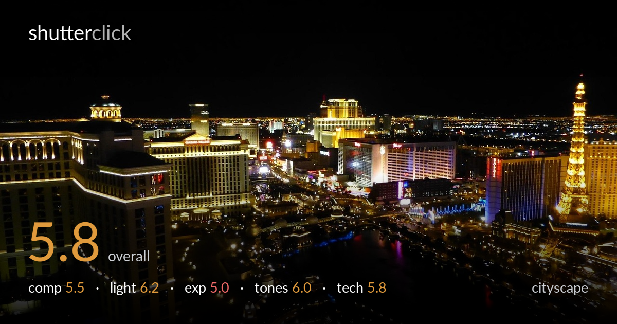
An elevated vantage over a recognisable strip delivers genuine layering and a strong sense of place, but the frame is dominated by dead black space. The upper half — roughly the top 30% — is empty sky that contributes nothing, while the most interesting cluster of buildings sits squeezed into the middle band. The Eiffel replica on the right and the domed hotel on the left make natural anchors, but the wide blacks of foreground and sky dilute the energy. Pulling the horizon higher and letting the lit city fill the frame would transform the impact considerably.
The high vantage point is a real asset, giving depth and a clear sense of the strip receding into the distance, with the Eiffel replica and domed hotel as strong bookends. But the framing wastes space: the top third is empty black sky and the lower-left foreground is largely dark and featureless. The brightest, most detailed band of buildings is compressed into the centre. Raising the camera angle or cropping to let the illuminated cityscape occupy more of the frame would concentrate the visual interest where it belongs.
The artificial light is the whole story here, and the mix of warm tungsten facades, the gold Eiffel tower, and scattered cool accents reads convincingly as a night skyline. The Bellagio dome and surrounding hotels carry pleasant detail in their lit faces. The far horizon glow adds depth. The main limitation is that the foreground falls into near-total darkness, so the layering of light loses its lower step. Catching a moment with more ambient sky glow or shooting slightly earlier at blue hour would lift the empty regions.
Exposure is the weakest link. The bright hotel facades — particularly the white-lit building centre-right and the gold tower — show clipped, blown highlights with little detail left in the brightest signage. Meanwhile the foreground and sky sit at pure black, crushing any shadow information. The dynamic range of the scene is wide and the single exposure can't hold both ends. The result reads more like accidental under-exposure of the lower frame than a deliberate choice. Bracketing and blending, or exposing slightly to protect highlights, would recover both ends.
The colour palette is the appealing part — warm golds and ambers dominate, balanced by occasional cool blues and a punch of magenta in the reflection, which suits the subject. White balance leans warm but appropriately so for tungsten-lit architecture. Contrast is naturally high given the night setting, though it tips into pure black across large areas, flattening the lower tonal range. Some mid-tone recovery in the darker districts would add gradation and stop the image splitting into bright-or-black with little in between.
Sharpness across the lit buildings is reasonable for a handheld-looking night frame, and the focus appears placed correctly on the mid-distance skyline. There is visible noise and softness in the darker regions, consistent with a high ISO needed to keep a usable shutter speed, and the brightest signage is clipped past recovery. Without a tripod and longer exposure, the image is forced to choose between motion blur and noise, and it appears to have leaned on sensitivity, which costs shadow cleanliness. A stable support allowing a low-ISO, multi-second exposure would clean the noise, hold detail in the foreground, and let the lights render more crisply. A small aperture would also tighten the point lights into sharper specular points rather than soft blooms. The wide focal length captures the scope well but contributes to the empty sky problem; a slightly longer lens compressing the strip would pack the layers more tightly and reward the elevated position.
what would elevate it
tags
Shot something like this?
Expert photo critique, on demand — scored across six categories, EXIF-aware. Start with 3 free critiques, no credit card.
critique my photo — free