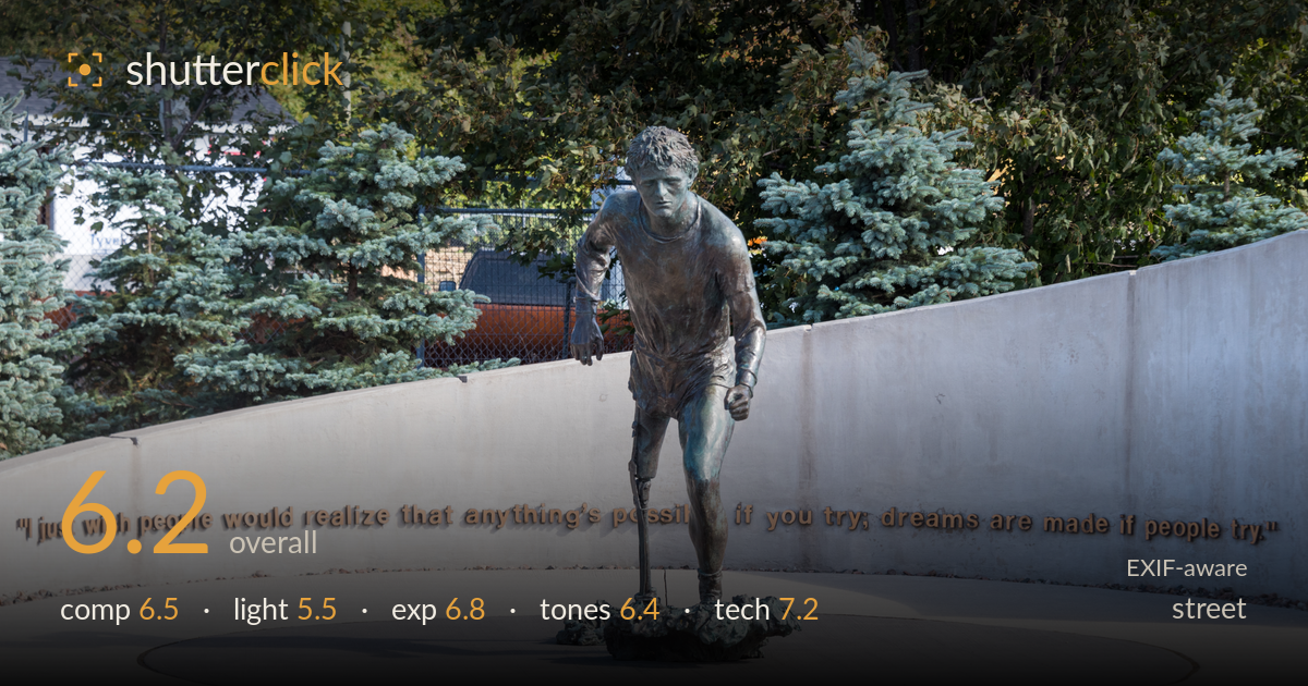
The terry fox memorial runner
Photo by Gordon Leggett

| Focal length | 92 mm |
| Aperture | f / 8.0 |
| Shutter | 1/250 s |
| ISO | ISO 200 |
| Exp. comp. | 0.0 EV |
| Shot at | 11:54 · Oct 7, 2017 |
The frame documents a Terry Fox memorial cleanly and centres the bronze runner mid-stride, with the curving quote wall pulling the eye across the base. The statue reads as the subject and the inscription supplies context, so the storytelling intent lands. What holds it back most is flat midday light: the bronze goes muddy and the whole scene feels evenly lit and low in energy. A busy, unresolved background — chain-link fence, a truck, mixed foliage on the left — competes with the memorial's dignity. Cleaner light and a tighter angle would lift this from a record shot to a photograph with presence.
The runner sits near dead-centre, which suits a symmetrical memorial and lets the arc of the wall and its inscription sweep the eye left and right. The full quote is legible, reinforcing the subject. The problem is the left third: the house, fence, truck and darker trees clutter that side and break the calm the right half achieves. The base and shadow are well placed, but the large empty foreground concrete adds little. A slightly higher or more frontal angle would balance the wall's curve and quiet the left-side distractions.
This is the weakest element. Flat, high overhead midday light leaves the bronze without modelling — the figure's musculature and the sculptor's surface detail flatten into a dull green-brown mass. Shadows fall straight down, adding no shape or drama, and the concrete wall reads evenly grey with no gradient to lead the eye. The memorial would gain enormous weight from raking low sunlight that skims the bronze and casts a long shadow across the plaza. As it stands, the light records the scene but does nothing to dignify or dramatize it.
Exposure is handled competently. Highlights on the bright concrete wall hold detail without clipping, and the darker bronze retains shadow information across its surface. The background foliage sits a touch dark but recovers, and the histogram appears well distributed for a high-contrast daylight scene. Nothing is blown or crushed in a way that costs the subject. The choice reads as deliberate and safe rather than expressive — appropriate given the flat light. A slight lift in the bronze's shadow side would help the figure separate from the trees behind it.
White balance is neutral to slightly cool, which keeps the concrete clean but does the aged bronze no favours — the greens and browns look muddy rather than rich. The gilded quote lettering carries the warmest, most pleasing tone in the frame. Overall contrast is moderate and the tonal range is decent, but the mixed greens of spruce, deciduous foliage and oxidised bronze all sit in a similar register, so the subject doesn't pop. Warming the grade slightly and deepening the bronze would give the figure more material presence.
The settings are well matched to the subject. At 92mm, f/8 delivers front-to-back sharpness across the statue and keeps the inscription legible, which is the right call for a memorial where both the figure and its context matter. ISO 200 keeps noise absent, and 1/250s is more than enough for a static bronze — there was headroom to drop ISO further or stop down had more depth been wanted, but f/8 is the lens's sweet spot here. Focus lands accurately on the runner, and the 28-300 superzoom holds up reasonably at this focal length, with acceptable corner-to-corner detail. The trade-off is that f/8 renders the cluttered background in the same sharpness as the subject, so nothing separates the figure from the fence and truck behind it. A wider aperture would have thrown that distraction out of focus, at the cost of the wall's legibility — a genuine tension the flat framing doesn't resolve. Solid, unshowy execution.
What would elevate it
Tags
Shot something like this?
Expert photo critique, on demand — scored across six categories, EXIF-aware. Start with 3 free critiques, no credit card.
critique my photo — free