The theatre under a broken sky
Photo by Florstein (Telegram:WikiPhoto.Space)

| Focal length | 13 mm |
| Aperture | f / 9.0 |
| Shutter | 1/250 s |
| ISO | ISO 125 |
| Exp. comp. | 0.0 EV |
| Shot at | 12:14 · Oct 1, 2014 |
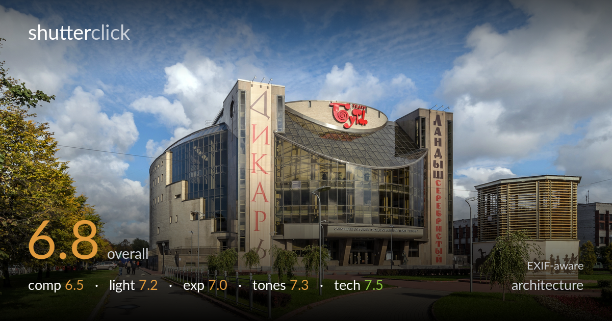
A clear, well-documented record of a striking theatre building, helped by clean daylight and a dramatic cloud-filled sky. The dual converging walkways pull the eye toward the entrance effectively. What most holds it back is the competition for attention: the building shares the frame with a second pavilion and sculpture group on the right, splitting focus, while the foreground asphalt path occupies a large, low-interest area. Verticals also lean inward from the wide lens. Tightening the framing onto the theatre and correcting perspective would lift this from a solid architectural document toward a more deliberate statement.
The two paving paths converge nicely toward the entrance and give depth, and the autumn trees frame the left edge. But the frame tries to hold too much: the wooden pavilion and silhouette sculpture group on the right pull weight away from the main theatre, splitting the subject. The large expanse of grey asphalt across the lower-left foreground is dead space with little texture or interest. A tighter framing on the curved glass facade, or a position that subordinates the right-hand structures, would give the building clearer primacy.
Side light from the left rakes across the textured stone and the curved glazing, separating planes and giving the facade dimension rather than flat frontal illumination. The dramatic broken cloud cover adds energy to the upper third and reads as a deliberate choice. Midday-ish sun keeps shadows fairly short, which suits the documentary clarity but costs some of the long-shadow drama golden hour would bring. Reflections in the glass curtain wall are well controlled and add interest without blowing out.
Exposure is well balanced for a high-contrast sky-and-building scene. Brighter cloud masses retain texture rather than clipping to white, and the stone facade sits at a natural midtone. Shadow areas in the glazing and under the entrance canopy hold reasonable detail without muddiness. The dynamic range is handled competently for a single frame at base ISO. A touch more shadow lift in the recessed entrance would reveal interior structure, but nothing reads as accidental under- or over-exposure here.
The colour palette is pleasant and natural: warm sandstone and brick against a saturated blue sky, with the red signage providing punchy accents. White balance is accurate, with neutral greys in the paving. Autumn yellows in the trees add seasonal warmth. Contrast is moderate and the sky has good tonal separation between cloud and blue. Saturation looks slightly boosted but stays believable. The overall grade serves the architectural-document purpose well without veering into oversaturated postcard territory.
The 13mm focal length on the 10-20mm ultra-wide captures the full building and its setting, an appropriate choice for the constraints of the site. f/9 is a sensible aperture for this lens, landing near its sharpness sweet spot and delivering deep front-to-back focus across the scene. ISO 125 keeps noise negligible, and 1/250s easily freezes the few pedestrians. Focus is accurate across the facade. The main technical cost is inherent to ultra-wide architecture: verticals converge noticeably inward, the building edges lean toward the centre, and there is mild barrel distortion bending the horizon and roofline. The lens is sharp enough that detail holds even at the frame edges. Stopping to a slightly more level camera position, or applying perspective correction in post, would straighten the leaning verticals. A tilt-shift lens or a step back with a longer focal length would have reduced the keystoning, but within this gear the execution is clean and deliberate.
what would elevate it
tags
Shot something like this?
Expert photo critique, on demand — scored across six categories, EXIF-aware. Start with 3 free critiques, no credit card.
critique my photo — free