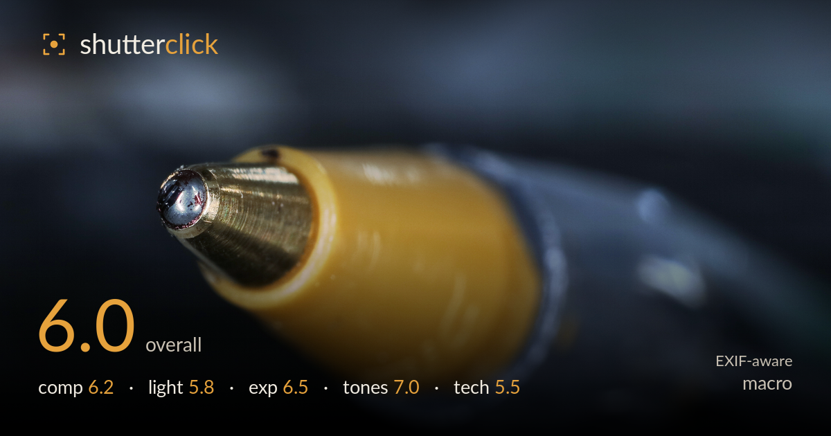
The tip of a ballpoint pen
Photo by Prosthetic Head

| Focal length | 28 mm |
| Aperture | f / 10.0 |
| Shutter | 3/10 s |
| ISO | ISO 100 |
| Exp. comp. | 0.0 EV |
| Shot at | 13:19 · Apr 16, 2018 |
The ballpoint tip is the strongest element here — the brass cone and dark ink ball hold genuine textural interest against a cool, moody background that complements the warm yellow barrel. What most holds the frame back is focus precision: the plane of sharpness sits on the metal cone but the very tip and the ink ball itself soften, and the barrel falls off quickly. At f/10 on a static subject there was room to nail a deeper, better-placed plane or stack frames. The diagonal composition works, but the tip crowds the left edge and the light is flat, leaving the metal without the sparkle it could carry.
The diagonal placement of the pen driving from lower-right to upper-left gives the frame energy and a natural lead into the tip. The warm barrel against the cool, dark negative space reads cleanly. The problem is the tip nearly kisses the left edge — a touch more breathing room ahead of the point would let the eye travel without hitting the border. The lower-left and bottom go very dark and empty, weighting the frame unevenly. Placing the sharp tip nearer a thirds intersection would strengthen the balance.
The light is soft and even, which keeps the yellow barrel smooth but leaves the brass cone flat and lifeless — metal wants a specular highlight to describe its shape and material, and there's little of that here. Direction is diffuse and frontal, so the tip lacks the modelling that would separate cone, collar and ink ball. A raking side light or a small hard source angled to catch the brass would reveal the machined texture and give the ink ball a defining catchlight. As shot, the surface reads duller than the subject deserves.
Exposure is well judged for the subject. The yellow barrel holds its detail without blowing out, the highlights on the metal are controlled, and the dark background retains enough tonal separation to read as depth rather than pure black. The histogram sits comfortably with the deep shadows intentional and the midtones on the barrel cleanly placed. ISO 100 keeps everything clean. If anything, the lower portion of the frame falls off into near-black with little recoverable detail, but that supports the isolation rather than harming it.
The colour relationship is the image's real asset — warm ochre barrel against cool steel-blue and near-black surroundings makes a pleasing complementary contrast. White balance looks accurate, with the metal reading neutral and the yellow believable rather than oversaturated. Tonal range is broad, from the bright brass to the shadowed base, with smooth gradation across the out-of-focus areas. The blues in the background have a slightly muddy cast in places, but overall the grade is restrained and cohesive, letting the subject's colour carry the frame.
At f/10, 3/10s, ISO 100 on a tripod-suitable static subject, the tools were right but the execution falls short on the one thing macro demands: focus placement. The sharpest plane lands on the brass cone's mid-section, while the ink ball at the very tip — the natural focal point — and the barrel behind both soften noticeably. At 28mm this isn't true macro magnification, so depth of field should have been more forgiving; f/10 gave a reasonable zone but it wasn't positioned on the critical detail. The three-tenths shutter confirms a stable support, which means a focus-stacked sequence was entirely feasible and would have carried sharpness from ink ball through barrel. Sharpening the tip itself, even at the cost of background, would have paid off more than the current placement. ISO 100 delivers clean, noise-free files, and the aperture is a sensible diffraction-safe choice. The gear and settings are sound; the focus decision is what needs revisiting.
What would elevate it
Tags
Shot something like this?
Expert photo critique, on demand — scored across six categories, EXIF-aware. Start with 3 free critiques, no credit card.
critique my photo — free