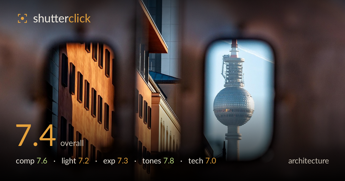
The tower through a window
Photo by wal_172619

No EXIF metadata in this file
Technical analysis based on visual assessment only.
A clever framing device — the out-of-focus foreground apertures turn the Fernsehturm and a warmly lit facade into two isolated vignettes, giving the shot a peephole intimacy that lifts it above a straight cityscape. The concept is the strength; the execution is where it wavers. The soft foreground occupies a large share of the frame and reads as murky rather than clearly intentional in every zone, and the two windows compete slightly for attention without a clear hierarchy. The tower's placement and the warm-cool split between the two panes are the real payoff. Tightening the relationship between the frames would sharpen the idea.
The dual-aperture framing is the strongest idea here — two soft-edged openings each holding a distinct subject, the tower and the golden facade. The tower sits well within its pane and reads cleanly. The trouble is balance: the two windows carry near-equal weight and pull the eye back and forth without a clear lead, and the dark central pillar dividing them feels a touch wide. A stronger vertical offset or letting one frame dominate would give the composition a clearer entry point rather than two equal destinations.
Warm low-angle light rakes across the left facade beautifully, picking out the window recesses and giving that block real dimensionality and glow. It contrasts nicely against the cooler, flatter light on the tower. The tower itself, however, sits in more even, diffuse light that renders its sphere slightly flat compared to the sculpted facade. The timing near golden hour serves the warm block well; the cool pane would benefit from the same directional shaping to unify the two halves of the frame.
Exposure is handled with restraint. The tower's silver sphere holds highlight detail without blowing out, and the warm facade retains texture in both the lit and shadowed windows. Shadows in the dark dividing pillar go deep but keep the frame anchored rather than crushing distractingly. The soft foreground edges sit in a muddy midtone that neither reads as clean bokeh nor as detail — the one exposure zone that feels ambiguous. Overall the histogram appears well controlled for a high-contrast scene.
The warm-cool split is the tonal highlight: amber and terracotta on the left facade set against the desaturated steel-blue of the tower and sky. It's a deliberate, pleasing colour contrast that reinforces the two-frame structure. White balance reads natural, with the golden light feeling authentic rather than pushed. The muted foreground tones frame the sharp zones without competing. If anything, the cool pane could carry a touch more tonal separation to match the richness of the warm side.
The shot relies on a very shallow depth of field to create the peephole effect, and focus is placed accurately on both the tower and the facade windows — both read acceptably sharp within their frames, which is the critical demand of this concept. The extreme foreground blur is clearly intentional, isolating the two apertures. The limitation is that the transition zones between sharp and soft are large and somewhat undefined, so parts of the frame read as neither crisp nor cleanly rendered bokeh — a longer focal length or a slightly stopped-down aperture might have held the two subjects sharp while tightening the blur. Detail on the tower's lattice antenna and the sphere's faceted panels is resolved well enough to satisfy at this scale. No obvious motion blur or noise issues. For architecture, verticals on the facade look reasonably controlled given the compressed, layered perspective; the tower stands straight within its window. Execution supports the idea competently without quite maximising the sharpness available.
What would elevate it
Tags
Shot something like this?
Expert photo critique, on demand — scored across six categories, EXIF-aware. Start with 3 free critiques, no credit card.
critique my photo — free