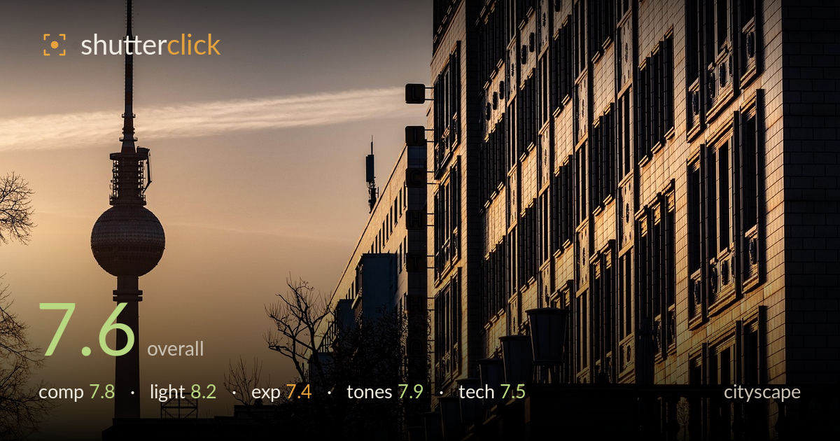
The tv tower at golden hour
Photo by wal_172619

No EXIF metadata in this file
Technical analysis based on visual assessment only.
A confident golden-hour cityscape that plays the Fernsehturm's silhouette against a warm, luminous sky while the receding building facade carries the eye deep into the frame. The lit tower ball and the raking light picking out the row of street lamps are the strongest elements, and the diagonal of the balustrade gives real depth. What most holds it back is the heavy right-hand mass, which dominates and leaves the tower slightly cramped against the top-left edge, and the deep shadow areas that lose most of their detail. A touch more headroom above the tower and gentler shadow recovery would let the composition breathe.
The receding facade builds strong perspective, and the line of illuminated street lamps functions as an effective leading element toward the tower, which anchors the negative space of the sky on the left. The balance is deliberate, but the right-hand building is a very heavy mass that crowds the frame and pushes the tower tight against the top edge, denying it breathing room. The "AUTHENTIC" sign in the lower right is a distraction that competes for attention. A little more headroom above the spire would resolve the tension.
The low golden-hour sun does the heavy lifting here, glazing the facade in warm amber and separating the row of lamps with clean edge light. The graduated sky from warm gold at the horizon to cooler grey above reads naturally and gives the tower a genuine glow. Directionality is well used, raking across the building to reveal window depth rather than flattening it. The only limitation is that so much of the left tower base and lower foreground falls into near-total shadow, sacrificing tonal information where a touch more fill light would have helped.
Exposure is judged to protect the bright sky, and the highlights on the facade and tower ball hold without clipping, which is the right priority for this light. The trade-off is heavy shadow blocking across the lower foreground and the tower's base, where detail collapses to black. Some of that is intentional silhouette and works, but the transition is abrupt rather than graceful. Pulling the deepest shadows up slightly in post would recover subtle structure without muddying the mood or lifting the sky.
The warm-to-cool tonal gradient across the sky is the image's real strength, with amber giving way to muted grey and the whole frame unified by a golden cast that suits the hour. Contrast is punchy and the saturation stays believable rather than pushed. The facade holds a pleasing range of coppery mid-tones. The main weakness is the crushed blacks in the lower third, which flatten what could be a richer tonal ladder. Slightly warmer white balance in the shadows would keep them from reading cold against the warm sky.
Focus appears accurate on the facade, with the window detail and the lamp edges rendering crisply where the light reaches them. The apparent depth of field is deep enough to hold both the near building and the distant tower in acceptable sharpness, which suits a cityscape and suggests a well-chosen aperture. The tower silhouette is clean without visible fringing, and there is no obvious motion blur, pointing to a shutter fast enough for the static scene. Noise is well controlled in the sky. A moderate telephoto compression is evident in how the tower and facade stack together, which is a good lens choice for this kind of layered urban view. The one execution note is the deep shadow areas, where the darkest zones show little recoverable information; whether that reflects the capture or the processing, retaining a touch more shadow latitude in the file would give more to work with. Overall the technical foundation is sound and dependable.
What would elevate it
Tags
Shot something like this?
Expert photo critique, on demand — scored across six categories, EXIF-aware. Start with 3 free critiques, no credit card.
critique my photo — free