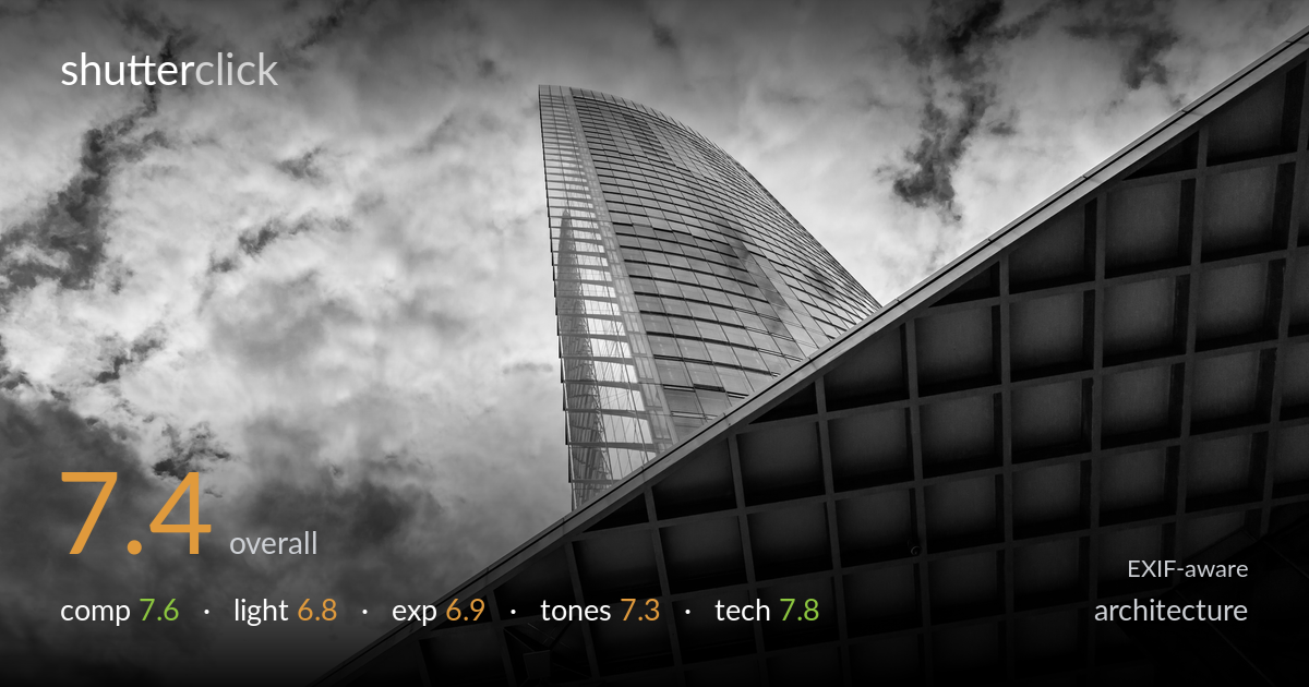
Tower against a coffered canopy
Photo by Dietmar Rabich

| Focal length | 19 mm |
| Aperture | f / 10.0 |
| Shutter | 1/500 s |
| ISO | ISO 100 |
| Exp. comp. | 0.0 EV |
| Shot at | 14:25 · Aug 20, 2017 |
A confident upward-looking composition that plays the curved glass tower against the hard diagonal of the coffered canopy, with the dramatic cloud field doing real work. The diagonal grid of the soffit is the strongest element — its geometry and depth anchor the frame. What most holds the shot back is the bright upper-right sky, which edges toward blown highlights and pulls attention from the structure, and a few competing lines (the lamp post, lower glass band) that clutter the lower frame. The black-and-white treatment suits the subject, though the cloud rendering verges on heavy-handed. A cleaner highlight recovery and a touch more restraint in the sky would sharpen the impact.
The intersecting forms work well — the swooping glass tower set against the hard triangular wedge of the canopy creates real tension, and the coffered soffit's receding grid gives strong depth. The diagonal sweeping from lower-left to upper-right organises the frame effectively. The lamp post in the lower-centre is a distraction, sitting awkwardly against the dark soffit, and the lower glass band feels like an afterthought rather than a deliberate third element. Cropping or repositioning to clean the bottom edge would tighten the geometry considerably.
Backlit, with the tower's glass catching reflected sky and the canopy soffit falling into shadow — a reasonable read of available light, and the contrast between lit cloud and dark structure builds drama. The light direction emphasises the soffit's recessed coffers nicely, giving them dimension. The upper-right sky, however, is pushing hard against the highlight ceiling, and the overall lighting feels more found than shaped. A slightly later or sidelit moment would have raked across the tower's curve and revealed more surface modelling on the glass.
Exposure is biased to hold the structure, which leaves the bright cloud regions — especially upper-right and lower-left — close to clipping, with some patches likely gone. The soffit retains good shadow detail and the glass facade holds its reflections, so the midtones are well placed. At ISO 100 there is ample latitude, and a slight negative compensation or bracketing would have protected the sky. As it stands the histogram is crowding the right end where it matters most for cloud texture.
The black-and-white conversion suits the architectural subject, with deep blacks in the coffers and a broad midtone range across the glass. Contrast has been pushed to dramatise the clouds, and that's where it tips slightly heavy — the sky reads as crunchy rather than gradated, and some mid-cloud detail flattens out. The tower's glass holds a pleasing tonal sweep from light to dark. Easing the cloud contrast and lifting the deepest highlights would restore a smoother, more natural gradation without losing the mood.
Settings are well chosen for the subject. f/10 at 19mm delivers front-to-back sharpness across both the near soffit and the distant tower, which is exactly what this layered composition needs. ISO 100 keeps the file clean and maximises dynamic range — sensible given the bright sky. 1/500s is faster than necessary for a static building hand-held, so there was room to stop down further or drop ISO had it been needed, but it guarantees no shake. Focus is accurate, with the grid edges crisp and the glass mullions resolved well. The 15-85 at 19mm introduces mild barrel distortion and the wide upward angle produces strong converging verticals — appropriate here as a deliberate dynamic choice rather than a flaw, though a tilt-shift or post correction would offer the option of straightened lines. Overall a technically sound capture; the main missed opportunity was metering for the highlights to protect the sky, which the clean ISO 100 file would have handled easily.
what would elevate it
tags
Shot something like this?
Expert photo critique, on demand — scored across six categories, EXIF-aware. Start with 3 free critiques, no credit card.
critique my photo — free