Tower framed between glass and steel
Photo by wal_172619

No EXIF metadata in this file
Technical analysis based on visual assessment only.
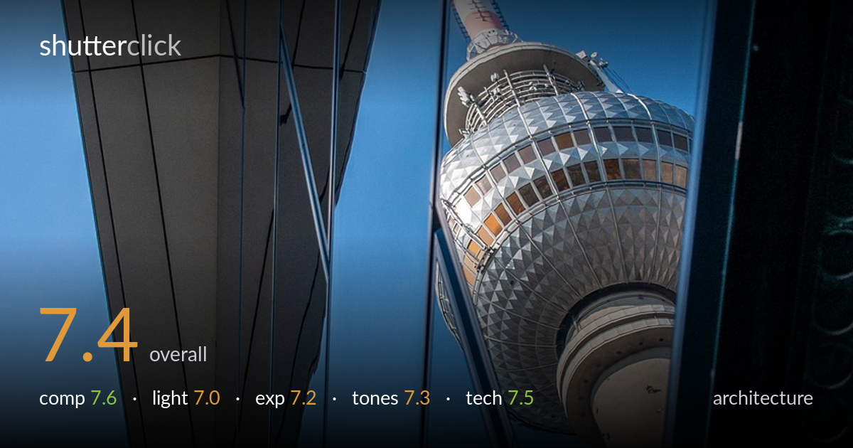
A confident framing device — the dark angular soffit and reflective glass facade channel the eye toward the television tower wedged in the gap. The diagonal convergence of the building lines creates strong tension and a real sense of vertical scale. What holds it back is the slightly cluttered right edge where a third structural element competes without quite earning its place, and a tower sphere that sits a touch soft against the crisp foreground lines. The blue-on-blue palette is cohesive but could carry more tonal punch. A strong graphic idea, executed with intent and only minor refinements away from being genuinely striking.
The strongest move here is using the dark building edge and glass facade as a converging frame that funnels attention to the tower in the central gap. The diagonals generate real energy and exaggerate the upward scale. The tower's placement in the right-of-centre slot works well against the heavy negative space of sky. The right margin, however, introduces a third dark vertical that crowds the frame without adding structure — trimming or rebalancing it would tighten the geometry. The reflected lines in the glass add welcome rhythm.
Flat, even daylight under a clear sky keeps the metal cladding and the tower's geometric sphere legible, but it lacks the raking direction that would model the facets and bring out texture. The light is functional rather than expressive — the dark soffit reads as near-silhouette, which suits the graphic intent, but the tower itself sits in soft, undramatic illumination. Shooting closer to golden hour, or with the sun raking across the facade, would carve more dimension into both the building and the tower's surface.
Exposure is well controlled across a tricky range — the bright tower sphere holds detail in its silver facets without clipping, while the deep shadows of the soffit retain just enough information to read as form. The blue sky sits at a clean midtone. The darkest structural edges verge on blocking up, which is acceptable given the graphic approach but leaves little recovery latitude. Overall a deliberate, balanced rendering that protects the highlights on the most important subject.
The cool blue palette is cohesive and ties the sky, glass reflections and shadowed metal into a unified mood. The warm reds and tans on the tower's antenna and sphere provide a useful accent against that blue. White balance reads accurate and neutral. Contrast is moderate but could push further — the midtones feel slightly flat, and a touch more separation between the dark facade and the sky would sharpen the graphic impact. Saturation is restrained and tasteful rather than punchy.
Focus appears placed on the foreground building edges, which are crisp and well resolved, while the tower sphere reads marginally softer — likely a depth-of-field or focus-plane decision rather than camera shake. For an architectural shot prioritising the tower as the payoff, nudging critical focus onto the sphere would strengthen the image, since the eye expects the subject to be the sharpest element. Depth of field looks adequate to hold most of the frame acceptably. Noise is well controlled in the shadows, suggesting a low ISO and good base exposure. The lens choice and shooting angle exploit perspective effectively, with the convergence reading as intentional rather than accidental keystoning. No obvious chromatic aberration along the high-contrast edges. The overall capture is clean and technically sound; the main improvement lies in focus priority and squeezing slightly more from the dark structural tones without losing the deliberate near-silhouette of the soffit.
What would elevate it
Tags
Shot something like this?
Expert photo critique, on demand — scored across six categories, EXIF-aware. Start with 3 free critiques, no credit card.
critique my photo — free