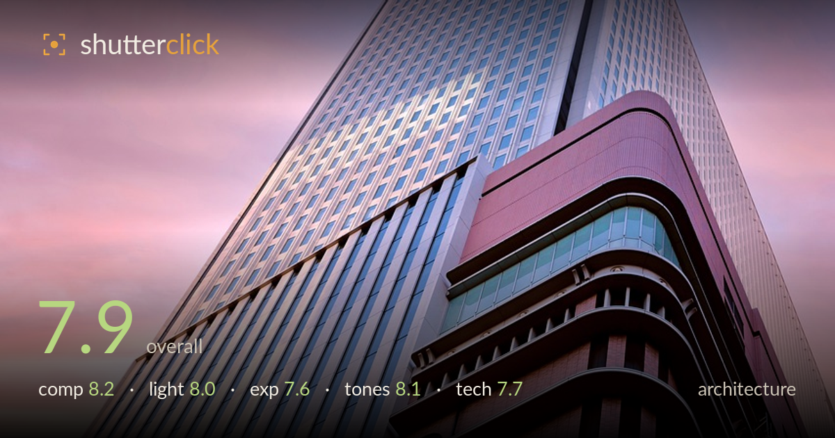
Tower reaching into a pastel sky
Photo by djedj

No EXIF metadata in this file
Technical analysis based on visual assessment only.
A confident upward-looking study of a tower, anchored by the strong central spine where two facades meet and split the frame into contrasting textures — the crisp glass grid on one side, the rounded balcony tiers on the other. The pastel sunset sky earns its place and grades beautifully into the warm reflections on the lower brick face. What holds it back most is the extreme convergence of the verticals: dramatic, but it tips toward disorientation rather than deliberate geometry. The upper glass tower also loses some highlight detail. Strong, cohesive, and genre-appropriate.
The diagonal spine where the two facades meet drives the eye upward with real force, and the contrast between the flat glass grid and the sculptural rounded balconies gives the frame two distinct textures to play against each other. The tight upward angle exaggerates scale effectively. The apex sits high and slightly off-centre, which works. The sky occupies a generous portion on the left, well used by the sunset colour. A touch more breathing room around the peak would let the tower resolve rather than crowd the top edge.
The timing is the real strength here — a soft sunset throws warm, directional light across the rounded balcony tiers, kindling copper and gold in the brickwork while the glass tower stays cooler and lit from a raking angle. The pastel gradient in the sky is a genuine gift of the hour, not manufactured. Shadow rendering between the balcony floors adds depth and rhythm. The contrast between warm lower facade and cool upper glass is handled naturally, and the low sun grazes the surfaces to reveal texture rather than flatten it.
Exposure is largely well judged, holding the pastel sky gradient without banding and keeping the warm reflections rich. The upper glass tower, however, pushes toward the highlight ceiling where the sky reflects off the panels — some panels read as near-clipped and lose their grid definition. Shadow detail in the recessed balcony bays holds up nicely with visible texture. The midtones on the brick facade are well placed. A slightly darker exposure or a highlight recovery pass would protect the brightest glass without dulling the overall mood.
The colour story is the standout — cool lavenders and pinks in the sky answered by warm copper and amber on the sunlit brick, a complementary balance that feels intentional rather than accidental. White balance sits believably at sunset. The gradation across the sky is smooth and the saturation is pushed just enough to sell the mood without tipping garish. Contrast between the two facades reinforces the split composition. If anything, the pink cast on the glass tower runs slightly heavy, faintly muddying what could be a cleaner cool counterpoint.
Focus is accurate across the facade, with the balcony railings, the porthole windows, and the brick texture all rendering crisply, and depth of field is deep enough to keep both near and far surfaces sharp — appropriate for architecture. Noise is controlled and the image looks clean at this scale. The wide, upward-tilted framing produces strong perspective convergence; the verticals lean hard toward the apex, which reads as an expressive choice but stops just short of feeling controlled. For architecture, judged strictly, the keystoning is significant — a shift lens or perspective correction in post would let the geometry feel deliberate rather than dramatic-by-accident. The lens shows minimal distortion on the straight glass grid, which suggests a decent optic. Sharpening looks reasonable without haloing along the high-contrast edges between building and sky. Overall execution is solid; the main technical lever left on the table is disciplined perspective control, followed by taming the brightest reflective glass to preserve its grid detail.
What would elevate it
Tags
Shot something like this?
Expert photo critique, on demand — scored across six categories, EXIF-aware. Start with 3 free critiques, no credit card.
critique my photo — free