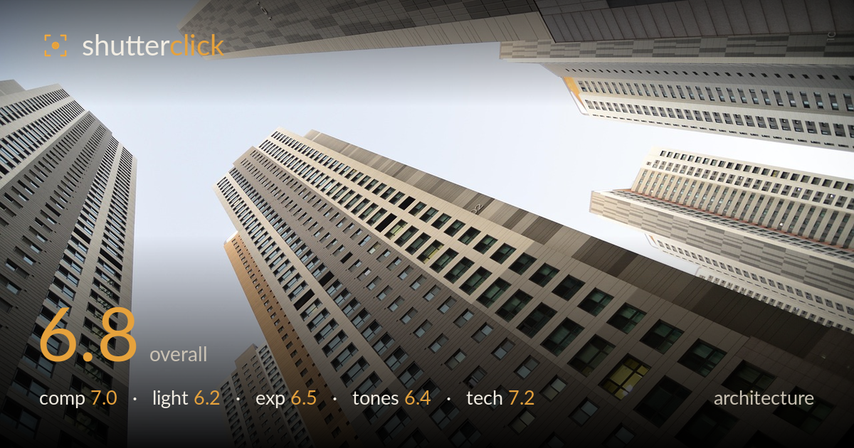
Towers converging into the sky
Photo by wal_172619

No EXIF metadata in this file
Technical analysis based on visual assessment only.
A confident up-angle look-up that uses converging verticals to pull several towers toward a shared vanishing point in the sky — a familiar but effective architectural device that reads with energy here. The wedge of pale sky at upper-left balances the mass of buildings well. What most holds the shot back is the flat, hazy light and a slightly washed sky that drains contrast from the facades, plus a foreground tower that dominates the lower-right without a clear hierarchy. Tighter tonal separation and a stronger single anchor tower would lift this from a competent geometric study to a striking one.
The radial convergence of five towers into the upper-left sky gives the frame strong graphic pull, and the diagonal building edges act as leading lines toward that shared vanishing point. The negative space of sky is well proportioned against the building mass. The weakness is that no single tower is given clear dominance — the eye ricochets between the near facade lower-right and the several receding slabs, so the frame reads busy rather than resolved. Committing to one anchor structure would sharpen the composition.
The light is soft and diffuse, likely hazy midday or overcast, which flattens the facades and mutes the sense of depth that raking side light would carve into these repeating grids. It avoids blown highlights and harsh shadow, which keeps window detail readable, but the tradeoff is a lack of dimensionality — the towers feel evenly lit and slightly lifeless. A lower-angle sun grazing the surfaces, or golden-hour warmth catching the upper floors, would give the geometry far more sculptural presence.
Exposure is safely middle-of-the-road: the facades hold detail across their range and the lit interior windows aren't clipped. The sky, however, sits pale and slightly washed toward the vanishing point, edging toward blown without quite reaching pure white, which flattens the brightest zone of the frame. Midtones on the buildings are comfortably placed. Protecting the sky a third to half a stop lower, then lifting the building shadows in post, would restore the tonal separation the scene needs.
The palette is muted and cool-neutral — grey and beige facades against a hazy blue-white sky, with only the warm ochre panel and a few lit windows breaking the monotony. White balance reads slightly cool and a touch flat. Contrast is low, which suits the calm mood but leaves the surfaces looking greyed. A modest contrast lift plus targeted warmth in the highlights would make the facade materials read more distinctly and give the sky-to-building transition more life.
Focus is accurate across the facades, with the window grids rendering crisp well into the distance, which is exactly what this deep-field architectural approach demands — depth of field appears well judged for the subject. The wide lens is the right tool for the look-up, and it exaggerates the convergence to good effect, though there's visible barrel and perspective distortion bending the outer towers, which is inherent to the angle rather than a flaw. Sharpness holds cleanly across the frame with no obvious motion blur or high-ISO noise, suggesting a steady hand and adequate light. The main technical consideration is that the extreme wide angle stretches the corner buildings noticeably; a slightly longer focal length from further back would tame that if a cleaner geometry were wanted. Overall execution is solid and the image is technically clean — the limitations here are more about light and tonal treatment than capture.
What would elevate it
Tags
Shot something like this?
Expert photo critique, on demand — scored across six categories, EXIF-aware. Start with 3 free critiques, no credit card.
critique my photo — free