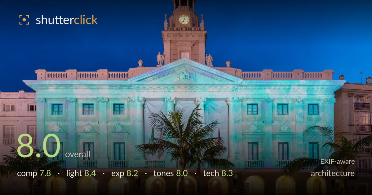
Town hall facade at blue hour
Photo by Diego Delso

| Focal length | 16 mm |
| Aperture | f / 10.0 |
| Shutter | 3/5 s |
| ISO | ISO 100 |
| Exp. comp. | 0.0 EV |
| Shot at | 18:36 · Dec 8, 2015 |
A well-executed blue-hour architectural frontal, with the ambient sky balanced cleanly against the projected illumination and warm archway glow. The near-symmetrical framing suits the neoclassical facade, and the clock tower anchors the top of the frame. What most holds it back is the palm tree dead-centre, which splits the main doorway and creates a distracting vertical trunk right through the building's axis. The blue-green projection on the facade reads as unusual — it may be an event installation, but it flattens the stone's natural texture. Verticals are largely controlled and the light timing is judged well.
The frontal, symmetry-driven approach is right for this facade, and the clock tower gives a strong vertical anchor. The plaza foreground and flanking palms add depth and frame the entrance. The central palm trunk is the main problem — it rises straight through the main doorway and the building's axis, splitting the strongest point of interest. The framing also clips both neighbouring buildings awkwardly at the edges. A step laterally, or waiting for a cleaner sightline to the entrance, would resolve the collision without losing the symmetry.
The blue-hour timing is judged precisely — the sky retains deep saturated blue while the artificial illumination reads clearly, the ideal window for architecture at dusk. The warm tungsten glow in the arcade arches balances beautifully against the cool projected facade, and the interplay of warm and cool gives the frame energy. The projected blue-green wash across the stone is dramatic, though it does mute the natural relief and texture of the neoclassical detailing. The illuminated clock face adds a welcome focal accent against the dark tower.
Exposure is handled well across a difficult dynamic range. The bright arcade lights hold detail without blowing out, the deep sky retains information, and the shadowed tower against the dark upper sky keeps separation. The 3/5s exposure at ISO 100 captured the full tonal spread of a blue-hour scene cleanly. Highlights in the arch lamps are near the ceiling but controlled. Shadow detail in the darker facade areas and the tower brickwork remains readable. A deliberate, balanced rendering with no evident clipping issues.
The warm-cool split — cobalt sky and orange arcade against the teal projection — drives the palette effectively. White balance holds a natural neutral in the arcade stone and doorways. The projected blue-green is the wild card: striking as a mood, but it dominates the midtones and can read slightly artificial where it washes the facade. Contrast is well judged for dusk, with clean separation between lit and shadow zones. The tonal gradation in the sky is smooth. Overall a coherent, atmospheric grade.
Solid technical execution for the genre. At 16mm on the EF16-35 f/4L, the wide angle captures the full facade from a workable plaza distance, and f/10 delivers front-to-back sharpness across the building and foreground plaza. ISO 100 keeps the file clean and noise-free, ideal for a tripod-based dusk frame. The 3/5s shutter is appropriate here — long enough for the low light, short enough that the palm fronds show only minimal movement. Verticals are largely corrected, though a faint outward lean remains at the frame edges, typical of 16mm even after correction; the neighbouring buildings tilt slightly. Focus is accurate on the facade plane. The main technical cost of the ultra-wide is edge stretching on the flanking buildings and palms, which exaggerates their scale. Stopping to f/8 would have been equally sharp with marginally less diffraction, but the difference is negligible. Clean, disciplined capture overall.
What would elevate it
Tags
Shot something like this?
Expert photo critique, on demand — scored across six categories, EXIF-aware. Start with 3 free critiques, no credit card.
critique my photo — free