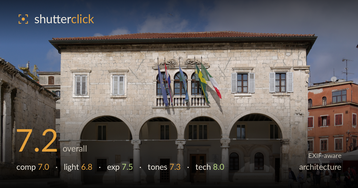
Town hall facade on the square
Photo by Berthold Werner

| Focal length | 24 mm |
| Aperture | f / 11.0 |
| Shutter | 1/350 s |
| ISO | ISO 100 |
| Exp. comp. | 0.0 EV |
| Shot at | 12:00 · Oct 11, 2014 |
A clean, well-executed frontal record of the town hall facade with the arcade and balcony reading clearly and verticals held remarkably straight. The building is documented with clarity and the warm stone against the deep blue sky is appealing. What holds it back is the flat, near-midday light that keeps the arched loggia's recesses in heavy shadow and mutes the relief of the stonework, plus a large expanse of empty foreground paving that does little to lead the eye. Tighter framing and lower, raking light would elevate this from a competent architectural record to a more atmospheric portrait of the building.
The frontal, near-symmetrical approach suits this civic facade, and the verticals sit impressively true. The building is well centred with breathing room on both sides, and the neighbouring ruin at left and terracotta block at right give useful context and scale. The lower third, however, is a broad slab of empty paving that adds little; a tighter crop from the bottom would give the arcade more presence. The pigeons and distant figures offer minor human interest but sit at the edges rather than anchoring the composition.
The light is the weakest element. Shot under high, roughly midday sun, the facade is evenly lit but flat, so the carved reliefs, capitals and window surrounds lose the modelling that side light would reveal. The arcade recesses fall into deep, detail-poor shadow, creating a hard tonal split between the sunlit stone and the dark loggia. The sky's directional cloud helps, but softer or lower-angle light — early or late in the day — would rake across the stonework and give the texture and depth the subject deserves.
Exposure is well judged for a bright, high-contrast scene. The sunlit stone holds highlight detail without clipping and the red roof tiles retain colour and structure. The deep shadows under the arches are dark but not wholly blocked, and the blue sky is rich without going murky. Given the wide dynamic range between lit facade and shaded loggia, the balance struck here is sensible; a touch of shadow lift in post would recover interior arcade detail without pushing the overall exposure off.
The warm limestone reads pleasingly against the graduated blue sky, and the terracotta building at right adds welcome colour contrast. White balance is neutral and believable, with the stone free of unwanted casts. Contrast is on the higher side, driven by the harsh light rather than grading, which deepens shadow blocks. Saturation feels natural rather than pushed. The tonal range is broad but weighted toward the extremes; more mid-tone gradation across the shaded stonework would give the surfaces a richer, more three-dimensional feel.
Technically this is sound work. At 24mm on the K10D's APS-C sensor (roughly 36mm equivalent), the focal length is a sensible choice for a facade at this distance, avoiding gross wide-angle distortion, and the verticals are held very well — either through careful camera levelling or correction, an important discipline for architecture. f/11 is the right call for edge-to-edge sharpness across a flat subject at this distance, sitting near the lens's optimal aperture before diffraction softens things. ISO 100 keeps noise absent and preserves clean detail in the stone. At 1/350s, camera shake is a non-issue and the few moving figures are adequately frozen. Focus is accurate across the plane of the facade, with crisp rendering of the arches, balustrade and window shutters. The only technical note is minor softness and low contrast in the deepest shadow areas, a consequence of light rather than execution. A polariser would have deepened the sky and cut some stone glare.
What would elevate it
Tags
Shot something like this?
Expert photo critique, on demand — scored across six categories, EXIF-aware. Start with 3 free critiques, no credit card.
critique my photo — free