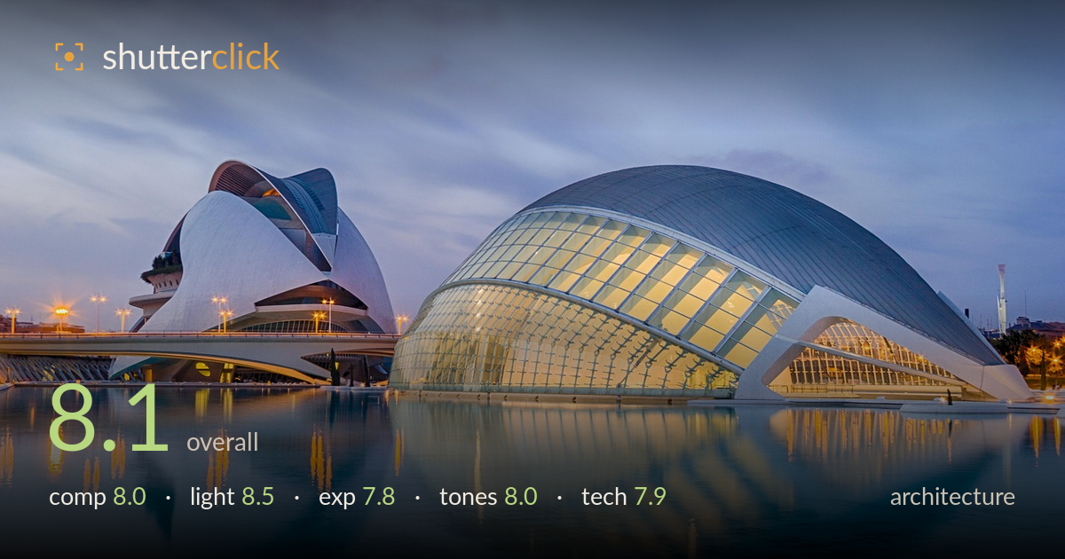
Twilight over the reflecting pool
Photo by papagnoc

No EXIF metadata in this file
Technical analysis based on visual assessment only.
A confident blue-hour architectural study anchored by the sweeping dome and its mirror reflection. The timing is the strongest asset — the warm interior glow set against a cool twilight sky is exactly the balance this subject rewards. The two sculptural forms play off one another well, and the reflecting pool doubles the impact. What most holds it back is the expanse of empty foreground water, which occupies nearly half the frame without adding proportional interest, and slightly soft rendering in the reflection zone. A tighter vertical balance and a cleaner sense of edge discipline would sharpen an already accomplished image.
The two curved structures are placed with good rhythm, the dome dominant on the right and the pointed form as a supporting counterweight left. The reflecting pool doubles the geometry effectively. However, the foreground water fills close to half the frame and grows featureless toward the bottom edge, diluting the energy. Raising the horizon or reducing the water share would concentrate attention on the architecture. The left structure sits slightly cramped against the frame edge; a touch more breathing room there would balance the composition better.
Blue-hour timing is judged very well — the moment when ambient sky and artificial light reach parity. The warm glow through the dome's glazing reads beautifully against the cool overcast twilight, and the path lights add secondary sparkle without overwhelming. The soft, directionless sky light keeps the white forms clean and free of harsh shadow. The only limitation is the flat, cloud-diffused sky, which lacks the drama a clearer gradient or lingering sunset colour might have provided. Still, the light does the heavy lifting here.
Exposure balances a wide dynamic range competently — the glowing interior retains detail rather than blowing out, and the twilight sky holds gradation. Shadow areas under the bridge and structures stay open with visible detail. The brightest window panels edge toward clipping in places but remain largely controlled. The foreground water is rendered a shade brighter than ideal, pulling the eye downward. A slightly darker foreground and marginally more restraint on the interior highlights would tighten the tonal hierarchy without sacrificing the mood.
The cool-warm colour interplay is the tonal signature here, and it works: teal water and steel-blue sky framing the amber interior. White balance sits convincingly in blue-hour territory. Contrast is gentle, suiting the soft light, though the mid-tones in the sky flatten somewhat. Saturation on the water is a touch punchy in the lower frame, drifting toward an artificial cyan. Reining that back slightly and adding a hint of contrast to the sky would give the palette more depth while preserving the serene twilight feel.
The image shows the hallmarks of a tripod-based blue-hour exposure — the smooth, slightly softened water and streaked cloud movement suggest a longer shutter, which suits the still, glassy surface well and keeps ISO low for clean rendering. The main structures are rendered sharply, with crisp edge definition on the dome's ribbing and glazing. Depth of field is more than adequate; everything from near water to distant buildings holds acceptable focus. Verticals are largely controlled — the light poles and structural columns read close to true, indicating either careful leveling or corrected perspective, which matters greatly in architecture. The lens choice captures the scene wide enough to include both forms and their reflections without obvious distortion at the edges. The reflection zone is marginally softer than the architecture itself, likely from subtle water movement during the exposure rather than focus error. Overall execution is clean and deliberate, with only minor highlight management and foreground sharpness open to refinement.
What would elevate it
Tags
Shot something like this?
Expert photo critique, on demand — scored across six categories, EXIF-aware. Start with 3 free critiques, no credit card.
critique my photo — free