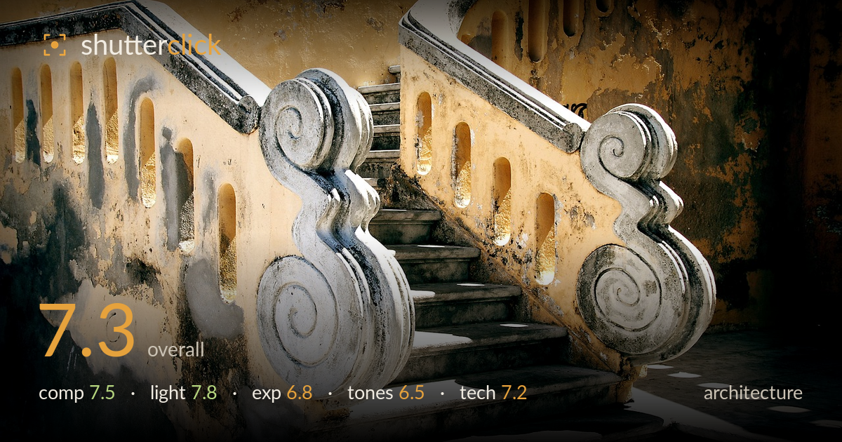
Twin scroll balustrades on old steps
Photo by PIRO4D

No EXIF metadata in this file
Technical analysis based on visual assessment only.
A pair of weathered scroll balustrades framing a central staircase makes for a strong, symmetrical subject with genuine character in the aged plaster and stone. The warm golden wash and diagonal shadows carry real atmosphere. What most holds the image back is a heavy vignette and over-warmed grade that push the corners into muddy darkness and flatten the yellows into an artificial-looking cast. The twin volutes anchor the frame well, but the tight top crop clips the upper handrail curves just as they resolve. A cleaner tonal treatment and a touch more headroom would let the architecture, rather than the processing, do the talking.
The twin scroll volutes create a natural, symmetrical frame that funnels the eye up the central steps — a satisfying use of the balustrade geometry. The diagonal of the ascending stairs adds depth and directs attention convincingly. Balance between the two carved masses is well judged. The weakness is the top edge: the upper handrail curves are clipped just as they complete, and the frame feels slightly cramped there. A touch more headroom and slightly more of the landing at lower right would give the structure room to breathe.
Warm raking light does good work here, skimming across the plaster to reveal its cracked, water-stained texture and throwing crisp diagonal shadows through the balusters. The dappled patch of light on the landing at right adds a nice secondary point of interest. Direction is genuinely flattering to the carved stone, giving the volutes dimension. The light is on the harder side, which suits the aged material, though the deep contrast between the sunlit face and the shadowed recesses pushes some areas toward being unreadable.
The midtones on the sunlit plaster are placed well and hold the texture that gives the image its character. Highlights on the white stone volutes are close to clipping but retain enough detail to read. The main issue is the shadow end: the vignette and the naturally dark recesses crush together into featureless black in the corners and lower right, losing information that would otherwise support the frame. A gentler treatment lifting those shadows slightly would recover depth without flattening the contrast that works.
The golden-ochre palette is the image's signature and its liability. The warmth is pushed hard enough that the yellows read slightly artificial and the whole frame skews toward a single hue, collapsing tonal variety. The white stone reads convincingly cool against it, which helps. The heavy vignette drags the corners into muddy, desaturated darkness that fights the warmth at the centre. Dialing back the global warmth and easing the vignette would restore a more natural, believable range across the plaster.
Focus is placed accurately on the near volute and carries adequate sharpness across the balustrades and steps, with detail holding well in the plaster and stone surfaces — the depth of field is sufficient to keep the whole architectural plane usably crisp. There is no obvious motion blur, and noise is not a distraction at this viewing size. The lens choice renders the scene without notable distortion, and the perspective keeps the balusters reading cleanly. The most visible technical intervention is post-processing: the strong vignette and aggressive warm grade are choices that dominate the file more than any capture flaw. These push the corners into mush and lend the yellows an unnatural, over-cooked quality. A more restrained edit would let the genuinely good capture — sharp, well-exposed in the midtones, cleanly framed — stand on its own merits rather than being masked by heavy-handed toning.
What would elevate it
Tags
Shot something like this?
Expert photo critique, on demand — scored across six categories, EXIF-aware. Start with 3 free critiques, no credit card.
critique my photo — free