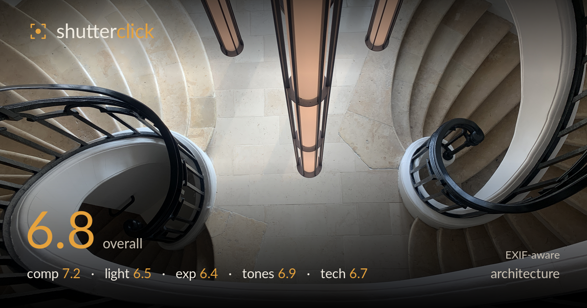
Twin spirals down the stairwell
Photo by Till Niermann

| Focal length | 4 mm |
| Aperture | f / 1.8 |
| Shutter | 1/195 s |
| ISO | ISO 32 |
| Exp. comp. | 0.0 EV |
| Shot at | 09:48 · Oct 4, 2021 |
The twin descending spirals of the twinned staircase create genuine graphic energy, and the downward vantage is the right instinct for this subject. What most holds the image back is the pendant light cluster hanging straight down the centre — it splits the frame and competes with the stair curves rather than resolving into them. The composition also fights a slight asymmetry: the two spirals aren't balanced, and the busy metal grate at the bottom edge pulls weight low. A cleaner sightline down the well and a more considered relationship between the fixture and the curves would let the geometry breathe.
The two nested spirals are the strength here — the sweeping white handrails read as elegant leading curves that carry the eye down and around. The problem is the central chandelier column, which drops vertically through the middle and interrupts the very geometry it should crown. It reads as a dark spine bisecting the swirl. The lower-left stairwell and lower-right void aren't quite balanced, and the metal grate along the bottom edge adds clutter. A vantage shifted to place the fixture off-axis, or a tighter crop on one spiral, would strengthen the flow.
The light is soft, even, and diffuse — the pale stone treads carry gentle gradation and the scene avoids harsh shadow, which suits the calm interior. The warm glow from the pendant tubes adds a pleasant accent against the cool stone. What's missing is directional light to model the stair edges; the flatness leaves the treads reading a touch soft and undefined. A moment with stronger raking daylight from a window would carve the curves and give the stone more three-dimensional presence.
Exposure is broadly well judged for a high-contrast interior — the pale stone holds detail without blowing out, and the warm lamp tubes retain some structure rather than clipping to pure white. The darker grate and ironwork sink toward black but keep enough shape to read. The overall rendering sits slightly bright in the stone midtones, flattening some of the tonal separation between treads. A touch more highlight recovery on the brightest floor tiles would preserve texture in the lower centre where it drifts toward featureless white.
The palette is quietly effective: cool cream stone against the warm amber of the light tubes and the near-black ironwork make a restrained three-note scheme. White balance is neutral and believable. Contrast is on the gentle side, which fits the airy feel but leaves the mid-tones of the stone slightly muddy in places. The blacks in the railings could go a shade deeper for more punch. Overall the tonal range is pleasant and coherent, just a little soft in separation between the various beige surfaces.
The iPhone XR's 4mm f/1.8 lens at ISO 32 and 1/195s is a sensible set of choices for a bright, static interior — the low ISO keeps noise negligible and the fast shutter guarantees no shake blur from the awkward downward-leaning position. At this focal length and subject distance depth of field is effectively total, so everything from the near railing to the floor below reads acceptably sharp; the slight softness in the stone treads is more about flat light and small-sensor detail rendering than any focus error. The ultra-wide field does introduce noticeable barrel distortion and stretching at the frame edges, exaggerating the outer railings — a real limitation of the phone's single wide lens here. The pendant tubes at the top also show mild flare and clipping. Nothing about the capture is technically wrong for the gear; the constraint is the lens itself. A dedicated wide with corrected geometry, or a rectilinear correction in post, would tame the edge distortion and let the spiral read truer.
What would elevate it
Tags
Shot something like this?
Expert photo critique, on demand — scored across six categories, EXIF-aware. Start with 3 free critiques, no credit card.
critique my photo — free