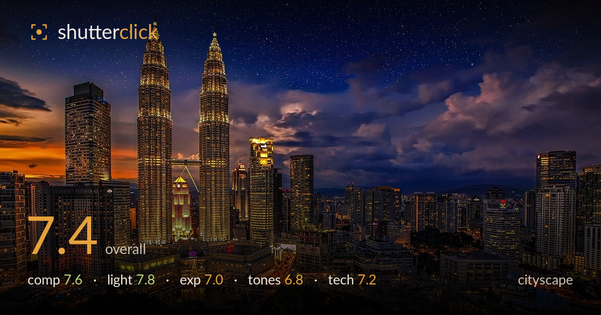
Twin towers at blue hour
Photo by Walkerssk

No EXIF metadata in this file
Technical analysis based on visual assessment only.
A confident twilight skyline anchored by the Petronas Towers, with the leftover sunset glow on the left horizon giving the frame a genuine sense of time and place. The towers are placed with good instinct, the layering of buildings recedes convincingly, and the warm-lit foreground balances the deep blue sky. What holds it back most is the tone handling: the sky shows signs of heavy processing, and the star field reads as pushed rather than natural, which undercuts the credibility of the moment. Tighter control over saturation and a cleaner sky would lift this from strong to excellent.
The twin towers are placed left of centre with the skyline fanning out to the right, a solid and dynamic arrangement that avoids dead symmetry. Foreground park and mall lights give a base layer, mid-ground towers build depth, and the horizon sits low enough to let the sky breathe. The bright residual sunset on the left edge pulls some attention away from the main subject. A hair more space above the tower spires would help, as the tips crowd the top edge slightly.
The blue-hour timing is the real strength here — deep sky colour retained while the city lights are fully lit, the ideal window for cityscape work. The warm sodium and tungsten glow of the towers and streets plays beautifully against the cool sky. The lingering orange sunset at left adds a natural gradient. The only caution is that the balance between artificial and ambient light looks partly manufactured in post rather than caught in a single honest exposure.
Exposure is broadly well judged for a high dynamic range scene: the tower highlights hold detail without blowing out, and the shadowed foreground retains texture. The brightest window and signage areas are close to clipping but mostly recoverable. The sky is exposed to keep colour rather than crush to black, which suits the mood. There's a slightly flat, HDR-like quality across the frame that softens contrast where a touch more punch in the midtones would give it more dimensionality.
This is the weakest link. The blue-to-orange gradient is appealing but the saturation is pushed hard, giving the sky an artificial, over-graded look, and the stars appear boosted beyond what a scene with this much light pollution and cloud would show. White balance leans slightly heavy on the warm foreground. The cloud detail on the right is nicely rendered, but the overall palette would read more convincingly with the saturation dialled back and a gentler transition between the warm and cool zones.
From visual evidence the shot appears sharp across the skyline with good detail in the tower facades and window grids, suggesting a stable tripod and a well-chosen aperture for deep depth of field. Noise is controlled in the sky, though close inspection of the darker cloud areas hints at some smoothing, likely from noise reduction or HDR blending. Focus is accurate on the main structures. The star field is the technical red flag: at this level of urban light and with visible cloud, a natural exposure would not resolve stars this cleanly across the whole sky, which points to compositing or heavy enhancement. A single long exposure or a careful bracket blended with restraint would give a more honest and ultimately more impressive result. The framing suggests a moderate telephoto or standard zoom from an elevated vantage, well suited to compressing the skyline. Overall execution is competent; the processing choices, not the capture, are where refinement is needed.
What would elevate it
Tags
Shot something like this?
Expert photo critique, on demand — scored across six categories, EXIF-aware. Start with 3 free critiques, no credit card.
critique my photo — free