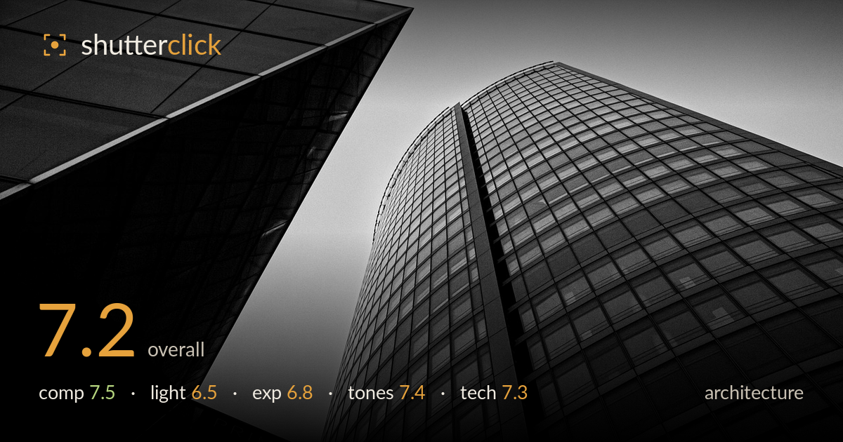
Twin towers converging skyward
Photo by Chloe_Dupre

No EXIF metadata in this file
Technical analysis based on visual assessment only.
A confident upward-looking composition that plays two facades against each other with real graphic tension. The curved glass tower on the right, split by its vertical seam, is the clear anchor, and the dark angular wedge on the left frames it aggressively. The main thing holding it back is the flat, overcast sky that gives the light nothing to shape — the grid of glass reads as tone rather than form. Shadow detail in the left mass is largely crushed, and while that suits the mood, it swallows information. The convergence is dramatic but the verticals lean hard; a decision about whether to correct or fully commit would sharpen the intent.
The two-facade interplay is the strength here — the sharp dark wedge on the left cuts into the frame and points toward the curved tower, creating strong diagonal energy. The vertical seam splitting the right building gives the eye a spine to travel up. The convergence toward the top builds height convincingly. The narrow sky gap between the two structures is a nice negative-space release. The bottom-left signage anchors scale but sits awkwardly, half-legible; a slightly wider or repositioned frame would let it read as intentional context.
The overcast, directionless light is the limiting factor. Flat sky illumination renders the glass grid as even tone with little modelling, so the facades read graphic rather than sculptural. There are no strong highlights or shaped shadows to give the curved surface volume — it relies entirely on the reflectivity gradient. The left wedge falls into deep shadow, which works for contrast but is a product of underlit conditions rather than shaped light. Directional low-angle sun or golden-hour raking light would carve real dimension into these surfaces.
Exposure is placed to protect the sky and the mid grey tones of the right tower, which hold cleanly without clipping. The trade-off is the left structure, where shadows are largely crushed to black with little recoverable detail. That reads as a deliberate silhouette-leaning choice and suits the mood, but it sacrifices the geometry of that facade. The sky sits as a smooth light grey with no blown highlights. A touch more shadow lift, or a bracketed frame, would preserve the left facade's edges without flattening the drama.
The black-and-white conversion is the image's most successful element. Contrast is well judged for the mood — deep blacks in the wedge, a clean mid-grey range across the glass grid, and a smooth highlight roll-off in the sky. Mid-tone gradation across the curved tower is subtle and reads the curvature nicely. The tonal separation between the two buildings and the sky is clear. If anything, the deepest shadows could carry a hint more detail to avoid pure-black voids, but the overall tonal architecture is coherent and deliberate.
The wide-angle choice suits the subject, exaggerating scale and convergence to good effect, though it introduces the strong vertical lean that defines the shot. From visual evidence, focus is accurate across the facade — the glass grid stays crisp from foreground edge into the receding distance, suggesting a sensible aperture for deep sharpness. Detail retention in the mid-tones is good, with no obvious noise or softening in the well-lit areas. Sharpness holds up under the demands of the fine window grid, which is where wide lenses often falter at the edges. The keystoning is significant: for architecture, converging verticals are judged strictly, and here they read as an aesthetic choice rather than a controlled correction. Committing fully to the dramatic upward tilt, or correcting the verticals in post for a cleaner geometric statement, would resolve the ambiguity. A shift lens or perspective correction would offer control. Overall execution is clean and competent, with the lens and focus decisions well matched to the intent.
What would elevate it
Tags
Shot something like this?
Expert photo critique, on demand — scored across six categories, EXIF-aware. Start with 3 free critiques, no credit card.
critique my photo — free