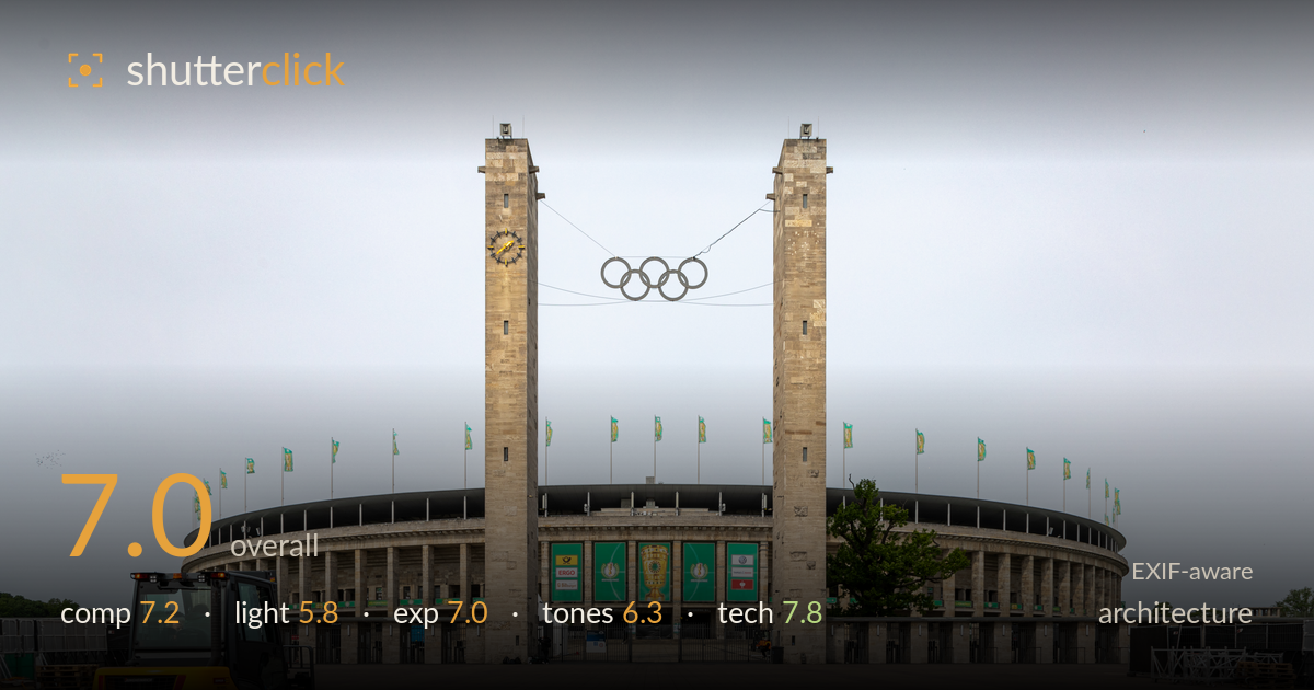
Twin towers of the olympiastadion
Photo by Dietmar Rabich

| Focal length | 24 mm |
| Aperture | f / 10.0 |
| Shutter | 1/250 s |
| ISO | ISO 100 |
| Exp. comp. | 0.0 EV |
| Shot at | 07:40 · May 26, 2019 |
A clean, symmetrical frontal study of the Olympiastadion's twin towers, anchored well by the near-perfect axis running up between the Olympic rings. The yellow forklift in the lower left is the quiet stroke of wit here — a splash of colour and human scale against the monumental grey stone, saving the image from being a flat postcard. What holds it back most is the flat, overcast light, which leaves the limestone and plaza tones muddy and drains the modelling from the towers. The vast empty foreground, while intentional, edges toward dead space in the lower third.
The strict frontal symmetry suits the building's monumental axial design, and centring the Olympic rings between the towers is the correct call for this subject. The forklift breaks the symmetry deliberately and gives the eye somewhere to land with scale reference — a smart addition. The verticals are held clean and upright. The main weakness is the lower third of paving, which occupies nearly half the frame and reads as empty rather than expansive; more of the stadium curve or a slightly lower angle would tighten the balance.
Flat, even overcast light dominates and does the architecture few favours. There is no directional modelling to bring out the depth of the tower reliefs or the ribbed stone of the colonnade, so the structure reads two-dimensional. The bright, featureless sky offers no interest and clips toward pure grey-white. Diffuse light does keep shadows manageable and detail readable across the facade, but the trade-off is a lack of drama or atmosphere. Directional low-angle light would carve out the towers and give the stone character.
Exposure is competent and well controlled. The stone facade, the green banners and the plaza all retain detail without blocked shadows, and the forklift's yellow holds without clipping. The sky is bright but not badly blown, sitting near the top of the histogram as an overcast sky naturally does. Midtones are placed sensibly across the wide subject. The overall result is slightly flat, but that stems from the light rather than the exposure choices, which are deliberate and even across the frame.
White balance leans slightly cool and grey, which reinforces the drab overcast feel. The limestone lacks warmth and the plaza paving sits in a muddy pink-grey that neither pops nor recedes cleanly. The green banners and yellow forklift provide the only saturated colour and are the tonal highlights of the frame. Contrast is low, as expected under flat light, leaving the image feeling slightly lifeless overall. A warmer white balance and a modest contrast lift would give the stone and plaza more presence.
The settings are well matched to the subject. At 24mm on full frame, f/10 delivers the deep front-to-back sharpness architecture demands, keeping both the near forklift and the distant colonnade crisp. ISO 100 keeps the file clean with no visible noise, and 1/250s is more than sufficient for a static building handheld or tripod-mounted. The 24-105 is a sensible choice, though 24mm introduces some perspective stretch in the near paving. Focus is accurate across the plane. Crucially, the verticals are held plumb — the towers rise true without keystoning, suggesting careful camera levelling or corrected distortion in post, which is exactly what this frontal architectural approach needs. The wide angle does exaggerate the foreground plaza relative to the building, contributing to the empty lower third. A modest telephoto compression from further back would have rendered the stadium more imposing, but as executed the technical craft is sound and deliberate throughout.
What would elevate it
Tags
Shot something like this?
Expert photo critique, on demand — scored across six categories, EXIF-aware. Start with 3 free critiques, no credit card.
critique my photo — free